

How to read and use an eNPS dashboard?
Employee Net Promoter Score (eNPS) data is only useful when organizations can interpret and act on it effectively. An eNPS dashboard is a powerful tool for management to monitor and improve company culture and business outcomes, helping HR teams and leaders convert survey results into clear insights on engagement levels, sentiment distribution, and team-level gaps.
Employee engagement surveys provide a venue for open feedback and establish two-way communication, helping assess employees' perceptions of their work, company culture, and management.
This guide explains how to read and use the eNPS dashboard data to identify issues early and support consistent decisions.


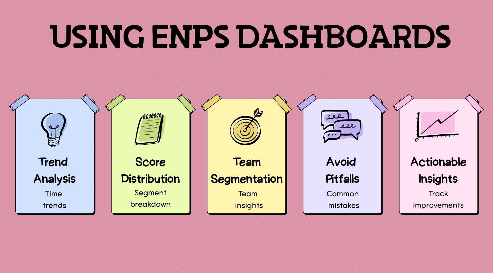
- Focus on trends over time, not a single eNPS score, to understand real engagement shifts.
- Always analyze promoter, passive, and detractor distribution to uncover hidden sentiment changes.
- Use team-level segmentation to identify specific problem areas instead of relying on overall scores.
- Avoid common mistakes like ignoring response rates or reacting to short-term fluctuations.
- Turn insights into action by prioritizing high-risk teams, identifying root causes, and tracking improvements consistently.
What is an eNPS dashboard?

An eNPS dashboard is a visual interface that displays employee Net Promoter Score data in a structured format, helping organizations track engagement levels across the workforce. These dashboards are essential tools that collect employee feedback through surveys and responses, generating actionable insights and reports for management to make informed decisions.
They present key information such as overall score, promoter–passive–detractor distribution, and segmented views by team, role, or location.
An eNPS dashboard also displays trend lines across survey cycles, allowing teams to track how employee sentiment changes over time. Real-time dashboards help managers spot issues early and track employee morale at a glance.
With these capabilities, eNPS dashboards enable HR teams to create and implement action plans based on actionable insights, ensuring that employee feedback leads to meaningful changes in workplace culture.
What are the key metrics in an eNPS dashboard?
eNPS dashboard metrics include the overall score, promoter–passive–detractor distribution, trends over time, and segmentation by team or role. These metrics help measure employee satisfaction, loyalty, and the likelihood that employees will recommend the organization as a good place to work.
- Overall eNPS score: Indicates the net difference between promoters and detractors, providing a high-level view of employee sentiment after each survey cycle. eNPS is calculated by subtracting the percentage of detractors from the percentage of promoters. Scores between 10 and 30 are considered good, while scores above 50 are excellent.
- Promoter, passive, detractor split: Shows response distribution, helping identify whether positive or negative sentiment is driving the score.
- Trend over time: Tracks score movement across survey cycles to detect improvement, decline, or stability in engagement. Regularly measuring eNPS helps improve employee satisfaction and retention, and helps identify areas for improvement in employee engagement.
- Team or department segmentation: Breaks down scores by function, location, or role to highlight localized engagement differences.
- Response rate: Measures participation levels, helping validate whether insights reflect a broad employee base.
- Score variance across groups: Compares engagement gaps between different groups, such as teams or departments, to provide insights into employee loyalty and morale and to identify high-risk or high-performing units.
When analyzing eNPS dashboard metrics, it is important to benchmark eNPS scores against previous performance rather than comparing with other organizations.
How to interpret eNPS scores in a dashboard?
To interpret the eNPS dashboard data, focus on trends, patterns, and movement across survey cycles rather than a single score. Interpreting eNPS scores provides actionable insights into the employee experience and helps organizations understand how employees feel about their workplace.
Effective communication of survey results and feedback is essential for management to ensure that employee voices matter and are connected to real change.
1. Trend direction
Consistent upward or downward movement across cycles signals real change, while isolated spikes often reflect short-term events. Teams should review trends across multiple survey rounds before acting. According to Gallup, highly engaged teams achieve up to 18% higher productivity, highlighting the importance of tracking engagement trends over time.
2. Cross-team patterns
Comparing patterns across teams highlights where engagement is concentrated or declining. Uneven patterns usually indicate localized issues such as leadership gaps or workload pressure, which require targeted action instead of broad interventions.
3. Promoter and detractor movement
Changes in promoter and detractor percentages reveal shifts in employee loyalty and the likelihood that employees will recommend working at the company, even when the overall score appears stable. eNPS surveys specifically measure how likely employees are to recommend their organization as a good place to work, providing valuable insights into workplace advocacy and internal sentiment.
4. Sudden fluctuations
Sharp score changes often align with internal events like policy updates or workload spikes. These should be interpreted in context, as reacting without understanding the cause can lead to incorrect decisions.
5. Participation consistency
Low response rates reduce data reliability and can distort trends. Higher and consistent participation improves confidence in patterns, making interpretation more accurate across survey cycles.
What are common mistakes when reading eNPS dashboards?

Common mistakes when reading an eNPS dashboard include overreacting to short-term score changes, ignoring segmented data, and misinterpreting trends without context. These issues lead to flawed conclusions, as teams fail to distinguish between real engagement shifts and temporary variations in survey data.
It is important to follow best practices to avoid survey fatigue, such as conducting eNPS surveys every three months. The HR team plays a key role in managing survey frequency and ensuring sufficient participation for meaningful insights.
Additionally, eNPS surveys should be lightweight and seamlessly delivered in the flow of work to encourage participation and avoid survey fatigue.
1. Overreacting to single data points
- Acting on one survey cycle without validating trends
- Treating short-term drops or spikes as long-term issues
- Making immediate changes without supporting data
2. Ignoring segmentation insights
- Looking only at the overall score instead of team-level data
- Missing engagement gaps across departments or roles
- Applying uniform actions despite varied team conditions
3. Misreading trends over time
- Assuming stability when the underlying sentiment is shifting
- Ignoring the gradual decline across multiple cycles
- Failing to compare data across consistent time periods
4. Focusing only on the overall score
- Overlooking promoter and detractor movement
- Missing early warning signals within the response distribution
- Relying on one number instead of detailed metrics
(Source: Gallup)
5. Neglecting response rate impact
- Concluding low participation data
- Ignoring uneven response rates across teams
- Assuming results represent the entire organization
6. Lack of contextual analysis
- Interpreting data without considering internal events
- Ignoring policy changes, workload spikes, or leadership shifts
- Making decisions without linking data to real conditions
How can you turn eNPS dashboard insights into action?
Turning eNPS insights into action requires identifying problem areas, prioritizing teams based on risk and impact, and linking trends to specific interventions. By leveraging these insights, a company can improve employee retention, job satisfaction, and overall business outcomes.
Implementing recognition programs aligned with company values further enhances engagement and retention, reinforcing a positive workplace culture. Additionally, eNPS software solutions can help improve employer branding by using advocacy data.
This ensures dashboard data drives measurable improvement instead of remaining static analysis. Dashboards in eNPS software provide actionable insights for leaders to improve employee engagement and the quality of services provided by the company.
1. Identify high-risk teams
- Analyze segments with declining scores or rising detractors
- Focus on teams showing consistent negative movement across cycles
- Flag areas where engagement drop aligns with attrition or absenteeism
Teams with repeated negative trends often indicate issues such as workload pressure, weak manager support, or role clarity gaps that require targeted intervention.
2. Prioritize teams based on impact
- Compare engagement gaps across departments and functions
- Focus on teams with low scores and a larger employee base
- Identify areas where improvement can influence overall engagement
Prioritization should consider both severity and scale, ensuring efforts focus on areas that affect overall organizational stability and performance.
3. Identify root causes behind trends
- Link score changes to workload shifts, policy changes, or leadership behavior
- Validate trends using manager feedback or qualitative inputs
- Identify recurring drivers across multiple survey cycles
4. Assign ownership for action
- Share insights with managers responsible for each team
- Define clear accountability for improvement areas
- Set measurable goals linked to engagement trends
Ownership ensures that insights translate into action at the team level rather than remaining within centralized reporting.
5. Track progress over time
- Monitor whether actions improve trends in future cycles
- Compare the engagement movement before and after interventions
- Adjust actions if no improvement is observed
Consistent tracking helps validate whether actions are effective and supports continuous improvement in engagement outcomes.
How often should you review your eNPS dashboard?

eNPS dashboards should be reviewed after each survey cycle, with additional monthly and quarterly reviews based on engagement risk and organizational changes.
Conducting recurring eNPS surveys and employee NPS surveys every three months is recommended to avoid survey fatigue and maintain high participation rates.
eNPS software can distribute surveys through various channels, such as email, SMS, pop-ups, QR codes, and web embeds, to maximize response rates. Embedding eNPS questions directly in emails can further increase participation by reducing the number of clicks required from employees.
- After every survey cycle: Enables immediate review of results to identify sentiment shifts, early warning signals, and high-risk areas while context is still relevant
- Monthly review: Tracks short-term changes across cycles and helps monitor whether engagement is improving, stable, or declining
- Quarterly review: Supports deeper analysis of long-term performance and comparison across teams for planning decisions
- Post major organizational changes: Evaluates the impact of restructuring, leadership changes, or policy updates on employee sentiment
- During high-risk periods: It allows closer monitoring of teams with declining scores or rising detractors to enable faster intervention
Conclusion
An eNPS dashboard plays a critical role in helping organizations understand employee sentiment, track engagement trends, and identify risks early. It enables leaders to move beyond surface-level scores and determine what drives employee satisfaction, team morale, and retention across different teams. However, dashboards only create value when insights are consistently interpreted and acted upon.
CultureMonkey strengthens this process by offering real-time eNPS dashboards, deep segmentation, and automated insights that make patterns easier to understand.
With built-in anonymity, flexible distribution, and actionable recommendations, CultureMonkey helps organizations turn employee feedback into measurable improvements in engagement, culture, and business performance.
Book a demo with CultureMonkey.
FAQs
1. What does an eNPS dashboard show?
An eNPS dashboard displays the overall eNPS score, promoter, passive, and detractor distribution, trend lines across survey cycles, response rate, and segmented views by team, location, or role. These elements help determine who drives scores, highlight team morale shifts, and show how employee satisfaction changes over time for targeted follow-up.
2. How do you read an eNPS dashboard?
Read eNPS dashboards by tracking score movement across cycles, examining promoter/detractor shifts, and identifying recurring patterns within segments. Validate single-cycle changes against recent events and use this data to determine where issues impact employee retention, team morale, or performance, enabling more flexibility in decision-making.
3. What metrics are included in eNPS dashboards?
Common metrics include overall eNPS score, counts and percentages for promoters, passives, and detractors, trend lines over time, response rate, segment-level breakdowns (team, location, role), and score variance across groups. For example, segment-level insights help determine differences in employee satisfaction and engagement across departments.
4. How often should HR review eNPS dashboards?
Review dashboards immediately after each survey cycle to capture fresh insights, monthly to monitor short-term movement, and quarterly for deeper trend analysis. This structured approach helps address engagement challenges early while maintaining consistent participation and improving employee retention over time.
5. What insights should you look for in eNPS data?
Look for sustained trends, benefits, shifts in promoter and detractor proportions, and persistent gaps between teams. These insights help determine underlying challenges affecting employee satisfaction, team morale, and even customer outcomes, allowing organizations to act before issues escalate.
6. Can managers access eNPS dashboards?
Managers can access aggregated, team-level dashboards through role-based permissions. Controlled access ensures they can act on insights while maintaining anonymity. This balance provides more flexibility for managers to improve team morale without compromising employee trust.
7. How do dashboards help improve engagement?
Dashboards reveal weak engagement areas, show trend direction, and surface root causes by segment. By linking insights to action, organizations improve employee satisfaction, strengthen team morale, and indirectly enhance customer experiences through better workforce engagement.
8. What mistakes should you avoid in eNPS analysis?
Avoid overreacting to single-cycle changes, ignoring segmentation, or neglecting response rates. These mistakes may lead to inaccurate conclusions about employee satisfaction or retention challenges. For example, relying only on overall scores can hide deeper issues affecting team morale and engagement.


