

View the action summary report
A complete guide to the action summary in CultureMonkey - how to read total actions, the To do / In progress / Completed breakdown, your completion rate, and the breakdown of actions by owner and driver.
On this page
- Where to find the report
- Total actions: the headline number
- The status breakdown and your completion rate
- Where your actions come from
- The breakdown by driver
- The breakdown by owner
- What changes by role and date
- Turning the summary into a spreadsheet
- Best practices for using the report
- Frequently asked questions
- Where to go next
Creating actions is only half the job. The other half is knowing, at a glance, whether all that follow-up work is actually moving. The action summary is the report that answers that question. It sits on top of every action in your account and rolls them up into a single dashboard: how many actions exist, how they split across statuses, where they came from, and who is driving them forward.
This guide walks through the whole report, panel by panel: the headline totals, the status breakdown that becomes your completion rate, the source and driver views that tell you what people are acting on, and the owner-level views that tell you who is doing the work. It also covers what changes depending on who is signed in, and where to go when you want the numbers in a spreadsheet.
The CultureMonkey action summary lives at Act > Summary. It shows your total actions, a live To do / In progress / Completed breakdown, the sources actions were created from, a feedback-to-action ratio, and cards for top collaborators, commenters, top drivers, and the top action taker. Account Admins see every action in the account; managers and other restricted roles see only the actions they own, created, or collaborate on.
Where to find the report
Open the Act area from the main navigation (this is where all your action plans live). At the top of the Actions area you'll see two tabs: Summary and Actions.
- Summary is the report this article describes: the roll-up dashboard.
- Actions is the working list and board where individual actions are created, assigned, and moved between statuses.
Click Summary to open the report. If you land on the Actions list first, the tab is right there at the top.
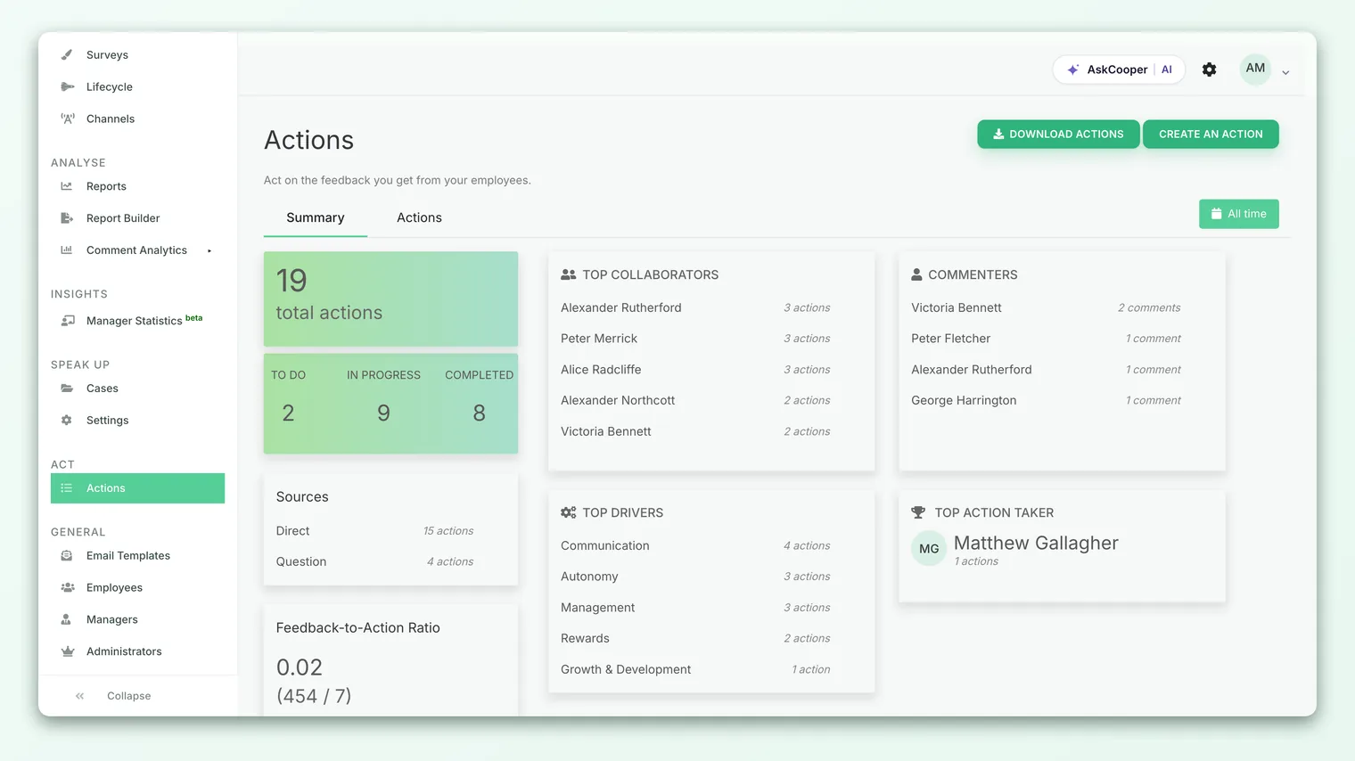
The Summary tab is available to Account Admins (full account view) and to managers who have been granted the action-summary view. A manager who can only see their own actions will see the summary scoped to those actions rather than the whole account. If you don't see the tab at all, your role doesn't currently have access to it.
Total actions: the headline number
The first and largest figure on the report is total actions. This is a simple count of every action that exists in the view you're allowed to see.
For an Account Admin, that means every action in the account, regardless of who owns it or which survey it came from. For a manager with restricted access, the same number counts only the actions they own, created, or were added to as a collaborator. So the "total" is always relative to your permissions, which is worth remembering when you compare notes with a colleague and see different numbers.
Total actions is your denominator for almost everything else on the page. A completion rate, a source split, an owner breakdown - all of them only make sense against the total they're a share of.
The status breakdown and your completion rate
Directly beneath the total, the report splits your actions into three status buckets:
| Status | What it means |
|---|---|
| To do | Created but not started. The action exists and has an owner, but work hasn't begun. |
| In progress | Actively being worked on. Someone has picked it up and moved it forward. |
| Completed | Finished and closed out. The follow-up has been delivered. |
These three counts always add up to your active pipeline, and they're the raw material for the single most useful number you can pull from this report: your completion rate.
Reading the completion rate
CultureMonkey shows the three status counts rather than a pre-computed percentage, which gives you the flexibility to read them the way that suits your team. The straightforward calculation is:
> Completion rate = Completed ÷ Total actions
Say the summary shows 40 total actions, split as 12 To do, 18 In progress, and 10 Completed. Your completion rate is 10 ÷ 40 = 25%. That single figure tells you a quarter of your commitments have been delivered, and, just as usefully, that 30 actions (the To do plus In progress buckets) are still open.
A healthy action program doesn't only have a high Completed count - it has movement. If To do is large and In progress is tiny, work is being created faster than it's being started, which usually points to owners who are overloaded or unclear on next steps. A big In progress bucket that never converts to Completed signals actions that have stalled. The three-way split is more diagnostic than a single percentage.
Because the status counts are live, refreshing the report after a review meeting is a quick way to confirm that actions people committed to moving actually moved.
An action can also carry an on hold or cancelled status behind the scenes. The summary's three headline buckets focus on the active lifecycle - To do, In progress, and Completed - so parked or dropped actions won't inflate your completion picture. If you need to account for those, the downloadable actions report lists every action with its exact status.
Where your actions come from
The Sources card breaks actions down by where they were created. In CultureMonkey you can spin up an action from several places, and this view shows you the mix:
- Feedback - actions created directly from an individual piece of employee feedback.
- Survey reports - actions created from a survey or report while reviewing results.
- Heatmap - actions created off a driver or demographic cell in a heatmap.
- Direct - actions created straight from the Actions area without being tied to a specific source.
The source mix tells you how deliberate your action-taking is. A program driven mostly by Feedback and Survey reports is one where actions are anchored to real employee signal. A program that's almost all Direct may still be valuable, but it's worth asking whether those actions are connected to what people actually told you.
The feedback-to-action ratio
Just below Sources sits the feedback-to-action ratio. This compares how many pieces of feedback have been turned into actions against the total feedback you've received. If the card reads something like 0.25 (50 / 200), that means 50 of your 200 feedback items are now attached to an action.
There's no universal "right" ratio - you won't (and shouldn't) turn every comment into a formal action. But tracked over time, this number tells you whether your team is closing the loop on the feedback that matters, or letting it pile up unaddressed. If the card shows "We don't have sufficient data," it simply means no feedback has been linked to an action yet.
The breakdown by driver
The Top drivers card ranks the engagement drivers that your actions are attached to, showing the drivers with the most actions first. Every action can be tagged to a driver (Recognition, Career Growth, Management, and so on), and this card aggregates those tags across the whole account.
This is one of the most strategically useful views on the report, because it shows you where your organization is putting its improvement effort. If most of your actions cluster under one or two drivers, that's either a sign of focus (you've identified your biggest opportunity and you're going after it) or a sign of blind spots (everything else is being ignored). Read it alongside your actual driver scores: ideally, your lowest-scoring drivers are the ones attracting the most actions.
For a deeper, owner-by-driver matrix - who is responsible for which drivers and how far along each is - see Track actions by owner and driver.
The breakdown by owner
Two cards on the summary tell you about the people behind the work.
Top action taker highlights the single owner with the most actions assigned to them, along with their action count. It's a quick way to see who is carrying the heaviest load, which is useful both for recognition and for spotting when one person has quietly become a bottleneck.
Top collaborators and Commenters round out the people picture. Collaborators are the people invited onto actions to help move them along, and the collaborators card ranks the five most active. The commenters card ranks the people leaving the most comments on actions, which is a good proxy for who is actively engaged in the discussion around follow-up, not just formally assigned to it.
Together these three cards answer the "who" questions: who owns the most, who is helping, and who is talking. When action work is concentrated in a handful of names, it's usually a prompt to distribute ownership more widely so that follow-up doesn't depend on one or two people.
Cross-read the Top action taker count against your status breakdown. If your busiest owner has a large share of the total but your Completed bucket is small, that person is likely overloaded rather than underperforming. Rebalancing ownership often does more for your completion rate than chasing individuals.
What changes by role and date
The action summary is permission-aware, so two people can open the same report and see different numbers. That's by design, not a bug.
- Account Admins see the full account: every action, every owner, every source.
- Managers and restricted roles see only the actions they own, created, or collaborate on. Their totals, statuses, and cards are all scoped to that subset.
Account Admins also get an All time date control at the top of the report. By default the summary spans your full history, but the range lets you narrow the view to a specific window - handy for reporting on a single survey cycle or quarter. When a card doesn't have enough data to display (for example, no collaborators yet in the selected range), it shows a small "We don't have sufficient data" message or a ~ placeholder rather than a misleading zero.
Turning the summary into a spreadsheet
The on-screen summary is built for a quick read. When you need to slice the data yourself, pivot it, or share it with someone who doesn't have a CultureMonkey login, export it.
- 1Open the Actions area - go to Act, where you'll find the export controls.
- 2Choose your export - "Actions" gives you a flat list of every action with its status, owner, driver, and dates. The owner-and-driver report gives you the completion counts grouped by owner and driver.
- 3Download and open - the file downloads as a spreadsheet you can filter and pivot however you like.
For a full walkthrough of the export options and what each column means, see Download the actions report. For the owner-by-driver status matrix specifically, see Track actions by owner and driver.
Best practices for using the report
- Check it before every action review. Opening the summary at the start of a follow-up meeting gives everyone a shared, current picture instead of stale notes.
- Watch the trend, not the snapshot. A completion rate of 30% that's climbing month over month is a better sign than a static 50%. Movement is the signal.
- Match actions to your weakest drivers. Use the Top drivers card to confirm your effort is going where your scores are lowest, not just where actions are easiest to create.
- Rebalance concentrated ownership. If one name dominates the Top action taker card, spread the load before it becomes a single point of failure.
- Close the loop on feedback. Use the feedback-to-action ratio to keep employee comments from going unanswered.
Frequently asked questions
Why does my total look different from a colleague's?
Because the summary is scoped to what each person can see. An Account Admin sees every action in the account; a manager sees only the actions they own, created, or collaborate on. Same report, different permissions, different totals.
Does the report show a completion-rate percentage directly?
It shows the three status counts (To do, In progress, Completed) rather than a single pre-computed percentage. Your completion rate is Completed divided by total actions - the report gives you both numbers so you can calculate it and also see the shape of the pipeline behind it.
Why does a card say "We don't have sufficient data" or show a ~?
That means CultureMonkey has nothing to display for that card in the current view - for example, no collaborators have been added yet, or no feedback has been linked to an action. It's an empty state, not an error. As activity builds up, the card fills in.
Can I limit the summary to one survey or quarter?
Account Admins have an All time date control at the top of the report that lets you narrow the range. Combined with the export, this makes it straightforward to report on a single survey cycle.
Does the status breakdown include cancelled or on-hold actions?
The three headline buckets focus on the active lifecycle: To do, In progress, and Completed. CultureMonkey keeps parked or dropped actions out of that view so they don't distort your completion picture. For a complete list with every status, use the downloadable actions report.
Where to go next
- The whole process in one page: How action planning works in CultureMonkey
- Owner and driver detail: Track actions by owner and driver
- Get the raw data: Download the actions report
- Start a new follow-up: Create an action
Your feedback helps us improve the Help Center.