

View answer distribution
See exactly how a question was answered across the scale or options - the count and share behind every rating point or choice, why it matters, and how it complements the average score.
On this page
- What "answer distribution" means
- Why the distribution matters
- The distribution for a rating question
- The distribution for a select question
- Reading the distribution in CultureMonkey
- How the distribution complements the average score
- Anonymity and the distribution
- Exporting the distribution
- Best practices
- Frequently asked questions
- Where to go next
An average tells you the middle. The answer distribution tells you the shape. For any rating or select question, it shows how many people chose each point on the scale (or each option), so you can see whether a score of 3.8 came from a room full of steady 4s or from a tense split between strong agreement and quiet frustration.
This guide covers what the distribution shows for each question type, how to read the chart in CultureMonkey, how it complements the average score, and how to break it down by segment to find where opinion diverges.
The answer distribution counts responses per scale point (for rating questions) or per option (for select questions), so you see the full spread behind a question, not just its average. In CultureMonkey it appears in the single-question view as the ANSWER DISTRIBUTION chart, with a color-coded bar for each segment of your organization. Pair it with the question score to catch polarized results a single number would hide.
What "answer distribution" means
Every rating or select question produces two kinds of summary. The first is a single number: the average score, or for select questions the most common choice. The second is the distribution, the full breakdown of how responses landed across the available answers.
Concretely, the distribution is a set of counts, one per possible answer:
- For a rating question on a 5-point agree/disagree scale, it's the number of people who chose Strongly Disagree, Disagree, Neutral, Agree, and Strongly Agree.
- For a single-select question, it's the number of people who picked each option you offered.
Those counts (and the percentages they imply) are the raw material behind every score in your report. The average is a summary of the distribution; the distribution is the fuller truth it summarizes.
Why the distribution matters
A distribution answers questions an average can't:
- Is opinion united or split? A 3.0 average made of forty 3s is a settled, lukewarm result. A 3.0 average made of twenty 1s and twenty 5s is a polarized one, and it needs a very different response.
- Where is the mass? Even a healthy 4.2 average can hide a meaningful cluster of detractors sitting at 1 and 2. The distribution puts a number on that cluster so you can size the problem.
- Which option won, and by how much? For select questions there's no average at all. The distribution is the whole answer: which choice led, whether it was a landslide or a near-tie, and how the long tail stacks up.
Whenever a question feels important, look at the distribution before you act on the score. A polarized result and a consensus result can share an identical average, but they call for opposite responses: one needs you to understand a divide, the other needs you to move a whole group.
The distribution for a rating question
For rating questions, CultureMonkey renders the distribution as a horizontal bar broken into color-coded segments, one segment per point on the scale. The scale runs in order, and on the standard 5-point scale the colors run from red for the lowest point through yellow to green for the highest:
| Scale point | Color | Reading |
|---|---|---|
| Strongly Disagree | Red | Strong negative |
| Disagree | Orange | Negative |
| Neutral | Yellow | On the fence |
| Agree | Light green | Positive |
| Strongly Agree | Green | Strong positive |
Each segment is labeled with its response count, and its length reflects its share of the bar. At a glance you can see whether the bar is mostly green (broad agreement), mostly red (a real problem), or heavy in the middle (a lot of neutrals, which often means "no strong opinion" or "not sure this applies to me").
The distribution uses the exact scale you configured, so a 3-point, 5-point, or 10-point scale produces that many segments. The scale you pick directly shapes how readable the distribution is, so see Rating questions when deciding how many points to offer.
The distribution for a select question
For single-select questions, the distribution counts how many people chose each option. Because these questions have no numeric scale, there's no average to fall back on, so the distribution is the primary way to read the result. It tells you which option led, the gap to second place, and how the remaining options are spread.
This matters most where the shape is the insight. A single option taking 60% is a clear mandate; five options each taking around 20% tells you there's no consensus and you'll need to dig deeper. For more on how these questions behave, see Single-select questions.
Multi-select and image-choice questions work the same way, with one wrinkle: because a respondent can pick more than one option, the counts total more than the number of respondents. Read those percentages as "share of people who chose this option," not as slices of a single pie.
Reading the distribution in CultureMonkey
The distribution lives inside the single-question view, under the heading ANSWER DISTRIBUTION, described in-product as "Analyze the distribution of responses by various segment of your organization for each question."
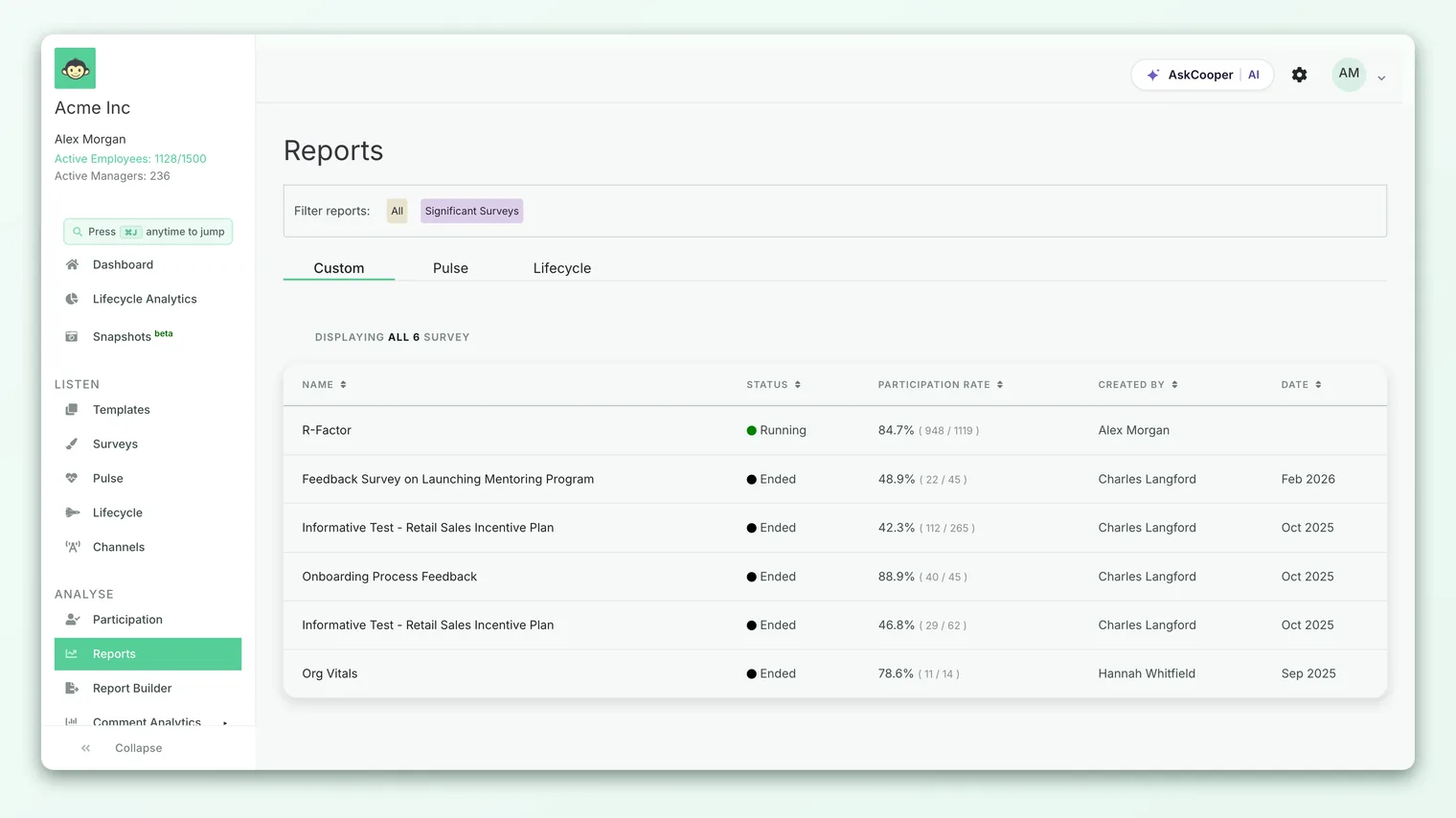
- 1Open a survey report - go to Analyse > Reports and open the survey you want.
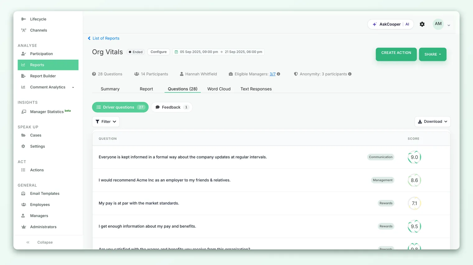
- 2Open the Questions view - switch to the question-level report and select the rating or select question you're interested in.
- 3Find the ANSWER DISTRIBUTION panel - scroll past the top-line score and the response pie chart. The distribution chart sits below them.
- 4Read each bar - every bar is one segment of your organization, split into color-coded parts for each scale point or option, with counts labeled on each part.
- 5Hover for detail - hover over any segment to see the scale point or option name and its exact count.
Break it down by segment
The most powerful part of the distribution view is the segment selector above the chart. By default the distribution is split across a demographic (such as team, department, or a custom attribute), so instead of one bar for the whole company you get one bar per group. That's where divergence becomes obvious: one team's bar is a wall of green while another's leans orange, even though the company average looked fine.
- 1Pick an attribute - use the segment dropdown above the chart to choose what to split by, such as team, location, or a custom attribute.
- 2Drill into business units and teams - where your account has business units and sub-teams set up, additional dropdowns let you narrow from a unit down to a specific team.
- 3Page through groups - if there are many segments, use the pagination control to move through them a page at a time.
- 4Compare bars - scan for bars whose color mix differs from the rest. Those are your outliers, up or down.
How the distribution complements the average score
The distribution and the question score are two views of the same data, and they're strongest together.
| Question score (average) | Answer distribution | |
|---|---|---|
| What it is | One number summarizing responses | The full spread of responses across answers |
| Best for | Ranking questions, tracking trends over time | Understanding the shape behind a number |
| Reveals | Overall direction, quickly | Consensus vs. polarization, hidden clusters |
| Works for select questions | No numeric average | Yes, this is the primary read |
Use the score to scan and prioritize, then use the distribution to understand any score that surprises you. Score first, distribution second: the number tells you where to look, the distribution tells you what's really going on.
A worked example. Two questions both score 3.4 out of 5:
- Question A distribution: 5 · 40 · 55 · 40 · 5. A tight hump around Neutral, a settled if unexciting result. The fix is to nudge a broadly-neutral group upward.
- Question B distribution: 35 · 10 · 10 · 10 · 40. A U-shape with big clusters at both ends. This is a divided workforce, and the average of 3.4 describes almost nobody. The fix is to understand why the two camps disagree.
Same score, opposite realities. Only the distribution tells them apart.
Anonymity and the distribution
The distribution respects the same anonymity protections as the rest of your reports. When you break responses down by segment, any group too small to report safely is left out of the chart, so no individual's answer can be inferred from a thin slice. If a segment you expected is missing, that's usually why, not a data error. Small bars are also noisy: one answer can swing the shape, so treat them with caution.
Exporting the distribution
You can take the distribution out of CultureMonkey when you need it elsewhere. The panel's export menu offers two formats: Distribution as image (a PNG of the chart, ready for a slide) and Distribution table (a CSV of the underlying counts per segment and scale point, for your own analysis).
Best practices
- Always check the distribution on your most important questions. The average is a starting point, not a verdict.
- Watch the neutrals. A tall middle segment often signals people who don't feel the question applies to them, or who are holding back. That's worth understanding, not ignoring.
- Read polarization by segment. When a distribution is U-shaped company-wide, split it by team or location. The divide is usually explained by who's answering, not by chance.
- Don't over-read small bars. With few responses, one answer moves the shape. Lean on segments with enough volume to be stable.
- Keep scales consistent over time. Changing a question's scale changes the shape of its distribution and breaks comparability with past cycles. See Rating questions.
Frequently asked questions
What's the difference between the distribution and the average score?
The average score is a single number that summarizes all responses. The distribution is the full breakdown of how many people chose each scale point or option. The average is derived from the distribution, so the distribution always carries more detail, including whether opinion is united or split.
Do select questions have a distribution?
Yes, and it's the main way to read them. Single-select, multi-select, and image questions don't produce a numeric average, so the distribution (the count per option) is the primary result. For multi-select, option counts can total more than the number of respondents because people can pick more than one.
Why is a segment missing from my distribution?
Almost always anonymity. When you split by a demographic, CultureMonkey removes from the chart any group too small to report without risking individual identification. This is expected. See Understand question scores for how anonymity thresholds work across reports.
Can I export the distribution?
Yes. The export menu on the panel gives you the chart as a PNG image ("Distribution as image") or the underlying counts as a CSV ("Distribution table").
Where to go next
- Understand the number it summarizes: Understand question scores
- How rating scales shape the distribution: Rating questions
- Reading choice-based results: Single-select questions
Your feedback helps us improve the Help Center.