

How to read question scores in a report
A complete guide to reading the score for every question in a CultureMonkey report - the average score, the favorable/neutral/unfavorable split, how the number maps to your scale, sorting from strongest to weakest, and the driver each question rolls up into.
On this page
Every survey report in CultureMonkey has a Questions view that lists each question you asked alongside a single score. That score is the quickest way to see, question by question, where your people feel good and where they don't. But a score of "7.8" only helps if you know what it's measuring, what scale it sits on, and what's hiding behind the average.
This guide walks through everything on the Questions view: the average score for each question, the favorable / neutral / unfavorable split that sits underneath it, how the number maps to your account's scale, how to sort from strongest to weakest, and the driver each question belongs to.
CultureMonkey gives each rating question an average score - the mean of every rating people gave, converted onto your account's scale (out of 5, out of 10, or a percentage). Beneath that average is a distribution you can read as favorable, neutral, and unfavorable responses. Sort the list to find your strongest and weakest questions, and use the driver label to see which theme each question rolls up into.
Where to find question scores
Open any survey with results, go to Analyse > Reports, pick the survey, and open the Questions tab. You'll see one row per question, each showing the question text, its score, the number of responses behind it, and the driver it belongs to.
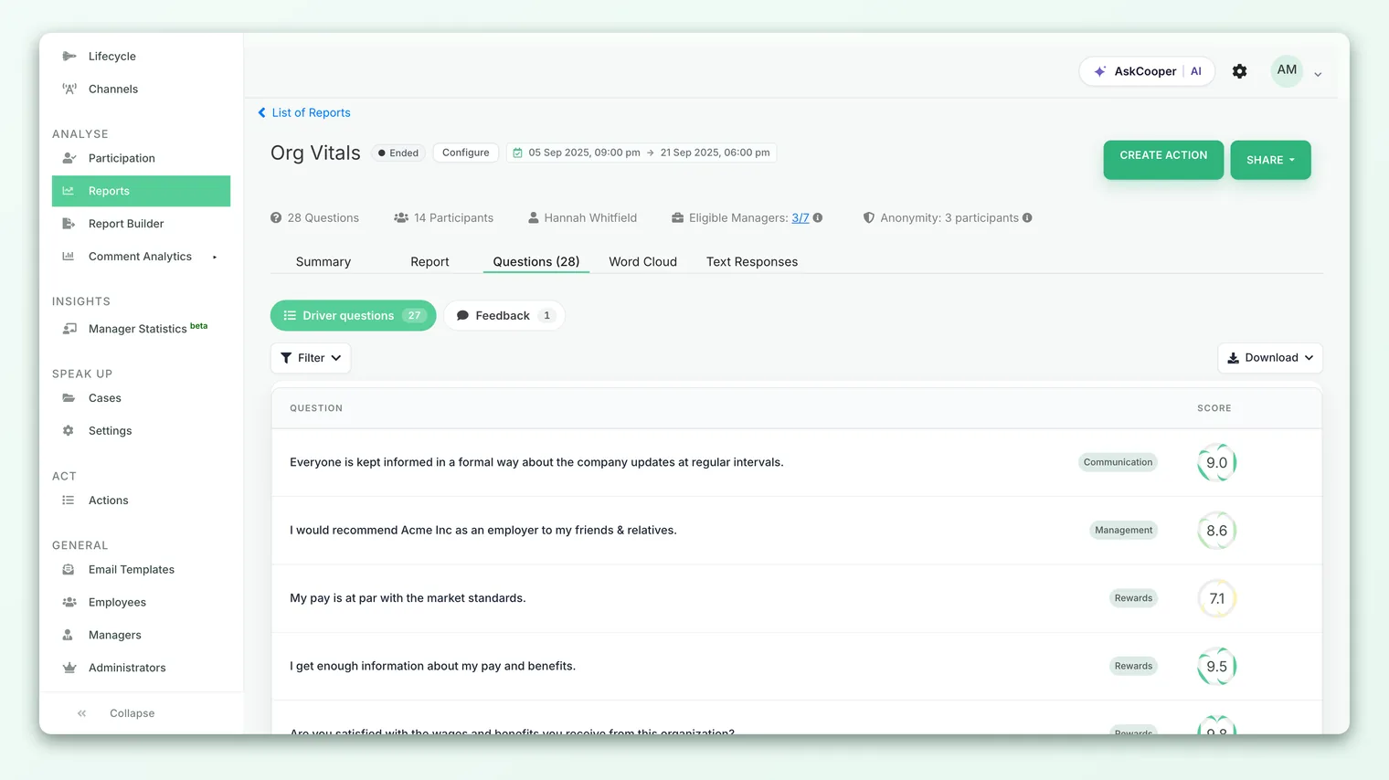
The list respects the same anonymity threshold as the rest of the report. If too few people answered a particular question (or a filtered slice of it), that score is hidden rather than shown for a handful of people, so no individual's answer can be inferred. A blank score usually means "not enough responses yet," not an error.
The average score
For a rating question, the score you see is the average (mean) of every rating submitted. CultureMonkey adds up all the individual ratings for that question and divides by the number of people who answered it. That's it - no weighting, no fancy math.
A few things follow from "it's just the average":
- It moves with every response. Early in a survey, a couple of extreme ratings can swing the number. It settles as more people answer.
- It's driven by the whole group, not the loudest voices. One very low rating is diluted by everyone who rated normally.
- It's directly comparable across questions and surveys, as long as they're on the same scale.
The response count shown next to each score tells you how much weight to put on it. A 4.6 from 300 people is a far stronger signal than a 4.6 from 4 people. Always read the score and the count together.
How the number maps to your scale
The raw average is always calculated on a 5-point basis internally, then converted to match how your account displays scores. Your account is configured one of three ways:
| Account scale | What you see | Example (raw 3.9 / 5) |
|---|---|---|
| Out of 5 | The average as-is | 3.9 |
| Out of 10 | The average doubled | 7.8 |
| Percentage | The average × 20 | 78% |
So the same underlying sentiment can appear as 3.9, 7.8, or 78% depending on your settings. This is a display choice, not a difference in the data. If your scores look higher or lower than a colleague expected, check which scale each of you is on before reading anything into it.
CultureMonkey treats a score below a set threshold as a low score worth attention: below 3 on the 5-point scale, below 6 out of 10, or below 60%. These lines all mark the same point on the underlying data. Use the threshold that matches your scale so you're comparing like with like.
The favorable, neutral, and unfavorable split
The average is a summary. Underneath it, every question has a distribution: how many people chose each point on the rating scale. That distribution is what lets you read a question as favorable, neutral, or unfavorable.
The idea is simple. On a typical agreement scale, the top options are positive, the bottom options are negative, and the middle sits in between:
| Group | Where it falls on the scale | Reading |
|---|---|---|
| Favorable | The top ratings (for example "Agree" and "Strongly agree") | People feel good about this |
| Neutral | The middle rating | On the fence, could go either way |
| Unfavorable | The bottom ratings (for example "Disagree" and "Strongly disagree") | A concern to dig into |
Why the split matters as much as the average: two questions can share the same average and tell completely different stories. A question where most people cluster on the middle option averages the same as one where the group is split hard between strongly favorable and strongly unfavorable. The average hides that polarization; the split reveals it. A high favorable percentage with a small unfavorable tail is a very different situation from a middling favorable percentage with a large one, even at the same headline score.
To see the full breakdown behind any question - every option and how many people chose it - open its detail view. See See the full answer distribution for how to read it option by option.
A worked example
Say a question scores 7.8 out of 10 from 200 respondents. That looks solid. But the split shows:
- Favorable: 130 people (65%)
- Neutral: 30 people (15%)
- Unfavorable: 40 people (20%)
The 7.8 is genuinely healthy, but one in five people is unfavorable. That 20% is where your open-text comments and follow-up actions should focus. Without the split, you'd never have known the tail was there. The average told you the room was warm; the split told you a corner of it was cold.
Sorting from strongest to weakest
The fastest way to turn a long list of questions into a to-do list is to sort by score. Ordering the Questions view lets you read the survey from either end:
- 1Sort descending (highest first) to surface your strongest questions - the things people clearly rate well. These are worth naming and protecting; they're also good candidates for "what's working" in a readout.
- 2Sort ascending (lowest first) to surface your weakest questions - the ones sitting below your low-score threshold. These are where attention and action plans belong.
Because the list is a plain average per question, sorting is honest and predictable: the question at the top really did get the highest mean rating, and the one at the bottom the lowest. Pair the ranking with the response count so you don't over-react to a very low score that only a few people gave.
A low score can reflect a genuinely hard area (for example, questions about pay or workload often score lower everywhere) rather than a local failure. Read weak questions in context - against past surveys, against benchmarks, and against the comments - before drawing conclusions.
The driver each question belongs to
Every question in CultureMonkey is mapped to a driver - the engagement theme it measures, such as Recognition, Manager relationship, Growth, or Wellbeing. The Questions view shows each question's driver right in the row, so you always know which theme a score is feeding.
This matters for two reasons:
- It groups related questions. If three questions all map to Recognition and all score low, that's a driver-level problem, not three unrelated blips. The driver label helps you spot that pattern.
- It connects the question list to your driver scores. A driver's score is built from the questions mapped to it, so a weak question is one of the things pulling its driver down. Reading them together tells you not just that a driver is low but which specific question is dragging it.
When you're triaging results, a good habit is to scan the weakest questions, note their drivers, and then check whether those drivers are low overall. A weak question inside an otherwise strong driver is a targeted fix; a weak question inside a weak driver is part of a bigger theme that deserves an action plan.
Comparing questions across slices
The single score per question is your baseline, but the same average can vary a lot between teams, locations, or managers. You can filter the Questions view by a demographic to see how each question scores for a specific group, or split a question across every group at once to find where sentiment is strongest and weakest.
This is how you move from "this question scored 7.8 overall" to "this question scored 8.9 for Sales and 5.4 for Support" - which is a much more actionable finding. See Group question scores by demographic for the full walkthrough.
When you narrow to a small group, more question scores may drop below the anonymity threshold and disappear, because each slice has fewer respondents than the whole survey. That's expected. If a score vanishes after filtering, the group is simply too small to report safely.
Best practices for reading question scores
- Read the score and the count together. A score with very few responses behind it is a hint, not a conclusion.
- Don't stop at the average. Always glance at the favorable/unfavorable split - it's where polarization and hidden tails live.
- Sort to prioritize, then verify. Ranking finds your weakest questions fast, but confirm with the response count and the comments before you act.
- Roll questions up to drivers. One weak question is a data point; several weak questions on the same driver is a story.
- Compare on the same scale. Out of 5, out of 10, and percentage are the same data. Convert before you compare with anyone.
- Watch the trend. A question's absolute score matters less than whether it's rising or falling across cycles. Compare against your previous survey wherever you can.
Frequently asked questions
Is the question score an average or a percentage?
For rating questions it's an average - the mean of every rating given, then converted to your account's scale. If your account displays scores as a percentage, that percentage is derived from the same average (raw average × 20), not a count of favorable responses. The favorable/neutral/unfavorable split is the separate distribution beneath the score.
Why do my question scores look different from a colleague's?
Almost always because you're on different display scales. The same data shows as 3.9 out of 5, 7.8 out of 10, or 78% depending on account settings. Check which scale each of you is viewing before assuming the numbers disagree.
Why is a question's score blank?
Because it hasn't cleared the anonymity threshold - not enough people answered it (or answered it within the filter you applied) for CultureMonkey to show a score safely. Blank means "too few responses to report," not zero and not an error.
Do free-text questions have a score?
No. Only rating and scale-based questions produce a numeric average. Open-text questions surface as comments, not scores. See How rating questions are scored for exactly which question types are scored.
How is the favorable percentage decided?
By where each answer falls on the rating scale: CultureMonkey counts the top options as favorable, the middle as neutral, and the bottom as unfavorable. The exact boundary depends on the scale used for that question, which is why the full answer distribution is the clearest way to see it option by option.
Can I see the score for just my team?
Yes, as long as the team is large enough to meet the anonymity threshold. Filter the Questions view by demographic, or split a question across groups. See Group question scores by demographic.
Where to go next
- See every option behind a score: See the full answer distribution
- Compare a question across teams and locations: Group question scores by demographic
- Understand how the numbers are built: How rating questions are scored
Your feedback helps us improve the Help Center.