

Read a CultureMonkey heatmap of driver scores
A complete guide to the driver heatmap in CultureMonkey - what the rows and columns mean, what each color band represents and its exact score thresholds, how to spot strengths and weaknesses at a glance, and why small cells are hidden.
On this page
The driver heatmap is one of the most powerful views in CultureMonkey. In a single grid of colored cells, it shows you how every engagement driver scores across every slice of your organization: teams, locations, managers, tenure bands, and any custom attribute you track. Instead of reading a wall of numbers, you scan for color. Green means healthy, red means struggling, and the pattern across the grid tells you where to focus.
This guide explains exactly how to read that grid: what the rows and columns represent, what each color band means and the real score thresholds behind it, how to tell a genuine strength from a genuine weakness, and why some cells appear blank.
The heatmap is a drivers x segments grid. Each row is a driver (or a metric like e-NPS or participation), each column is one segment value, and each cell is that group's average score, color-coded by band. On the default 0-10 scale, a score of 8.0 or above reads as a strength and 7.0 or below reads as a weakness. CultureMonkey hides cells for groups smaller than your anonymity threshold so no individual can be identified.
Where to find the heatmap
The driver heatmap lives inside a survey report. Go to Analyse > Reports, open the survey you want, and look for the heatmap view alongside the other breakdowns. The same grid also appears on your Dashboard for an at-a-glance, all-surveys view, and inside Lifecycle analytics for autopilot surveys.
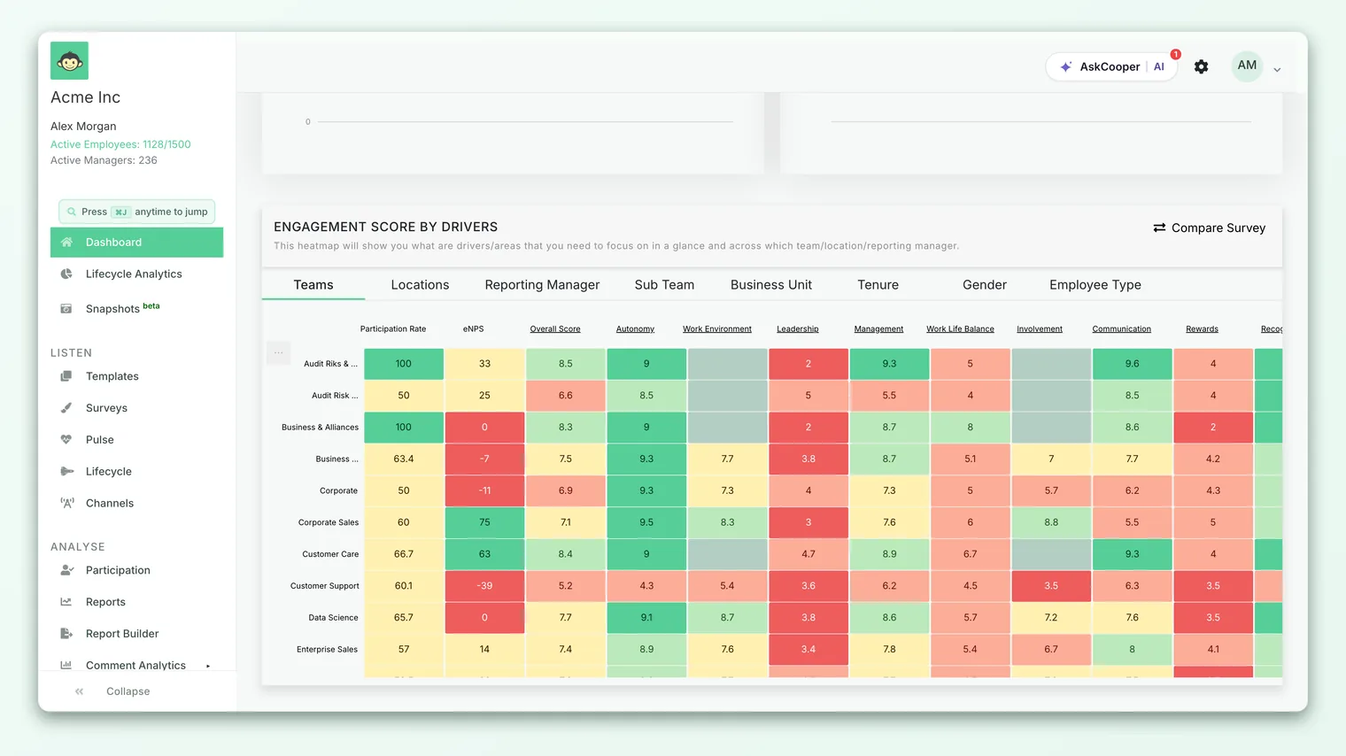
Wherever it appears, the heatmap reads the same way. The rest of this guide applies to all three views.
Rows and columns: the shape of the grid
The heatmap is a two-dimensional table. Understanding the two axes is the whole game.
Rows are drivers and metrics. Each row is one thing you're measuring. Most rows are engagement drivers (for example Recognition, Growth, Leadership, Work-Life Balance), but the heatmap also includes a few summary rows at the top:
- Overall Score - the organization's overall engagement score for that segment.
- e-NPS - the Employee Net Promoter Score for that segment. Custom e-NPS questions get their own rows too.
- Participation Rate and Participation Count - how many people in that segment took part, and the percentage who responded.
If your account uses custom drivers instead of the default set, those custom driver rows appear here instead. To understand what each driver actually measures, see Drivers and factors explained.
Columns are segment values. You pick one demographic (a segment type) at a time, and each column becomes one value within it. Choose Team and you get a column per team; choose Location and you get a column per office; choose Tenure and you get columns like "0-1 year," "1-3 years," and so on. The heatmap supports the same segments you see elsewhere in reports: team, location, manager, tenure, gender, and any custom attributes your account has set up.
The Overall column comes first. In a single-survey report, the leftmost column is always Overall: the whole-survey figure for each row. That gives you a baseline to compare every segment against. If a team's Recognition cell is greener than the Overall cell, that team is beating the company average on Recognition; if it's redder, it's lagging.
Each cell is one average score. Read a cell as "the average score for this driver among this group." A cell where the Growth row meets the "Sales" column is the average Growth score across everyone in Sales. The number is rounded to one decimal place, and the cell is colored by the band that number falls into.
The color bands and their exact thresholds
Color is what makes the heatmap fast to read, and the bands are not arbitrary. They come straight from the scoring logic in the product. On the default 0-10 scale, cells are colored by which band the score floor falls into:
| Color | Score band (0-10) | What it signals |
|---|---|---|
| Green | 9.0-10 | Excellent - a clear strength |
| Light green | 8.0-8.9 | Strong - above the strength line |
| Amber (yellow) | 7.0-7.9 | Fair - watch this |
| Orange (light red) | 4.0-6.9 | Weak - needs attention |
| Red | Below 4.0 | Critical - a clear weakness |
So a Recognition score of 8.4 in one team shows light green, a 7.2 in another shows amber, and a 3.8 somewhere else shows red. The bands are defined by the floor of the score, which is why 7.9 is still amber and 8.0 tips into light green.
Some accounts display driver scores on a 5-point scale. There the bands collapse to three: green at 4.0 and above, amber from 2.0 to 3.9, and red below 2.0. The color meaning is identical; only the cut points change to match the scale.
e-NPS and participation rows use their own bands
The summary rows aren't on the 0-10 driver scale, so they're colored differently:
- e-NPS (which runs from −100 to +100): green at 50 and above, amber above 0, red at 0 or below.
- Participation Rate (a percentage): green at 80% and above, amber above 40%, red at 40% or below. The Participation Count row is colored by that segment's participation rate, so a small headcount with high turnout can still be green.
If your account shows driver scores as percentages rather than a 0-10 index, the driver bands become green at 90%+, light green at 80-89%, amber at 70-79%, orange at 40-69%, and red below 40%.
Spotting strengths and weaknesses at a glance
The colors give you the instant read, but CultureMonkey also uses two specific lines to decide what officially counts as a strength or a weakness in its insights and digests. On the default 0-10 scale:
- Strength line: 8.0. A driver scoring 8.0 or higher is treated as a strength. That's the same point where cells turn light green.
- Weakness line: 7.0. A driver scoring 7.0 or lower is treated as a weakness.
The gap between them (the 7.1-7.9 amber zone) is the "fair but watch it" middle. On the 0-5 scale these lines are 4.0 for strength and 3.0 for weakness; on a percentage scale they're 80 and 70.
Here's how to put that to work when you're looking at the grid:
- 1Scan rows for consistent color. A driver row that's green all the way across is an organization-wide strength. A row that's mostly red or orange is a systemic weakness worth an action plan.
- 2Scan columns for struggling groups. A column that's noticeably redder than its neighbors points to a team, location, or manager that needs support across many drivers at once.
- 3Hunt for outlier cells. A single red cell in an otherwise green row is a hotspot: one group struggling with something the rest of the org handles well. These localized problems are often the easiest and highest-value fixes.
- 4Compare every cell to the Overall column. The leftmost column is your baseline. Cells greener than Overall are relative strengths; cells redder than Overall are relative weaknesses, even if their absolute color looks fine.
A wall of green is reassuring, but the story is usually in the contrasts. Two teams with the same overall score can have completely different color patterns across drivers - one strong on Growth but weak on Recognition, the other the reverse. Those patterns are what turn a heatmap into an action plan.
A worked example
Imagine you're looking at a heatmap segmented by Team, with drivers down the side. The Recognition row reads like this:
| Segment | Recognition score | Cell color |
|---|---|---|
| Overall | 7.8 | Amber |
| Engineering | 8.6 | Light green |
| Sales | 8.9 | Light green |
| Support | 6.4 | Orange |
| Design | 3.5 | Red |
At a glance you learn several things. Recognition is a relative strength in Engineering and Sales, both comfortably above the 8.0 strength line. It's a clear weakness in Design at 3.5 (red, well below the 7.0 line) and shaky in Support at 6.4 (orange). The Overall of 7.8 sits in the amber middle and hides that spread entirely - which is exactly why segmentation matters.
The obvious next move is to open Design's feedback for Recognition, because a red cell in an otherwise-healthy row is a targeted, fixable problem. To see how this same picture has moved since your last survey, use Compare heatmap periods, which recolors the grid by change rather than score.
Why some cells are blank
You'll sometimes see empty cells, or a segment that doesn't appear as a column at all. This is deliberate. CultureMonkey protects respondent anonymity with a minimum response threshold, and any group smaller than that threshold has its results suppressed so no individual's answers can be inferred from a small cell.
The default threshold is 3 respondents for anonymous surveys. Your survey admin can raise it, and some account types default higher (for example, certain configurations use a floor of 5). The rule is applied per cell: if the eligible headcount behind a given driver-and-segment combination falls below the threshold, that cell is hidden even when neighboring cells in the same row or column show fine.
An empty cell means "too few responses to show," not "scored zero." Reading suppression as a bad score is a common mistake. If a whole column is missing, that segment simply didn't clear the threshold. This is expected behavior, not a bug.
The same logic can hide the Overall cell for a driver if the eligible group for that driver is too small, and it's why a very narrow filter can empty out large parts of the grid. If you're seeing more blanks than you expect, the full explanation lives in Why can't I see results yet?.
Sorting, filtering, and drilling in
The heatmap is interactive, not a static picture. A few habits make it far more useful:
- Segment deliberately. Switch the column dimension between Team, Location, Manager, Tenure, and your custom attributes. Each cut can surface a different story. A problem invisible by team might be obvious by tenure.
- Filter to a population. Apply filters to focus the grid on one office, one business unit, or any combination, then read the pattern within that slice. Remember that narrower filters shrink group sizes, so more cells may drop below the anonymity threshold.
- Sort to bring extremes to the top. Ordering by a driver or metric pulls the strongest or weakest segments to where you can see them, instead of scanning the whole grid by eye.
- Compare over time. Once you've read where you stand today, look at movement. Compare heatmap periods shifts the coloring from absolute score to change, so green means "improved" and red means "declined."
Limitations to keep in mind
The heatmap is a summarizing tool, and summaries always trade detail for clarity. Use it with these caveats in mind:
- A cell is an average. A calm 7.5 could be everyone rating 7-8, or a hard split between 4s and 10s that happens to average out. The color won't tell you which - open the driver's response distribution and comments to see the shape behind the number.
- Bands have hard edges. A 7.9 (amber) and an 8.0 (light green) are a tenth of a point apart but land in different colors. Don't over-read a color change near a boundary; look at the underlying number.
- Small groups are noisier. A segment that just clears the anonymity threshold has a less stable average than a large one. Treat borderline-sized cells as directional, not definitive.
- *Color shows what, not why.* The grid tells you where to look. The reasons live in your open-text feedback and the individual factor scores inside each driver.
Frequently asked questions
What does each row in the heatmap represent?
Each row is one driver or summary metric. Most rows are engagement drivers; the top rows are Overall Score, e-NPS (plus any custom e-NPS), Participation Rate, and Participation Count. Columns, by contrast, are the values of whichever segment you've chosen (teams, locations, and so on).
What score turns a cell green?
On the default 0-10 scale, 9.0 and above is full green and 8.0 to 8.9 is light green, which is also the strength line. Below that, 7.0-7.9 is amber, 4.0-6.9 is orange, and under 4.0 is red. On a 0-5 scale, green starts at 4.0.
Why is one of my cells empty?
The group behind that cell is smaller than your survey's anonymity threshold (3 respondents by default), so its result is hidden to protect anonymity. It does not mean the score was zero. See Why can't I see results yet?.
How is a strength different from a weakness?
CultureMonkey treats a driver at 8.0 or above (0-10 scale) as a strength and 7.0 or below as a weakness, with the amber zone in between. The cell colors follow the same cut points, so strengths read green and weaknesses read orange or red.
Can I see how the heatmap has changed since last time?
Yes. Use Compare heatmap periods to recolor the grid by movement between two surveys or date ranges, so you can see which drivers and segments improved or declined rather than just their current level.
Where to go next
- See what has changed: Compare heatmap periods
- Understand what each row measures: Drivers and factors explained
- Cells or columns missing? Why can't I see results yet?
Your feedback helps us improve the Help Center.