

Explore AI topics with CultureMonkey Comment Analytics
How CultureMonkey uses AI to read every open-text comment, group it into themes, and show you the topics your people are really talking about - and how to read the topic list, volumes, and sentiment.
On this page
- What Comment Analytics does
- Where to find it
- How topics are generated (the AI behind it)
- How to read the topic list
- Reading the volumes and the breakdown
- A worked example
- How this connects to sentiment and eNPS
- Best practices
- Limitations to keep in mind
- Plan and access
- Frequently asked questions
- Where to go next
When you run engagement surveys, the numbers tell you what is happening, but the open-text comments tell you why. The problem is scale. A single survey across a few hundred people can produce thousands of written responses, and no one has time to read all of them line by line. Comment Analytics is the part of CultureMonkey that solves this. It reads every comment for you, groups them into themes, and shows you which topics your people are actually talking about - and how they feel about each one.
This guide explains what Comment Analytics does, how the AI generates topics behind the scenes, how to read the topic list and the volumes attached to each topic, and what it takes to turn those themes into action.
CultureMonkey Comment Analytics uses AI to read your open-text feedback, break each comment into topics, and tag the sentiment and emotion behind it. The result is a live map of the themes running through your workforce, sized by how many people mention each one and colored by how positive or negative the conversation is. It's an account-level feature that is switched on for eligible plans.
What Comment Analytics does
Every time an employee leaves a written comment - in a survey, a pulse, or the Speak Up channel - that text is just words on a screen until something reads it. Comment Analytics is that reader. Instead of you scrolling through an endless feed, the system does three jobs automatically:
- Finds the topics. It identifies the subjects each comment touches on, such as workload, manager support, career growth, compensation, or office facilities. One comment can carry several topics at once.
- Reads the sentiment. For each topic inside a comment, it decides whether the feeling is positive, neutral, or negative, and even tags an underlying emotion (for example excited, frustrated, or anxious).
- Counts the volume. It tallies how many distinct comments mention each topic, so the loudest themes rise to the top.
The payoff is that you move from reading individual comments to seeing the shape of the whole conversation. You can tell at a glance that "career growth" is the single most-discussed subject this cycle, that most of what people say about it is negative, and that "team culture" is being talked about warmly. That's the difference between drowning in feedback and actually understanding it.
Comment Analytics is where the topic view and the Topic Explorer live. This article covers how the topics are generated and how to read them; the Topic Explorer article walks through the interactive bubble view itself.
Where to find it
Comment Analytics appears as its own group in the left navigation under Feedback, and it expands into two areas:
- All Responses - the full, readable feed of individual comments.
- Topic Explorer - the AI-generated theme map that this article focuses on.
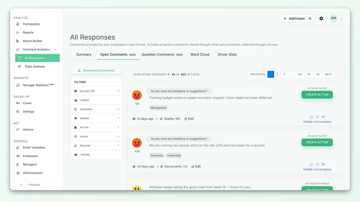
If you don't see the Comment Analytics group, it usually means the feature isn't enabled for your account or your role doesn't have access. See the plan and access note near the end of this article.
How topics are generated (the AI behind it)
Comment Analytics doesn't rely on you tagging anything or building a keyword list. The topics are generated automatically by an AI model.
Here is what happens, in plain terms:
- 1A comment comes in. As soon as an employee submits a written response, CultureMonkey hands the text to its AI service for analysis. This happens in the background, right after the comment is saved.
- 2The model reads and breaks it down. The AI parses the comment and pulls out the distinct topics inside it, along with the aspect (the specific phrase that carried the theme), the sentiment, and the emotion behind each one.
- 3The results are stored as structured tags. Each topic the model finds is saved against the original comment, so a single comment can end up linked to several topics. These stored tags are what the topic list and the Topic Explorer read from.
- 4The map builds up over time. As more comments are analyzed, the topic volumes and sentiment mix keep updating, so the view always reflects the feedback you have so far.
Because the model is reading natural language rather than matching fixed keywords, it recognizes that "I never hear back from my lead" and "my manager doesn't give me feedback" belong to the same theme, even though they share almost no words. That's the core advantage of AI-generated topics over a manual tagging scheme.
You don't choose the topics up front. The AI surfaces whatever themes are genuinely present in your comments, which means new issues can appear on the map as soon as people start talking about them - you're not limited to a list someone decided on in advance.
How to read the topic list
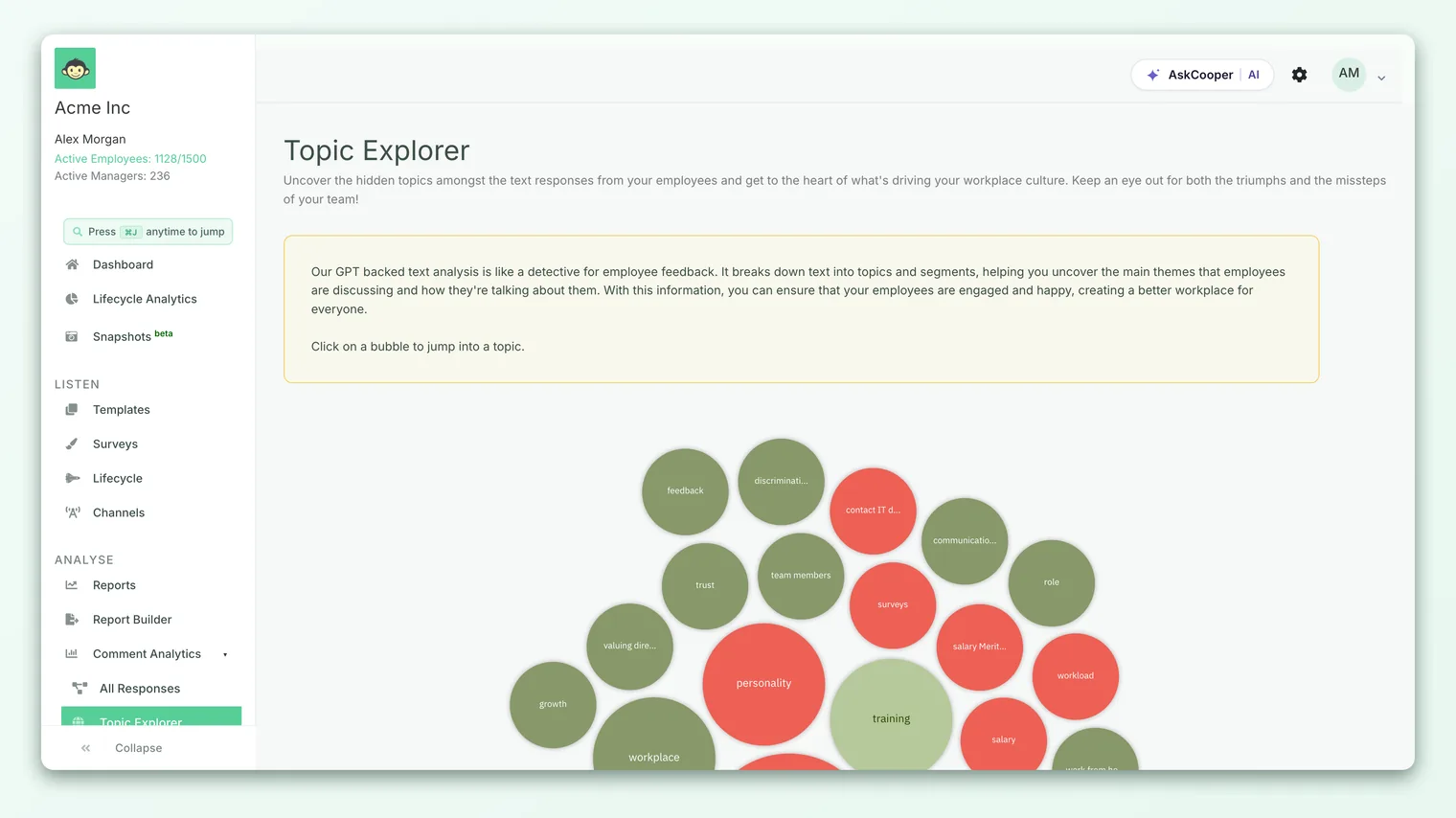
Open the Topic Explorer and you'll see your topics laid out as a set of bubbles, one per theme. Each bubble packs three pieces of information into a single glance.
Size = volume. The bigger the bubble, the more distinct comments mention that topic. This is counted as the number of unique comments touching the theme, so a topic that shows up in 200 different responses draws a much larger bubble than one mentioned in 12. Size is the fastest way to spot what's top of mind across your organization.
Color = sentiment mix. The color of each bubble reflects how positive the conversation around that topic is, based on the share of positive mentions:
| Share of positive mentions | What it signals |
|---|---|
| 75% and above | Strongly positive - a genuine strength people are praising |
| 50% to 74% | Leaning positive - mostly good, with some concerns mixed in |
| 25% to 49% | Leaning negative - more criticism than praise |
| Below 25% | Strongly negative - a clear pain point to dig into |
Label = the topic. Each bubble is named for the theme it represents, so you can read the map without opening anything.
The list is ranked and capped so it stays useful rather than overwhelming: the view surfaces the top themes by volume rather than every minor topic that appeared once or twice. That keeps your attention on the themes that carry weight.
Reading the volumes and the breakdown
Volume is the heart of Comment Analytics, so it's worth being precise about what the numbers mean. When you open a single topic, CultureMonkey shows a breakdown with a few related counts:
| Number | What it counts |
|---|---|
| Total feedbacks | How many distinct comments mention this topic. This is the volume that sizes the bubble. |
| Total phrases matched | Every individual mention of the topic, including multiple mentions inside the same comment. |
| Positive phrases | Mentions the AI read as positive. |
| Negative phrases | Mentions the AI read as negative. |
| Neutral phrases | Mentions with no clear positive or negative lean. |
The distinction between comments and phrases matters. A single comment might mention "workload" three times in different ways, which counts as one comment but three phrases. When you're gauging how many people care about a topic, look at the comment count. When you're gauging how strongly and how often it comes up, the phrase counts fill in the texture.
Below the counts, the breakdown shows the actual comments behind the topic, each tagged with its sentiment and the emotion the AI detected (shown with an emoji, for example a frustrated or excited face). This is where the analytics reconnect to real human voices: you see the theme, the volume, the feeling, and then the exact words people used.
A worked example
Say you've just closed an engagement survey and open the Topic Explorer. The largest bubble is Career Growth, and it's colored in the strongly-negative band. You click into it:
- Total feedbacks: 180. So 180 different people wrote something about career growth. That's a big share of your respondents.
- Total phrases matched: 214. Some people mentioned it more than once, which tells you it's not a passing remark for them.
- Positive: 26 · Negative: 171 · Neutral: 17. Roughly 12% positive, which is why the bubble is red.
Reading the comments underneath, a pattern emerges: people feel there's no clear path to promotion and that internal moves are rare. In one glance and one click, you've gone from "we ran a survey" to "career growth is our single biggest, most negative theme, and here's specifically why." That's the workflow Comment Analytics is built for.
Now compare that with a smaller green bubble, Team Culture, mentioned in 60 comments and 82% positive. That's a strength worth protecting and celebrating, and it's evidence you can point to when leaders ask what's going well.
How this connects to sentiment and eNPS
Comment Analytics doesn't stand alone. The sentiment it reads on each comment feeds the same understanding you get from your sentiment scores, and the topics give that sentiment a subject. A negative sentiment score tells you people are unhappy; the topic map tells you what about.
It also complements your headline metrics. If your eNPS dips this cycle, the topic map is often the fastest route to the reason. Find the largest red bubbles, read the comments, and you usually have your explanation. Numbers point to the problem; comment topics name it.
Best practices
- Start with size, then color. Scan for the biggest bubbles first (what most people care about), then look at color to see whether each big theme is a strength or a pain point.
- Prioritize big-and-red. A topic that is both high-volume and strongly negative is your clearest call to action. That combination is where focused effort pays off the most.
- Don't ignore big-and-green. Strong positive themes are worth naming out loud. Reinforcing what's working is as important as fixing what isn't.
- Read the comments, don't just count them. The volumes tell you where to look; the actual words tell you what to do. Always click into a topic before drawing conclusions.
- Watch topics across cycles. A theme shrinking or shifting from red toward green over successive surveys is real evidence that an action worked.
- Pair it with your drivers and scores. The richest picture comes from reading topics alongside your driver scores and sentiment, not in isolation.
Limitations to keep in mind
Comment Analytics is powerful, but it's an AI interpretation, so treat it as a sharp guide rather than a perfect verdict:
- The AI can misread nuance. Sarcasm, mixed messages, and heavy jargon can occasionally be tagged with the wrong sentiment. When something looks surprising, read the underlying comments to confirm.
- It only sees what people write. Topics reflect the comments you actually received. A theme that people feel strongly about but don't write about won't appear.
- Small topics can be noisy. A theme mentioned by only a handful of people can swing between colors easily. Weight your confidence toward higher-volume topics.
- Themes need enough comments to be meaningful. Early in a survey, or for a small group, the map may look thin until enough responses come in.
None of these are reasons to distrust the feature. They're reasons to use the topic map as your starting point and the raw comments as your confirmation.
Plan and access
Comment Analytics is an account-level feature that is enabled for eligible plans. When it's switched on, the Comment Analytics group and the Topic Explorer appear in your navigation; when it isn't, you'll see the standard readable feedback feed without the AI topic map.
If you'd like Comment Analytics turned on for your account, reach out to your CultureMonkey account contact or support.
Frequently asked questions
Do I have to tag or set up topics myself?
No. The AI discovers topics automatically from your comments. There's no keyword list to build and no manual tagging to maintain - new themes surface on their own as people start writing about them.
Why does one comment show up under several topics?
Because people rarely write about just one thing. If a comment mentions both workload and manager support, the AI links it to both topics. That's why the phrase counts can be higher than the comment counts.
What's the difference between "total feedbacks" and "total phrases"?
"Total feedbacks" counts distinct comments that mention a topic - your best measure of how many people care. "Total phrases matched" counts every mention, including repeats within the same comment, which reflects how often and how strongly the topic comes up.
Is the sentiment always right?
It's usually reliable, but AI can miss nuance like sarcasm or mixed feelings. Use the color to spot where to look, then read the actual comments to confirm the story before acting on it.
Does Comment Analytics respect anonymity?
Yes. Like the rest of CultureMonkey, it works with feedback under your anonymity protections, so the topic map shows themes and volumes without exposing who said what.
Where to go next
- Explore the interactive map: Explore feedback with the Topic Explorer
- Understand the feeling behind the topics: Understand sentiment scores
- Connect topics to your headline metric: What is eNPS and how is it calculated?
Your feedback helps us improve the Help Center.