

Drill into a theme with CultureMonkey Topic Explorer
How to open a topic in Topic Explorer to see the sentiment, volume, and every comment behind a theme, filter within it, and turn what you find into action.
On this page
Your people write a lot of open-text feedback. Somewhere in those comments is a story about workload, about a manager, about the new benefits program - but reading every response one by one is slow, and it's easy to miss the pattern that matters. Topic Explorer solves this. It groups your comments into themes, shows you which ones are loudest and which are most positive or negative, and lets you open any single theme to read the exact feedback behind it.
This guide is about that second half: drilling in. Once Topic Explorer has surfaced a theme, how do you open it, read the sentiment and volume for that specific topic, focus on the comments that matter, and move from "here's a theme" to "here's what we're doing about it." If you want the background on how comments become topics in the first place, start with How CultureMonkey groups comments into topics and come back here.
CultureMonkey Topic Explorer shows your feedback as a chart of bubbles, one per theme. Bigger bubbles have more feedback behind them; greener bubbles are more positive, redder ones more negative. Click any bubble to open a breakdown panel that shows the topic's counts and every comment behind it, with the relevant phrases highlighted. From there you read the "why" and create an action.
Where Topic Explorer lives
Topic Explorer sits inside the Feedback area, under Comment Analytics in the left sidebar. Expand Comment Analytics and you'll see All Responses (the full comment stream) and Topic Explorer beneath it.
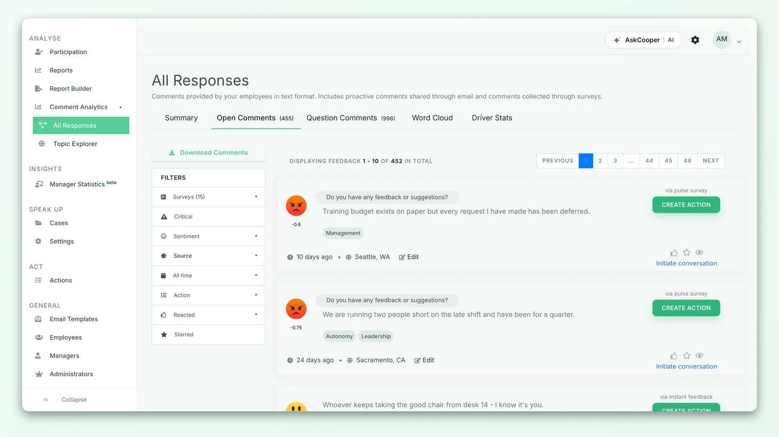
Topic Explorer is powered by CultureMonkey's AI text analysis, which is enabled per account. If you don't see it in your sidebar, it may not be turned on for your organization yet.
Reading the bubble chart
When you open Topic Explorer, you land on a chart of bubbles. Each bubble is one topic that the text analysis found across your open-text feedback. Before you drill into any single one, the chart itself is telling you three things at a glance.
Size is volume. The bigger the bubble, the more distinct pieces of feedback mention that topic. A large bubble means a lot of your people are talking about it, so it deserves attention regardless of whether the sentiment is good or bad.
Color is sentiment. Bubbles are shaded along a scale based on how positive the feedback is:
| Bubble color | What it means |
|---|---|
| Green | Strongly positive - the large majority of phrases about this topic are positive |
| Light green | Mostly positive |
| Cream / neutral | Mixed, leaning positive but with meaningful negatives |
| Red | Predominantly negative feedback about this topic |
Position and prominence follow volume too. The chart is built from the most-discussed topics, so the themes you see are the ones with the most feedback behind them, not a random sample. A big red bubble is your clearest "look here first" signal: lots of people, mostly unhappy.
Rest your cursor on any bubble and a tooltip appears with the topic's headline numbers - total feedback, total phrases matched, and the split of positive, negative, and neutral phrases. It's a quick way to size up a theme before you commit to opening it.
Drilling into a topic
To go from a theme to the feedback behind it, click the bubble. A breakdown panel slides in on the right, the chart shrinks to make room, and the panel fills with everything about that one topic.
- 1Pick a theme. Scan the chart for the bubble that matters - the biggest, the reddest, or the one tied to a question you're investigating.
- 2Click it. The breakdown panel opens on the right and the chart resizes to sit beside it.
- 3Read the header numbers. At the top of the panel you get the topic name and its counts (more on these below).
- 4Scroll the comments. Below the header, every comment that mentions this topic is listed, each tagged with the emotion and sentiment behind it.
- 5Close when done. Click the X at the top of the panel to close the breakdown and return the chart to full width, then pick another theme.
You can open one topic, read it, close it, and open another as many times as you like. Nothing you do here changes the underlying data - drilling in is a read-only way to explore.
The numbers behind a single topic
The breakdown panel opens with a compact set of counts for the topic you clicked. These are worth understanding, because "feedback" and "phrases" are not the same thing.
| Metric | What it counts |
|---|---|
| Total feedback(s) | The number of distinct comments that mention this topic. One person, one comment, counts once. |
| Total phrase(s) matched | The number of individual phrases across all those comments that map to this topic. A single comment can contain several matching phrases, so this is usually higher than total feedback. |
| Positive phrase(s) | How many of those matched phrases were positive in sentiment. |
| Negative phrase(s) | How many were negative. |
| Neutral phrase(s) | How many were neutral. |
The distinction matters when you interpret a theme. Total feedback tells you how many people raised the topic. Phrases matched tells you how much was said about it. A topic with 40 comments but 120 matched phrases is one people write about at length, not just in passing. And the positive, negative, and neutral phrase counts are exactly what drives the bubble's color on the chart, so the panel is really showing you the arithmetic behind what you saw.
Reading the comments
Below the counts, the panel lists the actual feedback. This is the heart of drilling in: the raw voice of your employees, filtered down to just this one theme.
Each comment is presented in two parts. First, a row of emotion tags - small labels with an emoji, such as "Frustrated," "Excited," "Stressed," or "Satisfied," colored by whether the sentiment is positive, negative, or neutral. These tell you at a glance how the person felt when they wrote it. Below the tags sits the comment itself, with the specific phrases that matched this topic highlighted so you can see instantly why the comment was grouped here. If someone wrote a long paragraph but only one clause is about, say, "career growth," that clause is what's highlighted.
Sentiment tells you positive or negative; emotion tells you which kind. "Frustrated" and "Anxious" are both negative, but they point to very different problems - one is about friction, the other about uncertainty. When you're deciding what to do, the emotion tags are often the more useful signal.
Reading a topic's comments in one place, rather than scattered through the full stream, is what turns a number into an insight. You stop seeing "18 negative phrases about workload" and start seeing the specific things people are actually saying.
Filtering within a topic
Topic Explorer is deliberately focused: the drill-in view is scoped to the one theme you clicked, so you're never wading through unrelated comments. To narrow things further, work at two levels.
Narrow the chart, then drill in. Topic Explorer reflects the feedback in scope. If you want to look at a single survey's themes rather than everything at once, set that scope first (for example by opening Topic Explorer for a specific survey), so the bubbles - and therefore every drill-in - reflect just that survey.
Read within the topic by sentiment and emotion. Once a topic is open, use the header counts and the per-comment tags as your filter. Want the criticism? Scan for the comments tagged with negative emotions like "Frustrated" or "Discouraged." Want to know what's working so you can protect it? Look at the "Excited" and "Satisfied" comments. The highlighting and tagging let you triage a long list quickly without reading every word.
Like everywhere else in CultureMonkey, open-text feedback is subject to anonymity thresholds. If a topic is built from very few responses, it may not surface, so that no individual comment can be traced back to a person. This is expected, not a bug. See Why can't I see results yet? if a theme you expected is missing.
From theme to action
Drilling in is only worth doing if it leads somewhere. The whole point of opening a topic is to understand a problem (or a strength) well enough to do something about it. A practical loop:
- 1Find the theme that matters. Start with the big red bubbles - high volume, negative sentiment. Those are the issues affecting the most people most badly.
- 2Open it and read the "why." Use the highlighted comments and emotion tags to understand the specific complaint, not just the category. "Workload" could mean understaffing, poor prioritization, or unrealistic deadlines - the comments tell you which.
- 3Confirm the scale. Check total feedback and phrases matched. A theme raised by many people, at length, is a stronger mandate for change than a handful of passing mentions.
- 4Turn it into an action. Create a concrete action plan for the theme, assign an owner, and set a deadline. See Create an action from feedback for how to do this directly from what you're reading.
- 5Close the loop. Tell your people what you heard and what you're changing. Visibly acting on feedback is one of the strongest ways to lift trust and future participation.
Green bubbles are just as useful as red ones. A strongly positive theme tells you what's working - the manager everyone praises, the policy people love. Protect and replicate those. Improvement isn't only about fixing what's broken; it's about scaling what's right.
Best practices
- Lead with volume plus sentiment together. A big red bubble beats a small red one for urgency, and a big green bubble is a strength worth defending. Let the two dimensions guide where you spend your attention.
- Read comments before drawing conclusions. The topic label is a summary, not the full story. The specific phrases people use will change how you frame the problem and the fix.
- Trust emotion tags for nuance. Two negative topics can need completely different responses depending on whether people are frustrated, anxious, or discouraged.
- Revisit after each survey cycle. Topics shift over time. A theme that was a big red bubble last quarter shrinking or turning green is direct evidence your actions are landing.
- Pair it with your scores. Topic Explorer explains the "why" behind movements in your engagement and eNPS numbers. Use the themes to interpret the metrics.
Limitations to keep in mind
Topic Explorer is powerful, but it's an aid to judgment, not a replacement for it.
- It reflects what people wrote. Topics come from open-text feedback, so themes people didn't put into words won't appear. Low comment volume means fewer or thinner themes.
- Grouping is automated. The text analysis is very good, but the occasional comment may be grouped in a way you'd disagree with. Always sanity-check by reading the highlighted phrases.
- Phrase counts aren't people counts. A topic with many matched phrases can still come from relatively few people writing at length. Check total feedback, not just phrase totals, before you conclude "everyone is talking about this."
- It shows the loudest themes. The chart is built from the most-discussed topics, so a real but quiet concern raised by a few people may not appear as a bubble. Use the full comment stream in All Responses to catch the long tail.
Frequently asked questions
Why does one comment count once for "total feedback" but add several "phrases matched"?
Because a single comment can talk about a topic more than once, or in more than one way. Each of those matching phrases is counted, while the comment itself is only counted once as a distinct piece of feedback. That's why phrases matched is usually higher than total feedback.
What makes a bubble green versus red?
Color is driven by the share of positive phrases for that topic. When most phrases are positive the bubble is green; as the balance tips toward negative it moves through cream toward red. The exact positive, negative, and neutral counts are shown in the breakdown panel when you drill in.
Can I see the topics for just one survey?
Topic Explorer reflects whatever feedback is in scope. To focus on a single survey, open Topic Explorer in that survey's context so the bubbles and every drill-in are limited to it.
A topic I expected isn't showing. Why?
Two common reasons. Either not enough people wrote about it, so it didn't rise into the most-discussed themes shown on the chart, or the group is too small to display under CultureMonkey's anonymity thresholds. See Why can't I see results yet?.
Does drilling into a topic change anything?
No. Opening a topic, reading the comments, and closing it are all read-only. You're exploring your data, not editing it. Changes only happen when you deliberately create an action.
Where to go next
- Understand how comments become topics: How CultureMonkey groups comments into topics
- Turn a theme into a plan: Create an action from feedback
- Connect themes to your headline number: What is eNPS and how is it calculated?
Your feedback helps us improve the Help Center.