

Track participation rate on the CultureMonkey dashboard
How to read the participation card on your CultureMonkey Dashboard - what it counts, the exact rate formula, how the selected surveys and dates shape it, the "from previous survey" delta, and how anonymity affects the number.
On this page
Your Dashboard is the first thing you land on in CultureMonkey, and near the top of it sits a single number that answers a question every admin asks: are people actually responding? That number is your participation rate, and it's the fastest read you have on whether your listening program is healthy.
This guide is about that one card. It explains exactly what the dashboard participation figure counts, the formula behind it, which surveys and dates feed into it, what the little delta beneath it means, and why the number is protected by the same anonymity rules as the rest of your results. If you want to watch a single survey fill up minute by minute while it's live, that's a different (and complementary) job covered in Track participation in real time.
The Dashboard participation card shows the share of invited people who submitted a response, calculated as submissions divided by total participants, times 100. It's an aggregate across your recent surveys (running and ended, minus any you've excluded), not a single survey. The small figure below it is the change from your previous survey. Like every result in CultureMonkey, it respects your access scope and the anonymity threshold.
Where the participation card lives
Open your home Dashboard and look at the row of summary cards at the very top. You'll see three sitting side by side: your Overall Score, your participation rate, and your eNPS. Participation is the middle one, shown as a percentage.
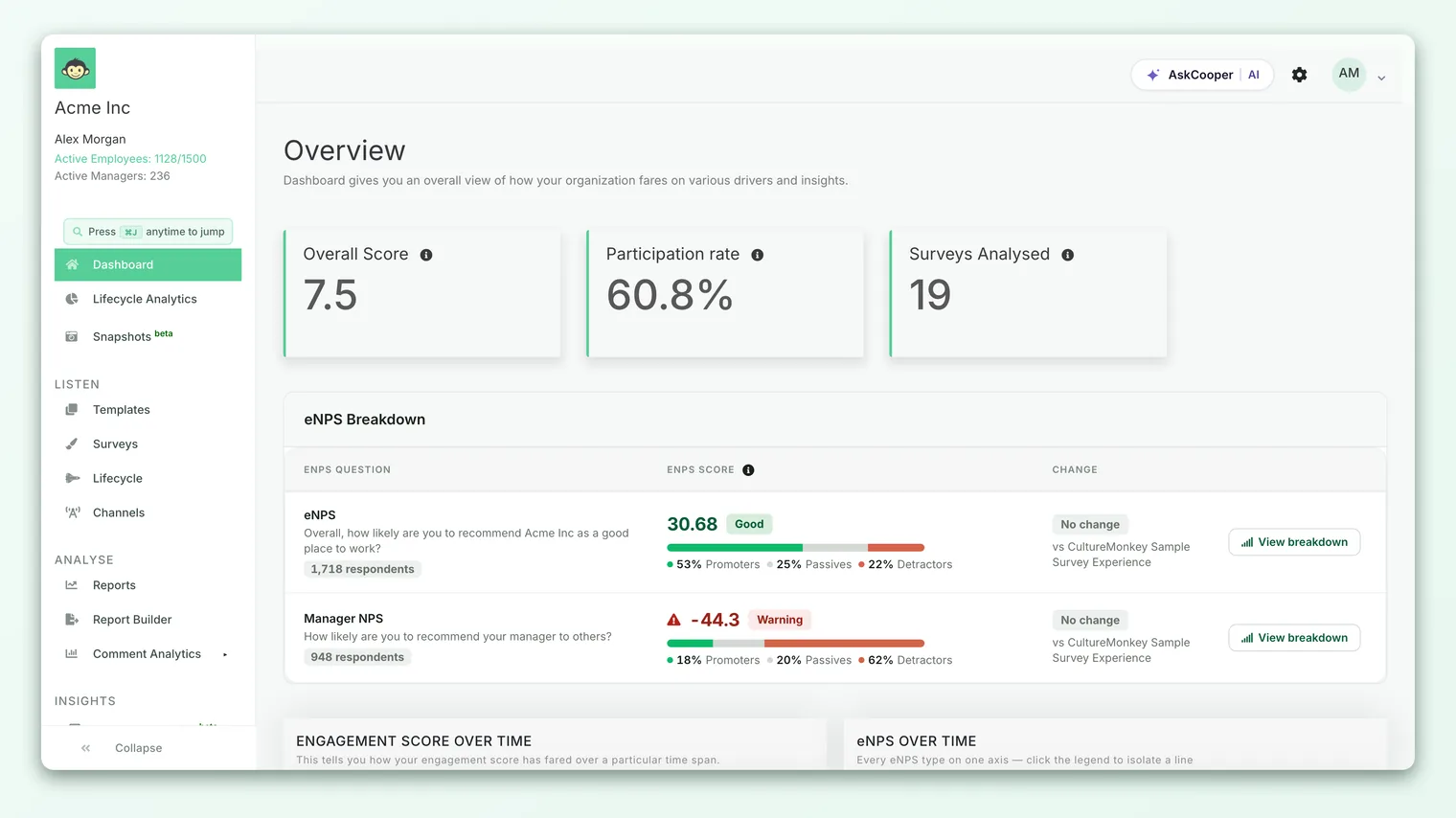
This card is deliberately glanceable. It exists so leaders and admins can see program health without opening a single survey. For the full tour of every other card and chart on this page, see Read the dashboard.
What the number actually counts
The participation rate comes down to two counts and the ratio between them:
- Total participants (invited) - everyone who was added to the surveys in scope. Each person invited becomes a participant record, whether or not they've answered.
- Submissions (received) - the number of people who completed and submitted a survey.
It is counted per person, not per answer. Submitting once counts once, no matter how many questions a survey contained. Opening the survey, or clicking the invitation link without finishing, does not count. Only a completed submission moves the number.
The rate formula
The math is a plain ratio, and it's the same formula used everywhere participation appears in the product:
> Participation rate = Submissions ÷ Total participants × 100
So if 1,200 people were invited across your recent surveys and 780 of them submitted, your dashboard rate is 780 ÷ 1,200 × 100 = 65%. The figure is rounded for display, so expect a clean percentage rather than a long decimal.
Because it's the identical formula behind the survey report and the standalone Participation view, the numbers reconcile: a difference between two views is almost always a difference in which surveys or people are in scope, not a difference in how the rate is worked out.
A rate alone can mislead. 90% of a 20-person team is 18 responses; 55% of a 2,000-person census is 1,100. The second is a far larger, more reliable sample. The dashboard card gives you the headline percentage; when you need the raw counts behind it, open the survey report or the Participation view.
Which surveys feed the dashboard rate
This is the part people most often misread. The dashboard participation card is not one survey's rate. It's an aggregate across your recent activity:
- It includes surveys that are running or recently ended (the ones whose results are ready to report on).
- It excludes any surveys an admin has chosen to keep off the dashboard. Accounts can mark specific surveys as excluded, for example a test send or a one-off pulse you don't want skewing the headline. Those excluded surveys drop out of this calculation.
The practical effect: the dashboard rate reflects the pool of people invited to your current, dashboard-visible surveys and how many of them have responded, all combined into one figure. This is what makes it a program-level health read rather than a single-launch read.
If you need the participation rate for a specific survey (with its own progress bar, sent and pending counts, and per-manager breakdown), open that survey's report or the Analyse > Participation view. The Dashboard card is intentionally an aggregate. See Track participation in real time.
The delta: "from previous survey"
Just below the participation percentage you'll see a small up or down figure labelled from previous survey. This is the change in participation compared with your last active survey, giving you a sense of direction at a glance.
A green upward delta means participation improved relative to your previous cycle; a red downward one means it slipped. Treat it as a nudge to look closer, not a verdict. Response rates naturally wobble with timing (holidays, quarter-end, a big org announcement), audience size, and survey type, so a single dip isn't necessarily disengagement. As with the whole card, the trend across several cycles tells you more than any one comparison.
How your selection and date range shape it
Two things quietly determine the number you see:
- Your access scope. The rate is computed for the people you're allowed to see. A full account admin sees the organization-wide figure. A sub-admin or manager sees participation scoped to the employees and teams they're mapped to, so the same dashboard shows them a smaller, relevant slice rather than the whole company. This scoping is applied automatically; you don't set it.
- The surveys in scope. As above, the running-and-ended, non-excluded surveys define the pool. Excluding a survey from the dashboard, or a new survey going live, will shift the aggregate.
When a fresh survey starts, its invited people join the participant pool immediately but their submissions arrive over the following days. That temporarily dilutes the aggregate rate until responses come in. A dip right after a launch is usually this effect, not a real drop in willingness to respond.
How anonymity affects what you see
The dashboard participation number obeys the same anonymity protections as every other result in CultureMonkey. In practice this rarely hides the top-level card, because the organization-wide (or full-scope) pool almost always clears the threshold comfortably, even early in a cycle.
Where anonymity bites is when the pool feeding the card is small, for example a manager whose team is only a few people, or a scope with very few invited employees. If that group hasn't crossed the survey's minimum response threshold (a floor of 3 responses for anonymous surveys), participation for it stays hidden so no individual's response, and later no individual's answers, can be inferred. This is expected behaviour, not an error.
If your participation card is blank or a scoped view shows nothing, the anonymity threshold is almost always the reason. The full walkthrough lives in Why can't I see results yet?.
The hidden number isn't an obstacle; it's the reason people answer honestly. A small team responds candidly precisely because its data can't be singled out. Waiting for the threshold is the price of candid feedback, and it's worth paying.
Reading the card well
A short checklist for getting real signal out of one glance:
- 1Read direction first. Check the delta against your previous survey to see whether participation is climbing or slipping.
- 2Sanity-check the timing. A dip right after a launch or around a holiday is usually timing, not disengagement.
- 3Go deeper when it matters. If the headline looks low, open a specific survey's report or Analyse > Participation to see counts and per-team breakdowns.
- 4Pair it with the counts. A percentage is only as meaningful as the number of people behind it, so confirm the sample size before drawing conclusions.
- 5Follow up where it's thin. Use the survey report's manager breakdown to nudge the groups that are behind. See Track participation in real time.
Frequently asked questions
Is the dashboard participation rate for one survey or all of them?
It's an aggregate across your recent CultureMonkey surveys (running and ended, minus any excluded from the dashboard), not a single survey. For one survey's rate, open its report or the Participation view.
Why doesn't my dashboard rate match a survey's report?
Almost always because the scope differs. The dashboard combines several surveys and is limited to what your role can see; a single report is that one survey, full scope. The formula is identical in both places.
Does clicking or opening a survey count toward the rate?
No. Only a completed submission counts. Opens and unfinished clicks are tracked separately and don't move the participation number.
What does "from previous survey" compare against?
The change in participation versus your last active survey, so you can see whether this cycle is running higher or lower than the one before it.
Why is my participation card empty?
Usually the anonymity threshold: the pool you can see hasn't reached the minimum number of responses (a floor of 3 for anonymous surveys). It appears once enough people respond. See Why can't I see results yet?.
Can a manager see participation on their dashboard?
Yes. CultureMonkey shows managers and sub-admins a participation rate scoped to the teams and people they're mapped to, subject to the same anonymity threshold, rather than the whole organization's figure.
Where to go next
- Watch a single survey fill up live: Track participation in real time
- Tour the rest of the Dashboard: Read the dashboard
- A card showing nothing? Why can't I see results yet?
Your feedback helps us improve the Help Center.