

Read the CultureMonkey admin dashboard
An analytical walkthrough of the CultureMonkey Dashboard for admins - the overall score, participation and eNPS cards, the engagement and eNPS trend charts, the driver heatmap and driver performance, and exactly how to move from each tile into detail.
On this page
The Dashboard is the roll-up view of your whole organization - every dashboard-included survey and pulse response, condensed into one scrollable page. If you are just getting oriented, start with A tour of the dashboard, which introduces each card in plain terms. This guide is the next step: the analytical read for an Account Admin who needs to turn the page into decisions - what each number is built from, how the tiles relate, and where to click to get from a headline to a root cause.
The CultureMonkey Dashboard reads top to bottom as a funnel. The three cards at the top give you the headline overall score, participation rate, and eNPS. Below them, two trend charts show engagement over time and eNPS over time. Then the engagement score by drivers heatmap breaks results down by team, location or manager, followed by overall driver performance and driver scores over time. Read the headline, confirm participation, then drill into the heatmap to find where to act.
How to open the Dashboard
The Dashboard lives at /dashboard and is the default landing page when you sign in as an admin. If you ever navigate away, the Dashboard item at the top of the left navigation brings you back.
What you see depends on your role and your data. Admins with full report access see the organization-wide roll-up described here. Managers are routed to their own manager dashboard scoped to their reportees, and accounts on a specialized dashboard view get their own layout. If your account has no report-ready survey yet and fewer than a handful of pulse responses, the Dashboard shows an empty state that walks you through launching your first survey instead of the cards below. Once results exist, the full analytical view appears.
The Dashboard aggregates your dashboard-included surveys, not every survey ever run. If a one-off or test survey is skewing the roll-up, an admin can exclude it. See Exclude surveys from dashboard summaries.
The three headline cards
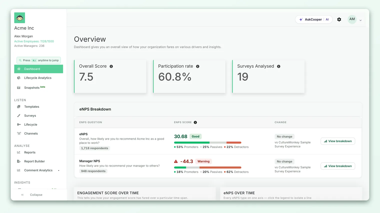
At the very top sit three summary cards in a single row. Read them left to right - each answers a different question, and together they frame everything below.
Overall score
The first card is your overall engagement score - the single number that summarizes how your people rated the engagement questions across your included surveys. Depending on your account setting, it is shown either as a score (on a 0-10 scale) or as a percentage. Under the number, a small delta shows the change since the last survey, with an up arrow in green for improvement and a down arrow in red for a decline. Hover the information icon on the card for a short definition.
Treat this as your thermometer. It tells you the temperature but not the cause. To understand what drives it and how it is calculated, see Understand the overall engagement score.
Participation rate
The middle card is your participation rate - the percentage of invited employees who responded. Its delta compares against the previous survey, so you can see whether response is trending up or down.
Read this card before you trust the other two. A strong overall score built on thin participation is a fragile signal, and a low participation rate is often the first thing worth acting on. To dig into who has and has not responded, see Track participation rate.
A headline score is only as trustworthy as the participation behind it. If participation is low or has dropped sharply, interpret the overall score and eNPS with caution and prioritize closing the response gap before drawing conclusions.
eNPS
The third card is your eNPS (Employee Net Promoter Score) - a number between −100 and +100 that captures whether employees, on balance, would recommend your organization as a place to work. Because eNPS is a score rather than a percentage, this card behaves slightly differently from the other two: it always displays when there is data, and it carries a View breakdown link.
Click View breakdown to open the eNPS detail, where the headline number is split into Promoters, Passives, and Detractors. If eNPS shows a tilde (~) instead of a number, there is not yet enough eligible data to display it. For the full definition and math, see What is eNPS and how is it calculated?; to interpret the split, see View the eNPS breakdown.
The trend charts: engagement and eNPS over time
Directly below the cards is a two-panel row. On the left, Engagement score over time plots your overall score across cycles; on the right, eNPS over time does the same for advocacy. Each panel has its own filter control so you can adjust what the line shows without affecting the other.
This is where a single snapshot becomes a story. A card tells you where you are; the trend tells you which direction you are moving. A modest score that has climbed steadily for several cycles is a healthier signal than a higher score that has been sliding.
Read the two lines together:
- Both rising - a clear, consistent good-news story worth sharing with leaders.
- Both falling - a genuine warning; drop into the heatmap below to find where.
- They diverge - the most interesting case. When engagement and eNPS move in opposite directions, something specific is happening (for example, people are satisfied with day-to-day work but less willing to recommend the company, or vice versa). Divergence is a prompt to investigate, not a number to average away.
For a deeper read of the trend panels, see Review engagement and eNPS trends over time.
The engagement score by drivers heatmap
Below the trends is the engagement score by drivers heatmap - the analytical heart of the Dashboard. Where the cards give you one number for the whole company, the heatmap shows how each engagement driver (such as recognition, growth, or wellbeing) scores across a chosen dimension. Each cell is a driver-by-segment score, color-coded so strengths and weak spots stand out at a glance.
Switching the breakdown dimension
Above the grid is a row of tabs, one per demographic dimension your account uses - typically team, location, and reporting manager, plus any custom attributes you have configured. The first tab is selected by default. Click a tab to re-slice the entire heatmap by that dimension without leaving the page. This is how you answer "is this a company-wide issue or a specific team's issue?" in a couple of clicks.
Read the heatmap in two passes. First scan down a driver column to see which teams or locations are strong or weak on that theme. Then scan across a row to see how one segment fares on every driver. A column that is red almost everywhere points to a systemic issue; a single dark cell in an otherwise healthy row points to a localized one.
Acting straight from the heatmap
The heatmap is not just a display - it is a jumping-off point. Right-click a cell to bring up a Create action option, which starts an action plan tied to that driver and segment so the insight does not get lost. Because the heatmap can take up to about 30 seconds to build for large accounts, a loader appears while it assembles; that wait is expected, not an error.
For how to read the colors, bands, and thresholds in detail, see Read a heatmap of driver scores; to slice a single driver further, see Drill down into driver performance.
Like every result in CultureMonkey, heatmap cells are protected by anonymity thresholds. A segment with too few respondents is suppressed so no individual's answer can be inferred. Empty or missing cells are usually this, not a bug. See Why can't I see results yet?.
Comparing across survey periods
On accounts where survey comparison is enabled, a Compare survey button sits in the heatmap header. It lets you overlay a second survey period so each cell shows the delta between the two - an efficient way to see which drivers and segments improved or regressed since your last cycle. If the button is greyed out with an "Insufficient Data" tooltip, there is not yet a second comparable survey to line up against. For the full workflow, see Compare a heatmap across survey periods.
Overall driver performance
Below the heatmap is the overall driver performance section, which ranks your drivers against a single measure so you can see, at a glance, which themes are pulling engagement up and which are dragging it down across the whole organization. On accounts with benchmarking turned on, industry and location selectors appear above this chart, letting you set an external comparison point so you can see not just how a driver scores, but how it compares to peers.
Use this section to prioritize. The heatmap tells you where a problem lives; overall driver performance tells you which theme deserves attention first when you cannot fix everything at once.
Driver scores over time
The final section, driver scores over time, plots all of your drivers together across cycles - an all-drivers comparison on one timeline. This is the long view of the story the cards and heatmap tell in snapshot. It answers the follow-through question every admin eventually asks: "after we ran an action plan on recognition, did the recognition line actually move?"
Read it as your proof-of-impact panel. A driver line that turns upward after you launched an initiative is the clearest evidence that your changes are working. For a focused look at a single driver's trajectory, see Track driver performance over time.
How the Dashboard fits together
Read from the top, the page is deliberately a funnel from headline to root cause:
| Section | Question it answers | Where it takes you next |
|---|---|---|
| Overall score card | How are we doing overall? | Understand the overall score |
| Participation card | Can we trust that number? | Track participation rate |
| eNPS card | Would people recommend us? | View the eNPS breakdown |
| Trend charts | Which direction are we moving? | Trends over time |
| Driver heatmap | Where exactly is the problem? | Read a heatmap |
| Overall driver performance | Which theme to fix first? | Drill into a driver |
| Driver scores over time | Did our actions work? | Driver performance over time |
The intended reading loop is: check the headline, verify participation, note the trend direction, drop into the heatmap to localize the issue, decide which driver to prioritize, then create an action right from the cell and re-check the driver trend next cycle.
Best practices for reading the Dashboard
- 1Verify participation first. Before you react to any score, confirm the participation card is healthy. A low response rate changes how you should read everything else.
- 2Lead with the trend, not the snapshot. A rising line at a modest score beats a falling line at a high one. Direction is the decision-relevant part.
- 3Localize before you generalize. A company-wide average almost always hides a struggling team. Use the heatmap tabs to slice by team, location and manager before drawing conclusions.
- 4Turn a cell into an action. When the heatmap surfaces a weak driver-and-segment combination, right-click to create an action plan on the spot so the insight becomes follow-through.
- 5Keep the roll-up clean. If a test or off-cycle survey is distorting the numbers, exclude it from the Dashboard so the headline reflects reality.
Frequently asked questions
Why is my Dashboard showing a "launch your first survey" screen instead of cards?
Because there is not yet enough data to roll up. The Dashboard shows its empty, getting-started state until you have at least one report-ready survey (or enough pulse responses). Once results come in, the full card view appears automatically.
Why does my eNPS card show a tilde instead of a number?
A ~ means there is not yet enough eligible data to calculate and display eNPS. It will populate once enough people have answered the eNPS question. See What is eNPS?.
The overall score is a percentage for me but a 0-10 score for a colleague. Why?
The Dashboard can display engagement as either a 0-10 score or a percentage, controlled by an account-level setting. Both describe the same underlying result; only the presentation differs.
Some heatmap cells are empty. Is that a bug?
Usually not. CultureMonkey suppresses cells for segments with too few respondents to protect anonymity. If a whole breakdown looks sparse, it is likely the threshold, not an error. See Why can't I see results yet?.
Why is the "Compare survey" button greyed out?
There is not yet a second comparable survey to line up against, so the comparison has insufficient data. Once you have run another qualifying survey, the button becomes active. See Compare a heatmap across survey periods.
How is the admin Dashboard different from a manager's dashboard?
Admins see the organization-wide roll-up across all included surveys. CultureMonkey routes managers to a manager dashboard scoped to their own reportees, with additional benchmarking of their team against the wider organization. The cards look similar, but the data is filtered to what each role is allowed to see.
Where to go next
- New to the page? A tour of the dashboard
- Read the headline number: Understand the overall engagement score
- Interpret the grid: Read a heatmap of driver scores
- Keep the roll-up accurate: Exclude surveys from dashboard summaries
Your feedback helps us improve the Help Center.