

Export a CultureMonkey heatmap to Excel
How to download the driver heatmap as a color-coded Excel (XLS) file - where the export lives, what the workbook contains, how the color bands carry over, and how to use it offline.
On this page
The driver heatmap is one of the most useful views in CultureMonkey: a grid of color-coded cells that shows how every engagement driver scores across every slice of your organization. Sometimes you need that grid outside the app, in a spreadsheet you can filter, sort, annotate, or drop into a board deck. That's what the Export to XLS option is for.
Related release: Org Hierarchy Export (February 25, 2026). See every dated change on Product Updates.
This guide covers the Excel export end to end: where to find it, what the downloaded workbook actually contains, how the same color bands you see on screen are baked into the file, and how to use it offline. It's a narrow feature, so this is a short read.
Open the report's export menu, choose Export to XLS, and tick Include Color Coding if you want the familiar green-to-red bands carried into the file. CultureMonkey builds an .xlsx workbook, one tab per demographic view, with drivers as rows and segments as columns - the same numbers and the same color logic you see in the heatmap on screen. For larger accounts the file is emailed to you rather than downloaded on the spot.
When to export the heatmap
The heatmap inside CultureMonkey is built for scanning and drilling down. The Excel export is built for everything you can't do in the browser:
- Work offline or share widely. Send the grid to someone who doesn't have a CultureMonkey login, or review it on a plane with no connection.
- Slice it your own way. Sort a driver column high-to-low, apply your own spreadsheet filters, or pivot the data to answer a question the on-screen view doesn't.
- Annotate and archive. Add your own notes, freeze a snapshot for a specific point in time, and keep it alongside your other planning files.
- Feed a deck or a review. Paste the color-coded grid straight into a leadership review, a QBR, or a board pack.
If you want a polished, presentation-ready document rather than raw cells, look at Export a report to PDF instead. The Excel export is the one to reach for when you want the data, movable and editable.
Where to find the export
The export lives in the report's action menu, not on the heatmap itself. You'll find it in three places, all of which produce the same kind of file:
- A single survey report - the heatmap for one survey.
- The Dashboard heatmap - the rolled-up view across your active surveys.
- A Lifecycle report - the driver analysis heatmap for autopilot lifecycle surveys.
In each case the export sits in the export/download dropdown in the report header, listed as Export to XLS next to the Excel icon.
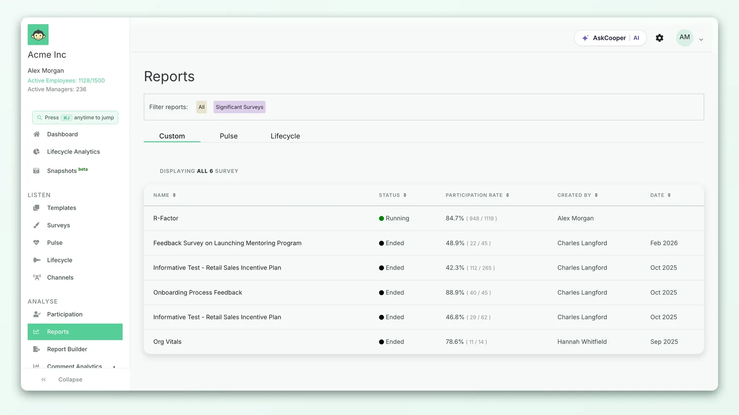
The export is available to admins and sub-admins who can already view the report and its heatmap. If you can see the heatmap on screen, you can export it. If exports appear to be turned off entirely, an Account Admin controls that - see Enable report exports.
Downloading the file, step by step
- 1Open the report whose heatmap you want - a single survey, the Dashboard, or a Lifecycle report.
- 2Open the export menu in the report header and choose Export to XLS. A small "Export to XLS" dialog opens.
- 3Decide on color. Tick Include Color Coding to carry the heatmap's green-to-red bands into the file. Leave it unticked for a plain workbook of numbers only.
- 4Mind your filters. The export respects the filters currently applied to the heatmap. If you've filtered to a team or applied a complex filter, the dialog reminds you that the file will contain only that filtered data.
- 5Click Export. For smaller accounts the
.xlsxdownloads straight to your device. For larger accounts it's generated in the background and emailed to you (more on that below).
That's the whole flow. There's no separate "with colors" and "without colors" button - the single Include Color Coding checkbox decides it.
What the workbook contains
The file is a genuine Excel workbook (.xlsx), built to mirror the heatmap you were just looking at.
One tab per demographic view. The heatmap can be sliced by different demographic types (team, location, manager, tenure, and any custom attributes you track). Each of those views becomes its own worksheet tab in the workbook, so a single file can carry several cuts of the same data.
Drivers as rows, segments as columns. Inside each tab the layout matches the on-screen grid. The first column holds the row labels (each engagement driver, plus summary rows like e-NPS and Participation Rate), and every following column is one segment value. Each cell is that group's average score for that driver, rounded to one decimal place - exactly as the heatmap rounds it.
Only columns and rows with data. For a single-survey or lifecycle export, empty segment columns and empty rows are dropped, so you're not left scrolling past blank space. (The Dashboard export keeps all columns so views line up across surveys.)
A descriptive filename. The file is named after its source - for example the survey title followed by _heatmap, or the dashboard or lifecycle heatmap name - with a timestamp appended, so repeated exports don't overwrite each other.
When color coding is on, cells that have no score (a group below the anonymity threshold, or a driver a segment didn't answer) are filled with a neutral gray rather than left white. That way a hidden or missing value is visually distinct from a genuine low score.
How the colors carry over
This is the part people care about most: the exported file uses the same color bands, at the same thresholds, as the heatmap on screen. Tick Include Color Coding and each cell is filled with the band its score falls into, straight from the product's scoring logic.
On the default 0-10 driver scale, the cell fills are:
| Fill color | Score band (0-10) | What it signals |
|---|---|---|
| Green | 9.0 and above | Excellent - a clear strength |
| Light green | 8.0-8.9 | Strong - above the strength line |
| Amber (yellow) | 7.0-7.9 | Fair - watch this |
| Light red (orange) | 4.0-6.9 | Weak - needs attention |
| Red | Below 4.0 | Critical - a clear weakness |
The summary rows use their own bands, just as they do in the app:
- e-NPS (which runs from −100 to +100): green at 50 and above, amber above 0, red at 0 or below.
- Participation Rate (a percentage): green at 80% and above, amber above 40%, red at 40% or below. The Participation Count row is colored by that segment's participation rate.
If your account displays driver scores on a 0-5 scale or as percentages, the bands shift to match, identically to the on-screen heatmap: on a 5-point scale, green at 4.0+, amber 2.0-3.9, red below 2.0. Because the export reads the exact same thresholds the heatmap uses, a cell that's light green on screen is light green in the file. For the full breakdown of what each band means, see How to read a heatmap.
Color coding is perfect for sharing and for decks. But if you plan to sort, filter, or run your own conditional formatting in Excel, exporting without colors gives you a clean numeric grid to work from. You can always add your own formatting on top.
Instant download vs. emailed file
For most reports the file downloads immediately when you click Export. For larger accounts, or reports heavy enough that building the workbook takes a moment, CultureMonkey generates it in the background and emails it to you instead. When that happens you'll see a confirmation message that the report is being generated and will be emailed shortly.
If you don't get the email within about half an hour, check your spam folder first, then reach out to support@culturemonkey.io. This background path is also why you can kick off an export and keep working rather than waiting on a spinner.
Limits and things to keep in mind
- It's a snapshot. The file reflects the data and filters at the moment you export. It won't update as new responses come in - re-export to refresh it.
- Filters travel with the export. Whatever filter is applied to the heatmap is applied to the file. If a colleague opens the file and the numbers look narrow, check whether a filter was on at export time.
- Anonymity still applies. Groups below your anonymity threshold are hidden in the export exactly as they are on screen - a small team's cell won't reappear just because it's in a spreadsheet.
- Colors are cell fills, not conditional formatting. The bands are baked in as static fill colors. If you re-sort or edit scores in Excel, the colors won't recalculate - they reflect the values at export time.
Frequently asked questions
What's the difference between the XLS export and the PDF export?
The Excel export gives you the raw, editable grid - numbers and color-coded cells you can sort, filter, and paste elsewhere. The PDF export gives you a fixed, presentation-ready document. Choose XLS when you want to work with the data, PDF when you want to share a polished report.
Will the file look exactly like the heatmap on screen?
The values, layout, and color bands match. Tick Include Color Coding to carry the green-to-red fills into the file; without it, you get the same grid of numbers with no coloring.
Why did my export get emailed instead of downloaded?
Larger accounts and heavier reports are built in the background so you don't have to wait. When that happens, CultureMonkey emails you the finished file rather than downloading it in the browser.
Can I export just one team or segment?
Yes. Apply your filter to the heatmap first, then export. The file contains only the filtered data, and the export dialog reminds you of this before you download.
Which format is the file?
A standard .xlsx workbook, which opens in Excel, Google Sheets, Numbers, and any other spreadsheet tool.
Where to go next
- Understand the color bands: How to read a heatmap
- Want a presentation-ready document instead? Export a report to PDF
- Exports not showing up? Enable report exports
Your feedback helps us improve the Help Center.