

Filter the CultureMonkey dashboard by date range
How to narrow the Dashboard's trend charts to a time window using the Last 12M, Last 3M, and Last 30D toggles, how to compare against a specific survey, what each control does and doesn't change, and what to do when a range shows no data.
On this page
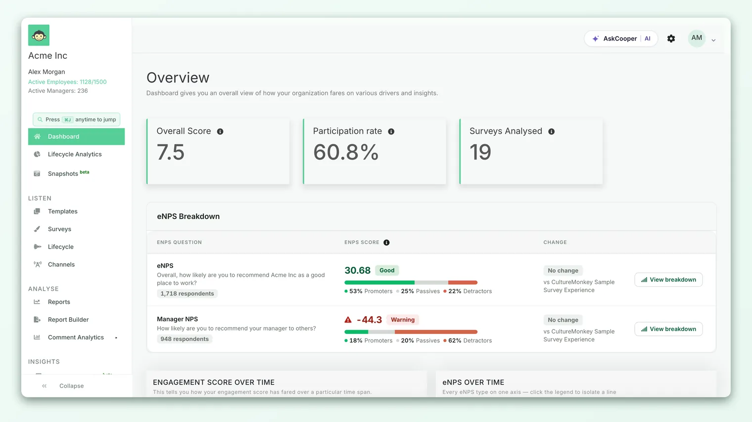
The Dashboard rolls up your latest engagement and pulse results into a single organization-wide view. Most of the time you want the newest picture, but often you want to zoom the timeline: how has our score moved over the last quarter? or did that change we made thirty days ago register yet? That's what the Dashboard's date-range controls are for.
This guide covers exactly where those controls live, what each one changes, why the headline cards behave differently from the trend charts, how to compare against a specific earlier survey, and what to do when a range legitimately comes back empty. If you haven't met the Dashboard yet, start with A tour of the dashboard and come back here to master the time filters.
The two over-time trend charts each carry their own toggle with three preset windows - Last 12M, Last 3M, and Last 30D. The toggle changes only the chart it sits on, not the headline cards, which always show your latest results with a delta versus the previous cycle. To pin the heatmap against one specific earlier survey, use Compare Survey. There's no free-form custom date picker on the CultureMonkey Dashboard, and a narrow window can legitimately return no data.
Where the date controls live
The Dashboard doesn't have one global date filter across the top. Instead, the time controls are attached to the individual cards that show change over time, which is a deliberate design choice. Some numbers describe where you are right now and shouldn't be re-scoped to an arbitrary window; others describe how you got here and are only meaningful across a span of time.
There are two places you'll change the time frame:
- The trend charts. Both Engagement Score Over Time and eNPS Over Time carry a compact toggle in the top corner of the card with three preset windows. This is the control you'll reach for most.
- The heatmap's Compare Survey button. The Engagement Score by Drivers heatmap can be pinned against a specific earlier survey so you see the movement between two points in time, driver by driver. This isn't a date range in the strict sense - it's a survey-to-survey comparison - but it's how you answer "what changed since that survey?" on the Dashboard.
The three preset windows
Each trend chart offers the same three presets, selected with a small set of radio buttons. There is no fourth "custom" option and no calendar picker - the presets are fixed, which keeps the control fast and the views comparable from one visit to the next.
| Toggle | Window it shows | When to reach for it |
|---|---|---|
| Last 12M | The trailing twelve months. This is the default. | The long-term direction. Engagement moves slowly, so a full year smooths out one-off dips and shows the real trajectory. |
| Last 3M | The last quarter. | Recent movement - checking whether the most recent cycle or two shifted the line. |
| Last 30D | The last thirty days. | The shortest, most immediate slice - useful right after a pulse or a specific event. |
Last 12M is selected for you when the Dashboard loads, and for most reading it's the right starting point. The shorter windows are for when you want to separate a recent move from the long-run trend.
- 1Pick a window - click Last 12M, Last 3M, or Last 30D on the chart you want to adjust. The chart fetches that period and redraws in place; you'll briefly see a "Fetching..." indicator while it loads.
- 2Compare the framings - a line can look flat over twelve months but show a sharp move over thirty days. Toggle between windows to tell a genuine trend apart from short-term noise.
- 3Read each chart on its own terms - the two charts have independent toggles, so you can view engagement over a full year while looking at eNPS over the last quarter at the same time.
Why the toggles are per chart, not global
This is the single most common point of confusion, so it's worth being precise: the date-range toggle changes only the chart it belongs to. Setting Engagement Score Over Time to Last 3M does not touch the eNPS chart, the headline cards, or the driver heatmap. Each trend chart carries its own independent toggle.
The upside is flexibility - you can frame each metric over the window that suits it. The thing to watch for is assuming you've re-scoped the whole page when you've only re-scoped one chart. If you're comparing engagement and eNPS side by side, glance at both toggles first so you know you're reading the same window on each.
What the toggles don't change
The date-range presets act on the over-time trend charts and nothing else. They do not re-scope your headline numbers:
- The Overall Score card always shows your latest engagement index, with a delta measured since your last survey.
- The Participation Rate and eNPS cards always show your latest figures, each with a delta from the previous survey.
These cards answer "where are we right now?", so a time window doesn't apply to them - they're a snapshot plus a comparison to the prior cycle, by design. If you want to see how any of these has moved across time, that's exactly what the trend charts are for. This is also why changing a chart's window never nudges the big numbers at the top of the page.
Think of the Dashboard in two layers. The headline cards are the snapshot - always current, never re-scoped. The trend charts are the trajectory - where the date-range toggles live. Reach for the toggles when you want the story over time, not the number right now.
Comparing against a specific survey
Sometimes "a time window" isn't what you want. You want to compare against one particular survey - last year's annual, or the pulse you ran before a reorg - and see, driver by driver, what moved. That's what Compare Survey on the driver heatmap does.
Above the Engagement Score by Drivers heatmap you'll find a Compare Survey button (where your account has this enabled). Clicking it opens a Compare survey scores window with a single dropdown: choose a survey to compare against your latest results, and the heatmap redraws to visualize the difference between the two on each driver-and-segment cell. It's the fastest way to answer "how did each driver change since that survey?" without opening two separate reports.
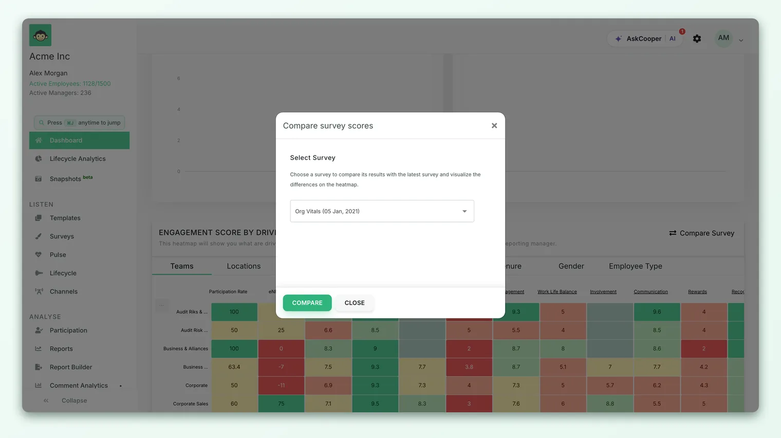
If there aren't enough comparable surveys to work with, the Compare Survey button is disabled and hovering it shows an Insufficient Data note. You need at least one earlier survey with results before a comparison is possible. This is expected on newer accounts that have only run one survey so far.
When a range shows no data
A time window can legitimately come back empty, and it usually isn't a fault. The most common reasons:
- No surveys ran in that window. If you narrow a chart to Last 30D but your most recent survey closed two months ago, there's simply nothing to plot in the last thirty days. Widen back to Last 3M or Last 12M and the line reappears.
- Not enough responses to show. Like everything in CultureMonkey, Dashboard numbers only appear once a group is large enough to protect individual responses. A short window that caught only a handful of answers can fall below the anonymity threshold and stay hidden.
- The account is still new. Before your first survey has produced report-ready results, the Dashboard shows a get-started screen rather than the cards and charts described here.
When a chart or the heatmap has nothing to draw, you'll see a plain empty state - the trend charts note that there isn't sufficient data, and the heatmap shows a No data found message inviting you to try again with different filters. The fix is almost always the same: widen the window, or wait for more responses to come in.
If a chart looks blank, your first move should be to switch back to Last 12M. An empty Last 30D or Last 3M view most often means no survey landed in that short window - not that your data is missing. If Last 12M is also empty, see Why can't I see results yet?.
A quick worked example
Say you ran a company-wide engagement survey in January and a lighter pulse in June, and it's now early July. Here's how the controls behave:
- On Last 12M, both trend charts show the full arc - the January survey, the June pulse, and the movement between them.
- Switch the engagement chart to Last 3M and you'll see only from April onward, which foregrounds the June pulse and drops the January baseline off the left edge.
- Switch it to Last 30D and, because nothing new closed in the last thirty days, the chart may show little or nothing - a legitimate empty window, not a bug.
- To see what actually changed between January and June on each driver, open Compare Survey on the heatmap and pick the January survey. The heatmap now shows the per-driver movement between the two.
Same data, four different questions, all answered without leaving the Dashboard.
Frequently asked questions
Is there a global date filter for the whole Dashboard?
No. The time controls live on the two over-time trend charts, and each toggle affects only its own chart. There isn't a single filter that re-scopes every card at once, and the headline cards aren't re-scoped by date at all.
Can I pick a custom start and end date?
Not on the CultureMonkey Dashboard. The trend charts offer three fixed presets - Last 12M, Last 3M, and Last 30D - rather than a free-form calendar. For finer, question-level analysis of one survey across a period, work inside that survey's report instead.
Why didn't the headline numbers change when I changed the window?
Because the toggles only act on the trend charts. The Overall Score, Participation Rate, and eNPS cards always show your latest results with a delta versus the previous cycle - they're a current snapshot, not a windowed view.
Do the two trend charts share one setting?
No. CultureMonkey gives each chart its own independent toggle, so you can view engagement over a year and eNPS over a quarter at the same time. If you're comparing them, check both toggles are on the same window first.
My Last 30D view is empty but Last 12M works. Is something broken?
Almost certainly not. An empty short window usually means no survey closed in the last thirty days, so there's nothing to plot. Widen the window and the line returns.
How is Compare Survey different from the date toggles?
The date toggles show a time window of results. Compare Survey pins the heatmap against one specific earlier survey and shows the per-driver difference between it and your latest results. Use the toggles for trends over time; use Compare Survey to see what changed since a particular survey.
Where to go next
- Learn the whole Dashboard card by card: A tour of the dashboard
- Understand the advocacy metric you're trending: What is eNPS?
- Seeing an empty view? Why can't I see results yet?
Your feedback helps us improve the Help Center.