

A tour of the CultureMonkey dashboard
A card-by-card guide to the CultureMonkey Dashboard - the overall score, participation rate, eNPS, the over-time trends, and the driver heatmap - plus how to filter by date, view breakdowns, and how the manager view differs.
On this page
- What the Dashboard is (and isn't)
- The Overall Score card
- The Participation Rate card
- The eNPS card
- The Engagement Score Over Time card
- The eNPS Over Time card
- Using the date-range filters
- The Engagement Score by Drivers heatmap
- Reading the Dashboard as a whole
- How the admin and manager dashboards differ
- Frequently asked questions
- Where to go next
The Dashboard is the first thing you see when you sign in to CultureMonkey, and it's designed to answer one question at a glance: how is my organization doing right now? Instead of opening a single survey, the Dashboard rolls up your latest results into a stack of cards - headline scores at the top, trends in the middle, and a driver-level breakdown below.
This guide walks the Dashboard card by card. For each one you'll learn what it shows, how to read the number, and how to dig deeper. We'll also cover the date-range filters, how to view breakdowns by team or location, and how the view a manager sees differs from the one an admin sees.
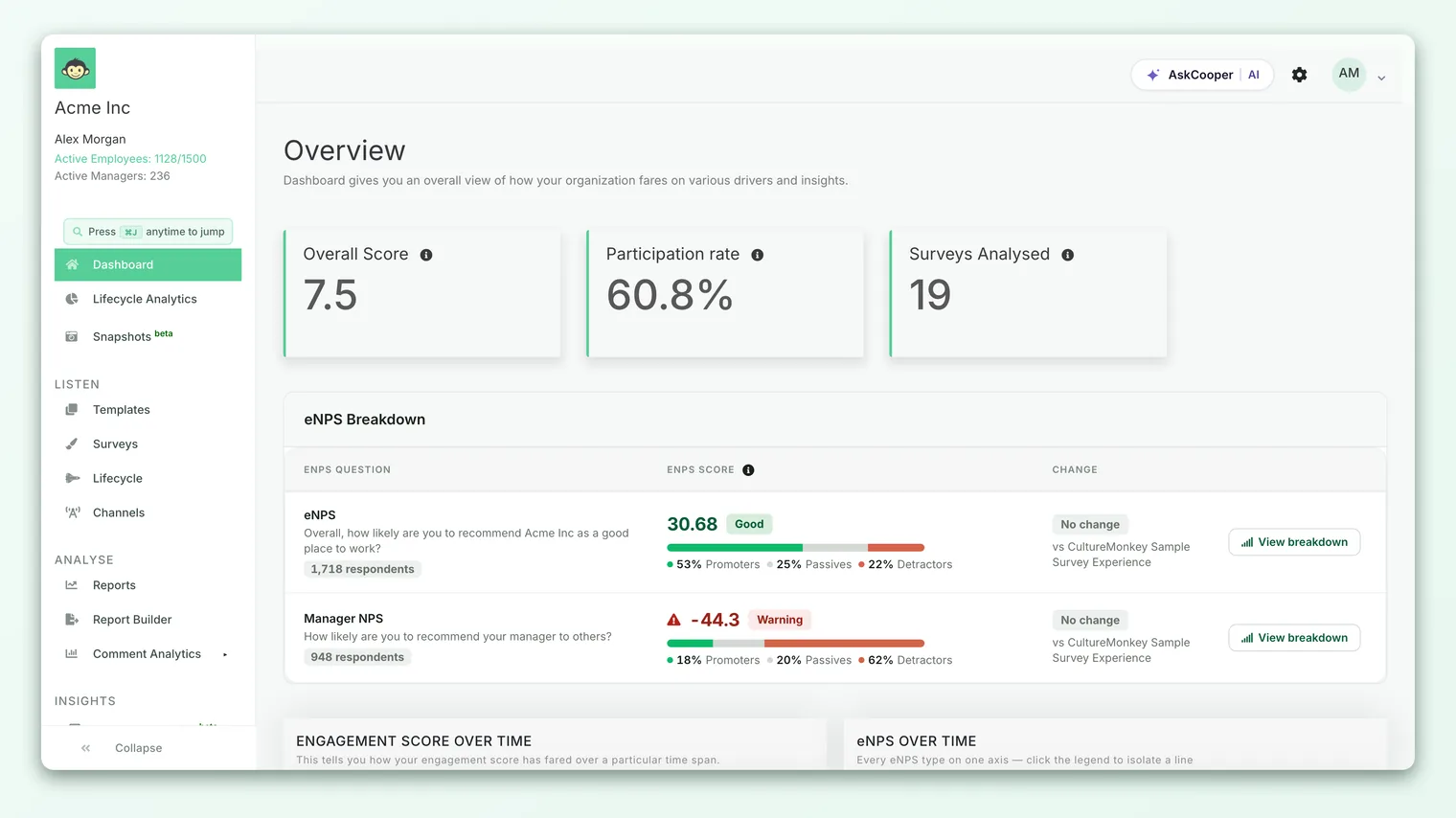
The CultureMonkey Dashboard stacks your organization's key numbers top to bottom: Overall Score and Participation Rate and eNPS as headline cards, then Engagement Score Over Time and eNPS Over Time as trend charts, and finally Engagement Score by Drivers - a heatmap that shows which drivers are strong or weak and across which teams. Admins see the whole organization; managers see a version scoped to their own reportees.
What the Dashboard is (and isn't)
The Dashboard is a roll-up, not a report. It blends your recent engagement surveys and pulse responses into a single organization-wide view so leaders can take the temperature without hunting through individual surveys. Each card is a doorway: it gives you the headline, and most cards let you click through or filter to the detail behind it.
A few things to keep in mind before you read a single number:
- It reflects recent activity. The Dashboard draws on your report-ready surveys and pulse answers. Until you've run at least one survey that's produced results, you'll see an empty-state screen inviting you to get started rather than the cards described here.
- It respects anonymity. Like everything in CultureMonkey, Dashboard numbers only appear once a group is large enough to protect individual responses. A very narrow filter can legitimately return nothing - that's a safeguard, not a bug.
- It's role-aware. What you see depends on your role. An account admin sees the whole organization; a manager sees only their team. More on that at the end.
The Overall Score card
The first headline card is the Overall Score - CultureMonkey's single index of how engaged your people are, blended across every engagement driver you measure (leadership, growth, recognition, and so on). It's the number leaders most often quote.
Read it in three parts:
- The value is the score itself. Depending on your account settings this is shown either as a score (for example, out of 10) or as a percentage - both express the same underlying engagement index.
- The delta is the small up-or-down figure beneath it, labelled since last survey. It tells you whether engagement rose or fell compared with your previous cycle. A green upward delta is good; a red downward delta is a prompt to investigate.
- The direction over time matters more than any single reading - which is exactly what the trend chart further down the page is for.
To understand precisely how this index is composed, see Understand the overall engagement score.
The Participation Rate card
Next to the overall score sits the Participation Rate - the percentage of invited employees who actually responded. This card is the credibility check on every other number on the page: a great score from a 20% response rate is far shakier than a modest score from 85%.
Its delta is labelled from previous survey, so you can see whether engagement with the survey itself is climbing or slipping. Watch this trend closely. Falling participation is often an early warning that people don't feel their voice leads to change - and it also makes your scores noisier, because fewer voices are shaping them.
A low or falling participation rate should temper how confidently you read the other cards. If only a fraction of a team responded, treat that team's scores as directional rather than definitive, and focus on lifting response rates before drawing firm conclusions.
The eNPS card
The third headline card is eNPS - your Employee Net Promoter Score. Where the overall score measures engagement across many dimensions, eNPS captures one thing: whether employees would recommend your organization as a place to work, on a −100 to +100 scale.
The card shows the score and a from previous survey delta, along with a View Breakdown link. Opening the breakdown reveals what's behind the number - the split of Promoters, Passives, and Detractors that produced it - so you can see not just what the score is but how it's composed.
eNPS and the overall score are complementary: eNPS is the fast, comparable headline of advocacy, while the overall score is the richer diagnostic. When they move together you have a clear story; when they diverge, that's your cue to dig in. For the full picture of how eNPS is calculated and what counts as a good number, see What is eNPS?.
The Engagement Score Over Time card
Below the three headline cards, the Dashboard shifts from where you are to where you're heading. The Engagement Score Over Time chart plots your overall engagement score across recent survey cycles, so you can see the trajectory rather than a single snapshot.
This is the card that turns the overall score from a number into a story. A score of 7.2 means little in isolation; a 7.2 that has climbed steadily for three cycles is genuinely encouraging, while a 7.2 that has slipped from 8.0 is a warning. The trend is where you find momentum - or the loss of it.
Each trend chart carries its own date-range toggle so you can zoom the timeline in or out; we cover that in the next section.
The eNPS Over Time card
Sitting alongside the engagement trend is eNPS Over Time, which does the same job for advocacy. It plots how your eNPS has moved across cycles, letting you see whether people are becoming more or less willing to recommend you as an employer.
A rising eNPS line is one of the clearest signs that changes you've made are landing. Read the two trend charts together: when engagement and eNPS climb in step, your interventions are working across the board; when they diverge - say, engagement holds but eNPS drops - it's worth asking which specific experiences are eroding people's willingness to advocate.
Using the date-range filters
Both trend charts include a compact date-range toggle in the top corner of the card. It offers three preset windows:
| Toggle | Window it shows |
|---|---|
| Last 12M | The trailing twelve months - the default, and the best view of long-term direction |
| Last 3M | The last quarter - useful for spotting recent shifts |
| Last 30D | The last thirty days - the shortest, most recent slice |
- 1Pick a window - click Last 12M, Last 3M, or Last 30D on the chart you want to adjust. The chart redraws instantly for that period.
- 2Compare the framings - a metric can look flat over twelve months but show a sharp recent move over thirty days. Toggle between windows to separate the long-term trend from short-term noise.
- 3Read each chart on its own terms - the engagement and eNPS charts have independent toggles, so you can view one over a year and the other over a quarter at the same time.
The default Last 12M view is usually the right starting point, because engagement moves slowly and a full year smooths out one-off dips. Reach for the shorter windows when you want to check whether a recent change or event has begun to register.
The Engagement Score by Drivers heatmap
The largest card on the Dashboard is the Engagement Score by Drivers heatmap - and it's where the page stops summarizing and starts diagnosing. Instead of one blended number, the heatmap breaks engagement down driver by driver (leadership, recognition, growth, wellbeing, and the rest) and colors each cell by strength: warmer, stronger colors for high scores and cooler, weaker ones for the areas that need attention.
In one glance it answers two questions the headline cards can't: which drivers are lifting or dragging our engagement? and is a weak driver a company-wide problem or concentrated in one part of the organization?
Viewing breakdowns
Across the top of the heatmap is a row of breakdown tabs. Selecting one re-slices the grid so each column becomes a segment of your organization. Depending on your account configuration you'll typically see:
- Teams
- Locations
- Reporting Manager
- Business Unit, Sub Team, Tenure, Gender, and Employee Type
- Any custom attributes your organization has set up (once a segment has enough respondents)
Switching from, say, Teams to Locations lets you ask the same question from a different angle. A low Recognition score that's evenly spread across every team points to a policy or program gap; the same low score concentrated in two locations points to something local. This is how you move from we have a recognition problem to we have a recognition problem in these two offices - which is the difference between a vague concern and an actionable one.
Reading the colors
The point of a heatmap is speed: your eye is drawn to the weakest cells before you read a single number. Scan for the coolest cells to find where a driver is struggling, then read across a row to see whether that weakness is broad or isolated. The heatmap is dense, so it rewards a little practice - for a full walkthrough of reading cells, rows, and columns, see Read a heatmap of driver scores.
Right-clicking a heatmap cell lets you create an action for that specific driver-and-segment combination. The heatmap isn't just for reading - it's the fastest place to turn a weak spot into an owned, tracked next step.
Beneath the heatmap you'll find two more driver views: Overall Driver Performance, which lines the drivers up against each other so you can compare their relative strength (and, if benchmarking is enabled, against industry and location norms), and Driver Scores Over Time, which trends every driver together so you can see which ones are improving and which are sliding.
Reading the Dashboard as a whole
Taken together, the cards tell a top-to-bottom story, and reading them in order is the fastest way to a useful conclusion:
Start with Participation Rate to judge how much to trust the rest. Read Overall Score and eNPS for the headline mood, then check their deltas to see which way things are moving. Confirm the direction on the two over-time charts. Finally, drop into the driver heatmap to find the why - and switch breakdowns to find where. In five minutes you've gone from a single number to a specific, owned next step.
The headline cards tell you how much; the trend charts tell you which way; the heatmap tells you why and where. A number on its own is rarely enough - the value comes from reading the cards against each other.
How the admin and manager dashboards differ
CultureMonkey shows a different Dashboard depending on your role, because a manager and an admin need to answer different questions.
Account and survey admins see the organization-wide Dashboard described above: overall score, participation, and eNPS for the whole company, the two trend charts, and the driver heatmap sliced by any breakdown - teams, locations, reporting manager, and more. Admins are steering the whole organization, so they get the whole organization.
Managers see a manager dashboard scoped to their own reportees. It's built around the team they lead and organized into named sections: Team pulse (their team's engagement, participation, and eNPS), The trajectory (their team's scores over time), The voice of my team (the sentiment of their team's feedback), How I compare (internal and industry benchmarks, where enabled), Strengths & focus areas (their highest- and lowest-scoring drivers), and Turning insight into action (their action items). Admin managers may also see a Reports I can access panel. Crucially, a manager's numbers are limited to the people who report to them, so they can focus on the group they can actually influence - and if their team is smaller than the anonymity threshold, the cards stay empty to protect individual responses.
| Admin dashboard | Manager dashboard | |
|---|---|---|
| Scope | The whole organization | The manager's own reportees |
| Headline focus | Overall score, participation, eNPS | Their team's engagement and trend |
| Breakdowns | Team, location, reporting manager, and more | Centered on their team |
| Extras | Org-wide driver heatmap and driver trends | Internal/industry benchmarks, feedback sentiment, strengths & focus areas, team actions |
| Best for | Steering the organization | Acting on one team's results |
The exact cards a manager sees can be tuned by admins through report and demographic settings, so two organizations may configure the manager view slightly differently. If you expect a Dashboard and land on a reports or surveys page instead, your role may not have Dashboard access - an account admin can confirm what your permissions allow.
Frequently asked questions
Why is my Dashboard empty?
The Dashboard needs results to summarize. Until you've run at least one engagement survey that's produced a report - or gathered a handful of pulse responses - you'll see a get-started screen instead of the cards. Once results exist, CultureMonkey populates the cards automatically.
Why do the deltas compare to different things?
Each headline card compares to the most relevant prior point. The overall score's delta is measured since your last survey, while participation and eNPS are compared from the previous survey. The label under each number tells you exactly what it's being compared against.
Can I change the date range on the headline score cards?
The date-range toggles (Last 12M / Last 3M / Last 30D) apply to the over-time trend charts, not to the headline score cards, which always reflect your latest results with a delta versus the previous cycle. Use the trend charts when you want to change the time window.
Why does a breakdown show no data?
Almost always because of the anonymity threshold. If a team, location, or custom segment has too few respondents, its scores are hidden so no individual can be identified. Try a broader breakdown or wait for more responses. See Why can't I see results yet?.
As a manager, why can't I see the whole company?
By design. The manager dashboard is scoped to your own reportees so you can focus on the team you lead and influence. Organization-wide views are reserved for admins.
Is the Dashboard the same as a survey report?
No. The CultureMonkey Dashboard is a cross-survey roll-up for an at-a-glance view; individual survey reports give you the full detail - every question, segment, and comment - for one specific survey. Use the Dashboard to spot where to look, and reports to dig in.
Where to go next
- Understand the headline index: Understand the overall engagement score
- Get the advocacy number right: What is eNPS?
- Master the driver grid: Read a heatmap of driver scores
Your feedback helps us improve the Help Center.