

Compare against industry benchmarks in CultureMonkey
How to use the Benchmark and eNPS Benchmark tabs in CultureMonkey to compare your driver and eNPS scores against external benchmarks for your industry and company size.
On this page
A score on its own only tells you half the story. A driver score of 7.4 for Recognition sounds fine, but is it? Are peer organizations in your industry sitting at 6.8, in which case you're ahead, or at 8.1, in which case you have work to do? Industry benchmarks answer exactly that question. They let you place your results next to an external reference point for your industry and company size, so "how are we doing?" becomes "how are we doing compared to everyone else like us?" CultureMonkey builds these benchmarks from its own aggregated survey data and matches them to your industry and company size.
This guide covers where the benchmark comparison lives inside a survey report, what data is available, how the comparison is presented, and the important caveats to keep in mind when you read it.
Open any survey report and go to the Benchmark tab. There you'll see each of your standard engagement drivers side by side with an external benchmark score for your industry and employee size, with an arrow showing whether you're above or below. A separate eNPS Benchmark tab does the same thing for your eNPS. Benchmarks apply to CultureMonkey's standard drivers and eNPS, not to custom questions.
What an industry benchmark is
An industry benchmark is an aggregated reference score drawn from a wider pool of organizations, grouped by industry and, where the data supports it, by company size. Instead of comparing your Wellness score only to your own past results, you compare it to what "typical" looks like for organizations in your sector of a similar scale.
That external context matters because raw scores are hard to interpret in isolation. Employee sentiment varies a lot by industry: fast-moving, high-pressure sectors often score differently on drivers like Workload or Autonomy than, say, a professional-services firm. Benchmarking normalizes for that. It tells you whether a "low" score is genuinely low for your context, or simply normal for your kind of business, and it helps you prioritize: the drivers where you fall furthest below your peers are usually the ones worth acting on first.
CultureMonkey uses the industry set on your account to pick the right benchmark. You choose this in General → Account Settings, from a fixed list of industries (for example Technology, Healthcare, Manufacturing, Banking & Capital Markets, Financial Services, Insurance, Consumer & Retail, Media, Telecom, Transport & Logistics, and others). If your account industry isn't set, or there's no benchmark data for it, the comparison columns simply won't populate.
The benchmark you see is only as relevant as the industry on your account. Before you read too much into the numbers, confirm that General → Account Settings shows the industry that best describes your organization. Changing it changes which benchmark you're compared against.
Where to find the Benchmark tab
Benchmarks live inside an individual survey report, not on the main Dashboard.
- 1Open a report - go to Analyse → Reports and open the survey you want to look at.
- 2Find the report tabs - along the top of the report you'll see tabs like Summary, Report, Questions, Word Cloud, and Text Responses.
- 3Click Benchmark - this tab holds the driver-versus-industry comparison. If your survey uses standard drivers, it appears automatically.
- 4Click eNPS Benchmark - if your account has the eNPS benchmark enabled, a separate tab compares your eNPS against the industry eNPS benchmark.
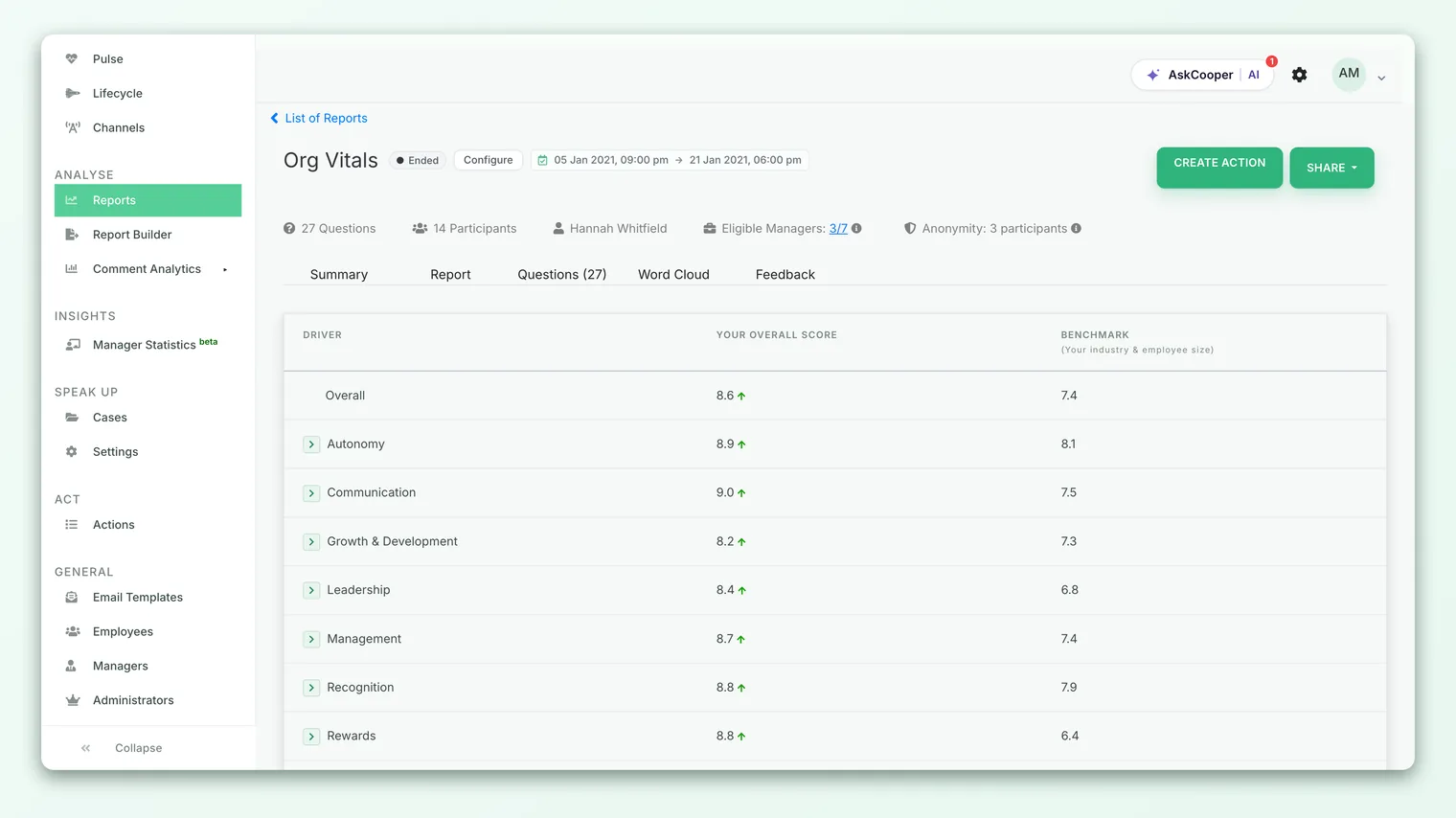
The Benchmark tab compares your engagement driver scores (and an overall score) to the industry benchmark. The eNPS Benchmark tab compares your eNPS to the industry eNPS benchmark. They're separate tabs because they measure different things.
How the driver comparison is shown
The Benchmark tab is built around a simple three-column table, one row per driver:
| Column | What it shows |
|---|---|
| Driver | The engagement driver (for example Recognition, Wellness, Autonomy). An Overall row sits at the top. |
| Your Overall Score | Your organization's score for that driver in this survey. |
| Benchmark (Your industry & employee size) | The external reference score for your industry and company size. |
Next to your score, a small up or down arrow shows the direction of the gap at a glance: an up arrow means you're above the benchmark for that driver, a down arrow means you're below it. Rows where your score exactly matches the benchmark show no arrow. This makes the table scannable in seconds, you can spot your strong and weak spots without reading a single number closely.
The table respects your account's score display format. If your organization views scores on a 0-5 scale, as percentages, or on the default 0-10 scale, the benchmark figures are converted to match, so you're always comparing like with like rather than mentally rescaling.
The Overall row
At the top of the table, an Overall row compares your overall engagement score to the industry's overall benchmark. This is the headline: a single line that tells you whether, taken as a whole, your engagement sits above or below the pack for your sector.
Expanding a driver
Each driver row can be expanded. Click a driver and CultureMonkey loads the individual questions that make up that driver, along with their scores, so you can see which specific questions are pulling a driver above or below the benchmark. This is where a broad "we're a bit low on Growth" turns into a specific, actionable finding.
The benchmark chart
Below the table, unless it's been turned off for your account, there's a visual comparison: a Driver Score vs Industry Benchmark chart. It plots your driver scores against the benchmark line so you can see the shape of the gap across all drivers at once, rather than row by row. It's the same data as the table, presented for quick visual scanning in review meetings.
The eNPS Benchmark tab
eNPS (Employee Net Promoter Score) has its own benchmark tab because it's a single, standardized metric that's especially comparable across organizations. If it's enabled for your account, the eNPS Benchmark tab shows:
| Column | What it shows |
|---|---|
| Industry | Your account's industry. |
| Your Overall eNPS Score | Your organization's eNPS for this survey, from −100 to +100. |
| Benchmark (Your industry & employee size) | The industry eNPS benchmark for your sector and size. |
As on the driver tab, an up or down arrow flags whether your eNPS is above or below the benchmark. Because eNPS is calculated the same way everywhere (percentage of promoters minus percentage of detractors), it's one of the cleaner cross-company comparisons you can make. For a refresher on how the number itself is built, see What is eNPS and how is it calculated?.
If your survey didn't collect enough eNPS responses to produce a score, or there's no benchmark for your industry, the tab shows a "no data found" message rather than a misleading number.
What benchmarks apply to
This is the most important thing to understand about benchmarks, and the most common source of confusion.
Benchmarks apply to CultureMonkey's standard engagement drivers and eNPS only. They come from an aggregated external dataset that's keyed on standard drivers, so:
- Standard drivers are benchmarked. If your survey uses the built-in engagement drivers, each one that has benchmark data for your industry appears in the comparison.
- Custom questions and custom drivers are not. A question you wrote yourself, or a driver unique to your organization, has no external reference point, so it won't appear on the Benchmark tab. There's simply nothing comparable to measure it against.
- A row only appears if benchmark data exists. Even among standard drivers, a driver is shown only when there's a benchmark score for your industry. Gaps in the underlying dataset mean some drivers may not appear for some industries.
Because of this, a survey built entirely from custom questions may show little or nothing on the Benchmark tab, and that's expected, not a bug.
If a survey uses custom drivers, the Benchmark tab may not appear at all for that report, since there's no standard driver data to benchmark. This behavior can differ by account configuration.
A worked example
Say you run a manufacturing organization and open the Benchmark tab on your latest engagement survey. You might see something like:
| Driver | Your score | Benchmark | Read |
|---|---|---|---|
| Overall | 7.6 | 7.4 | Slightly above the sector |
| Recognition | 6.9 | 7.5 | Below - a priority |
| Wellness | 7.1 | 7.0 | On par |
| Autonomy | 8.0 | 7.2 | A real strength |
| Growth | 6.4 | 7.3 | Well below - dig in here |
The overall number is healthy, but the benchmark reveals a more nuanced picture: you're genuinely strong on Autonomy, but Recognition and especially Growth trail your peers. Without the benchmark, a 6.4 on Growth might look "okay." Against a sector norm of 7.3, it's clearly the driver to focus your action planning on. Expand the Growth row to see which specific questions are dragging it down, then build an action plan from there.
Best practices
- Read gaps, not absolutes. The value of benchmarking is the distance between your score and the reference, not either number alone. Sort your attention by the biggest downside gaps.
- Confirm your industry is set correctly. The whole comparison hinges on the industry on your account. A mismatched industry gives you a misleading benchmark.
- Don't over-index on tiny differences. A gap of a tenth of a point is noise. Focus on the drivers where you're meaningfully ahead or behind.
- Pair benchmarks with trends. Being below the benchmark but climbing steadily each cycle is a good story. Benchmarks tell you where you stand; your trend over time tells you where you're heading.
- Combine with internal comparison. External benchmarks tell you how you compare to other companies; internal benchmarks tell you how your own teams compare to each other. Use both.
Limitations and caveats
External benchmarks are a compass, not a scoreboard. A few things to keep in mind:
- Benchmarks are aggregated references, not live competitor data. They represent a broad pool for your industry and size, not the specific companies you compete with.
- Data availability varies. Not every industry and driver combination has a benchmark, so some rows, or occasionally the whole tab, may be empty. This depends on the underlying dataset.
- Cultural and regional effects are real. Rating tendencies differ across regions, which can widen or narrow a gap for reasons unrelated to actual experience. If you operate across regions, look at regional benchmarks too.
- A benchmark is not a target. Matching the industry average isn't automatically "good," and beating it isn't automatically "done." Use benchmarks to prioritize, then let your own goals and trends drive what "good" means for you.
Frequently asked questions
Why is my Benchmark tab empty?
The most common reasons are that your account's industry isn't set, there's no benchmark data for your industry, or the survey uses custom drivers or custom questions that have no external reference. Check General → Account Settings for the industry first.
Do benchmarks work on custom questions?
No. Benchmarks apply to CultureMonkey's standard drivers and eNPS only. Custom questions and custom drivers have no comparable external data, so they don't appear on the Benchmark tab.
What does "Your industry & employee size" mean under the benchmark column?
It signals that the benchmark is filtered to organizations in your industry and of a similar company size, so you're compared against a relevant peer group rather than a global average.
Can I compare against a different industry?
The benchmark follows the industry set on your account. To compare against another sector you would change the account industry, which affects the whole account, so this isn't a per-report toggle.
What's the difference between industry and internal benchmarks?
Industry (external) benchmarks compare you to other organizations in your sector. Internal benchmarks compare your own teams, departments, or managers against each other or against your organization's overall score. Different questions, different tabs.
Why do the arrows sometimes disappear?
An arrow appears only when your score differs from the benchmark. When your score exactly matches the benchmark, there's no direction to show, so no arrow is drawn.
Where to go next
- Compare your own teams: Compare teams with internal benchmarks
- Factor in geography: Compare against regional benchmarks
- Understand the eNPS metric: What is eNPS and how is it calculated?
Your feedback helps us improve the Help Center.