

Compare against internal benchmarks in CultureMonkey
How to compare a team or segment against the organization average in CultureMonkey - where the comparison appears, how the org average is computed, how to read above and below the line, and the caveats to keep in mind.
On this page
An internal benchmark answers a simple, human question: "How is my team doing compared to everyone else here?" Instead of measuring your scores against an outside standard, it measures them against your own organization - the company-wide average, and in some views the top-scoring manager. It turns a lone number into a position: ahead of the pack, in the middle, or behind. CultureMonkey calculates internal benchmarks from your own results, so the comparison stays inside your organization.
This guide covers where internal benchmarks show up in CultureMonkey, how the organization average is actually calculated behind the scenes, how to read being above or below the line, and the caveats that keep you from over-reading a small gap.
A CultureMonkey internal benchmark compares your team's driver scores to the organization average (all employees, not just yours), and sometimes to the top manager's score for the same driver. Your score is scoped to the people you manage; the org average deliberately ignores that scope and covers everyone. A gap of a point or two is normal. Look at which drivers sit furthest below the line, not at the exact number.
Internal vs industry benchmarks
CultureMonkey offers two kinds of benchmark, and it helps to keep them straight:
| Internal benchmark | Industry benchmark | |
|---|---|---|
| Compares your score to | Your own organization's average (and the top manager) | An external standard for your industry and company size |
| Answers | Am I ahead of or behind my peers here? | Are we ahead of or behind other companies like us? |
| Best for | Managers wanting a fair, like-for-like internal reference | Leaders wanting an outside-in view |
| Where it lives | The manager dashboard, and the Benchmark report | The Benchmark report and industry benchmark views |
The two are complements, not rivals. A team can sit comfortably above the company average yet still trail the wider industry, or the reverse. For the outside-in view, see Compare against industry benchmarks. This article is about the internal comparison.
Where the internal benchmark appears
There are two main places you will meet an internal benchmark.
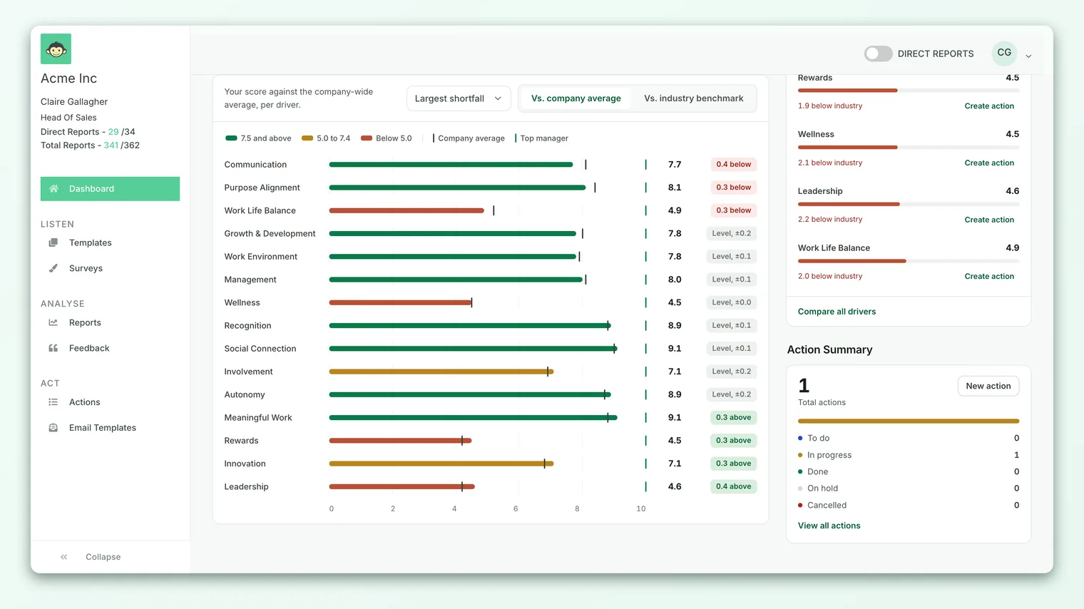
1. The manager dashboard - "How I compare." If you manage a team, your dashboard has a section called How I compare with an Internal benchmark tab. Its description reads: "Your scores vs. the top-scoring manager and the company-wide average, per driver." Each engagement driver is drawn as a horizontal bar with your score, a marker for the org average, and (where available) a marker for the top manager. A small delta chip on the right shows the gap between your score and the org average, in green when you are at or above it and in red when you are below.
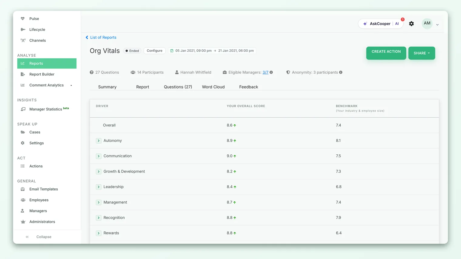
2. The Benchmark report - an extra "Org" column. When you open a survey's Benchmark report (under Analyse), you see a table of drivers with your score and the industry benchmark. For accounts that have it switched on, an extra Org Overall Score column appears alongside, so you can read your team's score, the industry benchmark, and the organization average side by side in the same row. An up or down arrow next to your score signals whether you are above or below the reference.
How the org average is computed
This is the part worth understanding, because it explains why the comparison is fair.
When CultureMonkey works out your internal benchmark, it runs the same driver-score calculation twice against the same survey data:
- 1Your score - the average of the answers from the employees you can access. This is scoped to your team (and anyone below you), exactly as the rest of your dashboard is.
- 2The org average - the average of the answers from everyone, with the manager scoping deliberately switched off. It is the whole-organization figure for that driver, computed the same way, on the same survey.
- 3The top manager (where shown) - the highest driver average among managers, so you can see not just the middle of the pack but the leading edge.
Because both numbers come from the same aggregation over the same survey, they are directly comparable. Your score reflects your people; the org average reflects the entire company. The only difference between the two calculations is who is included. Scores are shown on whatever scale your account uses (a 0-10 driver score, a 0-5 heatmap value, or a percentage), and both sides of the comparison are always on that same scale.
The org average includes your team's answers too, because your people are part of the organization. It is not the average of other teams. For most companies your team is a small slice of the whole, so its effect on the org number is tiny, but it is worth knowing that you are compared to a total that quietly contains you.
Reading above and below the line
Once you can see your score and the org average together, here is how to make sense of the gap.
| Where your score sits | General reading | A good next move |
|---|---|---|
| Well above the org average | A genuine strength for your team | Notice what you are doing here - it may transfer to weaker drivers |
| Around the org average | In line with the company; neither a flag nor a win | Watch the trend rather than the single reading |
| Slightly below | Common and often noise, especially for small teams | Confirm it repeats before acting |
| Well below the org average | A real gap worth investigating | Open the driver, read the comments, and plan an action |
Two habits keep this useful:
- Rank by the gap, not the score. The most useful drivers are the ones that sit furthest below the org average, not simply your lowest scores. A low absolute score that matches the company average is a company-wide theme; a driver where you trail the average is specifically yours to work on.
- Follow the delta chip. In the manager dashboard, the delta chip already does this subtraction for you (your score minus the org average). Green means at or above; red means below. Scan the reds first.
Being below the org average on one driver in one survey is a question, not a failing grade. Before you act, check that the gap is meaningful (see the caveats below) and read the open-text comments for that driver so you understand the why and not just the how much.
Digging into a driver
The internal benchmark tells you where to look; the detail underneath tells you why. When a driver sits below the org average:
- 1Expand the driver - in the Benchmark report you can open a driver row to see the individual question scores that make it up. One weak question can drag a whole driver below the line.
- 2Read the comments - pair the number with the open-text feedback for that driver. The reason for a gap almost always shows up in what people wrote.
- 3Cross-check the heatmap - the same scores viewed as a grid can show whether the gap is one sub-team or the whole group. See How to read a heatmap.
- 4Turn it into an action - create a concrete action plan for the drivers that trail the average the most, assign an owner, and re-measure next cycle.
Availability and settings
Whether you see internal benchmarks, and in which places, depends on your role and a few account settings your admin controls.
- You need to manage a team. The comparison only makes sense for a manager with a team to score, so it lives on the manager dashboard and manager-facing reports.
- The manager-dashboard section can be hidden. Admins can switch off the "How I compare" internal benchmark panel account-wide. If you do not see it, it may be turned off rather than empty.
- The org column in the Benchmark report is a separate switch. The extra org-score column in the survey Benchmark report is gated by its own account setting and is available to admin managers. Not every account shows it.
- CSV export may be available. Some accounts can export the internal benchmark to CSV from the manager dashboard. If you see a download icon next to the section, that is it.
- Some accounts swap in an engagement score. An optional setting replaces the per-driver top-manager comparison with a manager or organization engagement score instead. If your view looks different from a colleague's at another company, this is often why.
If a setting you expect is missing, your account admin is the person to ask.
Caveats to keep in mind
Internal benchmarks are fair and intuitive, but they have limits. Keep these in view.
- Anonymity thresholds still apply. If your team is too small to meet the response threshold, the internal benchmark will not render and you will see an "insufficient data" message rather than a comparison. This is by design, so no individual's answers can be inferred. It is not a bug.
- Small teams are noisy. With a handful of respondents, one person's mood can swing your average by a point or more. The smaller your team, the more you should trust the trend over any single gap.
- The org average moves too. You are being compared to a moving target. If the whole company improves, staying level means you slipped relative to the average even though your own score held. Read both movements together.
- "Average" is not "good." Matching the org average is not the same as being in good shape. If the whole organization is struggling on a driver, sitting at the average just means you are struggling in good company. This is exactly where an industry benchmark adds the missing outside perspective.
- A few drivers may be suppressed. For governance reasons, some drivers can be withheld from the comparison, so your list may be shorter than the full set of drivers. That is expected.
None of these are reasons to avoid the internal benchmark. They are reasons to read it as one input among several, alongside your comments, your trend, and your industry benchmark.
Frequently asked questions
Does the org average include my own team?
Yes. Your employees are part of the organization, so CultureMonkey counts their answers in the company-wide average. For most teams the effect is small, but the org number is a true whole-company figure, not the average of everyone except you.
Why is my score based on fewer people than the org average?
Because your score is scoped to the employees you manage, while the org average deliberately ignores that scope and covers the whole company. That difference in who is included is the whole point of the comparison.
My internal benchmark is blank. What happened?
The most common reason is the anonymity threshold: if too few people on your team responded, the comparison is hidden until there are enough responses. The section can also be switched off account-wide by an admin. See How to read a heatmap for how thresholds behave across views.
Is the internal benchmark the same as the industry benchmark?
No. The internal benchmark compares you to your own organization; the industry benchmark compares you to an outside standard for your industry and size. They often point in different directions, which is why both are useful. See Compare against industry benchmarks.
Who is the "top manager" I am compared to?
It is the highest driver average among managers for that driver, which CultureMonkey shows so you can see the leading edge and not just the middle. Some accounts replace this marker with an engagement score instead.
Where to go next
- Get the outside-in view: Compare against industry benchmarks
- See where a gap is concentrated: How to read a heatmap
- Understand a related headline metric: What is eNPS and how is it calculated?
Your feedback helps us improve the Help Center.