

A tour of the CultureMonkey manager dashboard
A guided walk through the manager dashboard in CultureMonkey - team pulse, scores over time, feedback sentiment, benchmarks, strengths and focus areas, all scoped to your own reportees, and how it differs from the admin dashboard.
On this page
- Getting to the dashboard
- The hero band: who you lead
- Team pulse: your three headline rings
- The trajectory: scores over time
- The voice of my team: feedback sentiment
- How I compare: benchmarks
- Turning insight into action
- The right rail: reports, strengths, and focus areas
- Everything is scoped to your reportees
- Anonymity: why the page can be empty
- How it differs from the admin dashboard
- Frequently asked questions
- Where to go next
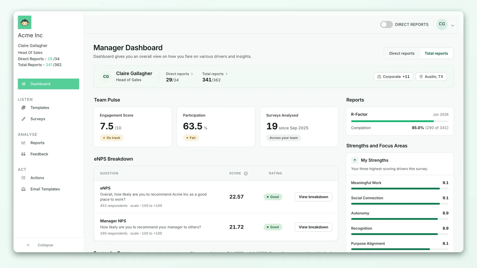
When you sign in to CultureMonkey as a people manager, the first thing you land on is your manager dashboard. It's built to answer one question fast: how is my team doing right now, and where should I put my attention? Everything on the page is scoped to the people who report to you, so you're never wading through org-wide numbers to find the ones that are yours.
Related release: Switch Between Manager and Sub-Admin Views (April 8, 2026). See every dated change on Product Updates.
This guide walks the dashboard top to bottom - the hero band that names who you lead, the team pulse rings, the trajectory chart, your team's feedback sentiment, benchmarks, actions, and the strengths and focus areas rail on the right. Along the way we'll be clear about what each number counts, why some cards stay hidden, and how this view differs from the admin dashboard your HR team sees.
The CultureMonkey manager dashboard shows your team's engagement score, participation rate, and eNPS, plus how those have trended, what your team's written feedback is saying, how you compare to other managers, and your highest and lowest scoring drivers. Every figure is limited to your reportees, and the whole page stays hidden until enough of them have responded to protect anonymity.
Getting to the dashboard
The manager dashboard lives at /manager-dashboard and is the default landing page for anyone whose role is Manager. If you're a sub-admin who also manages a team, you'll reach the same view once you switch into your manager context. For more on how roles and contexts decide what you see, read Understanding roles.
Not everyone gets this page. Access to this dashboard is controlled by your role, so a pure survey admin or a Speak Up only user will be routed to Reports or Surveys instead. If you land somewhere unexpected, that routing (rather than a bug) is usually why.
If your team hasn't gathered enough responses yet, the dashboard shows a friendly "Not enough data!" empty state instead of the cards. This isn't an error - CultureMonkey simply won't render team results until there's a body of responses large enough to keep individuals anonymous. Once a survey closes and enough of your reportees have answered, the full dashboard appears.
The hero band: who you lead
At the very top sits the hero band - a wide, colored panel with your initials, your name, and your designation. Its job is to frame everything below it by stating, plainly, the group these numbers describe.
On the right of the band you'll see two quick stats:
- Direct reports - the people who report straight to you, shown as active over total (for example,
8/9means eight of your nine direct reports are active employees). - Total reports - everyone in your reporting line, direct reports plus their reports, and so on down the tree. Your account may rename this label (some organizations call it "Indirect" or use a custom word), so the wording you see can differ.
Click either stat to open a modal listing exactly who's counted. Below that, a row of chips summarizes your employee count, your team(s), your business unit if one applies, and your location. Together the hero band is your answer to "whose engagement am I looking at?" - it's the scoping key for the whole page.
Team pulse: your three headline rings
Directly under the hero, the Team pulse block shows three ring gauges - the headline numbers for your team right now:
| Ring | What it measures | Scale |
|---|---|---|
| Engagement score | Your team's overall engagement, averaged across every rating question in your surveys | 0-10 (or 0-100% if your account shows scores as percentages) |
| Overall participation rate | The share of your reportees who actually responded | 0-100% |
| Manager eNPS | Your team's Employee Net Promoter Score - would they recommend the organization as a place to work | −100 to +100 |
Each ring fills in proportion to its value, so you can read the page at a glance before you read a single digit. The engagement ring deliberately excludes pulse surveys so that a light, frequent pulse can't skew your headline number - it reflects your fuller engagement surveys.
The eNPS ring carries a Breakdown link. Follow it to see the promoter, passive, and detractor split behind the score. If a ring shows a dash or a tilde instead of a number, that metric doesn't have enough data yet. For a deeper read of all three, see Read your team headline metrics.
A great engagement score built on a 20% response rate is a fragile signal. Glance at the participation ring before you trust the other two - the more of your team that responded, the more the engagement and eNPS numbers mean.
The trajectory: scores over time
One snapshot rarely tells the story - the direction of travel does. The Scores over time card plots your team's engagement score and eNPS month on month, so you can see whether things are climbing, holding, or slipping.
You can flip the card between a bar and a line view with the small toggle in its header. The bar view splits into two side-by-side panels, one for engagement and one for eNPS; the line view overlays the trend for a cleaner read of momentum. Either way, a rising line over several cycles is your strongest evidence that the changes you've made are landing.
The voice of my team: feedback sentiment
Numbers tell you how your team feels; their words tell you why. The Feedback sentiment card summarizes the open-text answers and comments your reportees left across surveys. CultureMonkey's AI reads each one, scores it from −1 (negative) to +1 (positive), and rolls the results up for you:
- Total feedback - how many written responses your team left.
- Sentiment distribution - the mix of positive, neutral, and negative comments.
- Average sentiment - a single dot on a −1 to +1 scale, so you can see at a glance where the balance sits.
- Positive and negative drivers - the top themes pulling sentiment up and the ones dragging it down, each with a score.
This card gives you the reasons behind the pulse rings without making you read every comment by hand. Note that it only appears when there's written feedback to show, and it can be turned off account-wide by your admin, so not every manager will see it.
How I compare: benchmarks
The How I compare card puts your scores in context with a tabbed view. Depending on what your admin has enabled, you may see one or both of:
- Internal benchmark - your scores per driver against the top-scoring manager and the company-wide average. This tells you where you're leading and where you're behind your peers, without naming anyone.
- Industry benchmark - your scores per driver against the external industry standard, so you can see how your team stacks up beyond your own organization.
If your account has an export enabled, an internal benchmark can be downloaded to CSV from this card. Both benchmark types are controlled by account settings, so if you don't see this card at all, your organization has chosen to keep manager benchmarks off.
The internal benchmark is there to help you learn from the highest-scoring driver in the company, not to rank managers against each other. Treat a gap as a place to ask "what's working for them?" rather than a grade.
Turning insight into action
If your admin has enabled actions on the manager dashboard, an Actions card shows what you're doing about all of this. It breaks your action plans into To do, In progress, and Completed, and adds a Feedback to action ratio - how many of your team's feedback items have become a concrete action. You'll also see how many actions were assigned by Human Resources versus suggested by the CultureMonkey Coach, and a short list of pending actions by driver so you can see where work is still owed. A View all link takes you to the full action board.
The right-hand rail carries a compact Action summary as well - a total count, a status bar, and a New action button - so you can create a plan the moment something on the dashboard prompts it.
The right rail: reports, strengths, and focus areas
The narrower column on the right holds three supporting cards.
Reports I can access lists the survey reports you're allowed to open, each with its participation rate, so you can jump from the summary on the dashboard into the detail of a specific survey.
Strengths and focus areas is the card people return to most. It splits into two:
- My strengths - your highest-scoring drivers across every rating question in your surveys. This is what your team already values about working with you.
- Focus areas - the drivers with the most room to improve. These are where your attention moves the needle fastest.
Each driver shows a labeled bar and a score, so you can see relative strength at a glance. This card can be turned off account-wide, so it won't appear for every manager. For how to read and act on it, see Your strengths and focus areas.
Action summary rounds out the rail, as described above.
Everything is scoped to your reportees
The single most important thing to understand about this page is its scope. Every score, rate, comment, and benchmark is calculated from your reportees only - the people named in the hero band. When you read an engagement score of 7.8 here, that's your team's 7.8, not the organization's.
How your reporting line is drawn depends on your setup. If your account uses a direct reports toggle, your dashboard can be limited to just the people who report straight to you; otherwise it includes your whole reporting tree, direct and indirect. Either way, the data never reaches beyond your line. For how those relationships are defined, see Understanding roles.
Anonymity: why the page can be empty
CultureMonkey protects individual anonymity everywhere, and the manager dashboard is no exception. When the anonymity check for manager dashboards is on, the platform counts how many of your reportees actually responded and compares that to your account's anonymity threshold. If too few people have answered, the cards don't render partial numbers that could expose an individual - the metric shows a dash, or the whole dashboard falls back to the "Not enough data!" state.
This applies card by card as well as page-wide. The team pulse rings, feedback sentiment, benchmarks, strengths and focus areas, and the accessible-reports list all check the threshold before they load. So if your team is small, or a survey has just opened, expect some cards to stay quiet until enough responses come in. This is by design, not a fault - it's what lets your people answer honestly.
How it differs from the admin dashboard
Managers and admins see genuinely different pages, not the same page with different data. The distinction is worth understanding:
| Manager dashboard | Admin dashboard | |
|---|---|---|
| Who sees it | People managers (and sub-admins in a manager context) | Account and survey admins |
| Scope of data | Only your reportees | The whole organization, filterable by team, location, and more |
| Benchmark framing | You vs. the top manager and the company average | Segment vs. segment across the org |
| Primary lens | "How is my team, and what should I do?" | "How is the organization, and where are the hotspots?" |
| Filtering | Fixed to your line; no org-wide slicing | Rich filtering, heatmaps, and demographic breakdowns |
In short, the admin dashboard is a wide-angle, filterable view of everyone; the manager dashboard is a focused, ready-scoped view of your team with your strengths and focus areas built in. If an admin needs to see exactly what one of your cards shows, they can use "View as" to step into your view rather than reconstruct it from filters.
Frequently asked questions
Why is my whole dashboard empty?
Almost always because your team hasn't reached the response volume needed to keep answers anonymous, or a survey has only just opened. Once enough of your reportees respond, CultureMonkey shows the cards. If it persists after a survey closes, ask your admin whether your reporting line is mapped correctly.
Do pulse surveys count toward my engagement ring?
No. The engagement score ring in CultureMonkey deliberately excludes pulse surveys so a frequent, lightweight pulse can't distort your headline number. It reflects your fuller engagement surveys.
Why can't I see the benchmarks or strengths card?
Both are controlled by account settings your admin manages. If a card is missing entirely (rather than showing "insufficient data"), your organization has chosen to keep that card off for managers.
Does "Total reports" include people who report to my reports?
Yes. Direct reports are the people who report straight to you; total reports include your whole reporting line beneath you. Your account may rename the second label, so the exact wording can vary.
Can my team see their individual scores in my numbers?
No. Every figure is an aggregate across your reportees, and the anonymity threshold prevents any card from rendering when the group is too small to hide an individual response.
Where to go next
- The manager's process, start to finish: A manager's guide to acting on your CultureMonkey survey results
- Read the headline numbers in depth: Read your team headline metrics
- Act on your driver scores: Your strengths and focus areas
- Understand what your role can see: Understanding roles
Your feedback helps us improve the Help Center.