

Read your team's headline metrics
A manager's guide to the three headline cards on the Manager Dashboard - your team engagement score, participation rate, and eNPS - what each number means, how it's scoped to your reports, and how to read it in context.
On this page
When you open your Manager Dashboard, the first thing that greets you (after your name and the count of people you lead) is a row of three ring-shaped cards under the heading Team pulse. These are your headline metrics: your team engagement score, your team participation rate, and your team eNPS. Together they answer the question every manager asks first - "how is my team doing right now?" - in three glances.
This guide explains what each of the three cards shows, the scale it lives on, exactly how it's scoped to your people (and no one else's), why a card might read blank, and how to read the numbers together rather than in isolation.
On your CultureMonkey Manager Dashboard, the Team pulse row shows three numbers, all calculated from your reports only: your engagement score (on your account's scale, usually 0 to 10), your participation rate (a percentage), and your eNPS (from -100 to +100). Each is filtered to the employees who roll up to you. If your team is smaller than the anonymity threshold, the cards stay blank to protect individual responses.
Where to find the headline cards
Your headline metrics live at the top of the Manager Dashboard, which you reach from Manager Dashboard in your navigation once you've been given manager access. If you're an admin who also manages a team, you may switch into your manager view to see it. For the full layout of the page (trajectory chart, feedback sentiment, benchmarks, and actions), see Manager dashboard overview.
The three cards sit in a section labelled Team pulse, just below the hero banner that shows your name, your direct and indirect report counts, your team names, and your location.
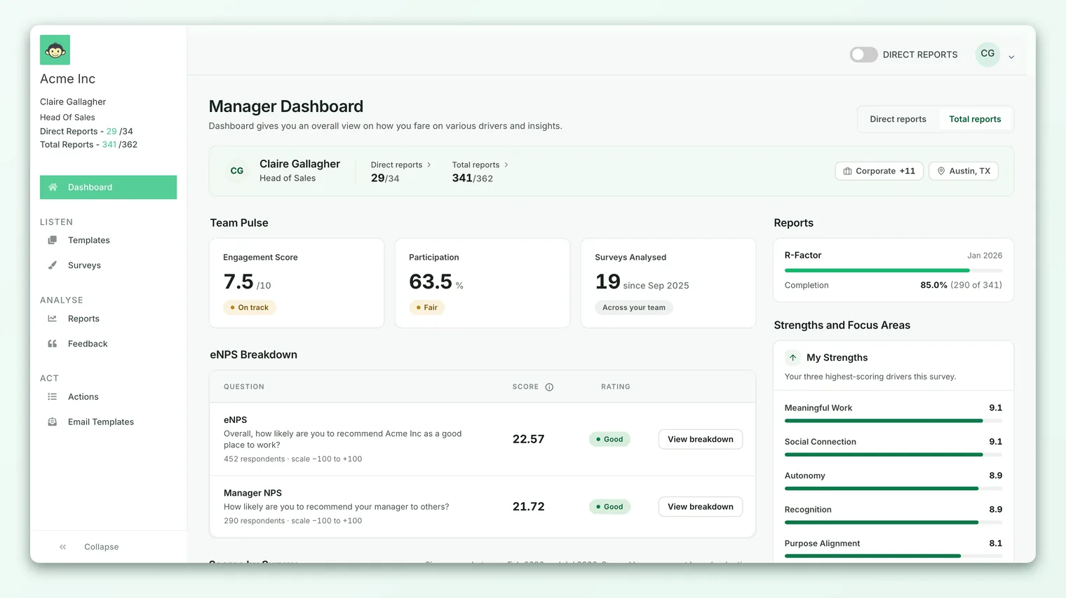
Each card is a circular ring with the number in the middle and a label beneath it. The ring fills in proportion to the value, so you get a visual sense of the score before you even read the digits. The cards load a moment after the rest of the page, so you may briefly see three empty rings while your team's data is fetched.
Card 1: your team engagement score
The first card (the green one, marked with a heartbeat icon) is your team engagement score. It carries the label Manager Engagement Score on the dashboard.
This is the same kind of number as the organization-wide engagement score, just filtered to your people. It's the average of every rating answer your team members gave across all your engagement questions, rolled up from question scores, into driver scores, into one number. For the full explanation of how that rollup works and what a healthy score looks like, see Understand the overall engagement score.
The scale depends on how your account is configured. Most accounts show it out of 10 (so the card reads something like 7.8/10), but if your account reports scores in percentage, the same card shows a percentage instead (for example 78%). The ring fills to match: a score of 7.8 out of 10 fills the ring to roughly 78 percent.
If your team hasn't answered enough rating questions to produce a score, the card shows a dash instead of a number.
The engagement score is a summary, not a diagnosis. When it dips, the "Scores over time" chart and the "Strengths and focus areas" panel further down the dashboard tell you which drivers moved. The headline is where you start, not where you stop.
Card 2: your team participation rate
The second card (the blue one, marked with a check icon) is your Overall Participation Rate. It's shown as a percentage and answers a simple question: of the people on your team who were invited to respond, how many actually did?
Participation is worth reading first, before you react to the engagement score or eNPS. A score built on a handful of responses is noisier and less representative than one built on most of your team. A high engagement score with low participation isn't automatically good news; it may just mean the people who were already happy are the ones who replied.
Like the engagement score, this rate is scoped to your reports only. It reflects submissions from the employees who roll up to you, not the whole organization. For a deeper look at how participation is measured and how to lift it, see Track participation.
If there's no participation data to show, the card displays a dash rather than a zero, so you can tell "no data yet" apart from "genuinely zero percent."
Card 3: your team eNPS
The third card (the amber one, marked with a megaphone icon) is your Manager eNPS - your team's Employee Net Promoter Score. It captures whether your team members are, on balance, advocates for the organization as a place to work or critics of it.
eNPS is calculated by subtracting the percentage of detractors (who scored 0 to 6) from the percentage of promoters (who scored 9 to 10), which produces a number between -100 and +100. The card shows that single number in the ring, and the ring fills based on where the score lands on the -100 to +100 range (so a score of 0 fills the ring halfway). For the full method and what counts as a good score, see What is eNPS and how is it calculated?.
Under the eNPS number you'll usually see a Breakdown link. Clicking it opens a panel that splits your team's eNPS into promoters, passives, and detractors, so you can see the composition behind the headline number rather than just the net result. That breakdown is covered in detail in View the eNPS breakdown.
If your team hasn't answered an eNPS question (or there isn't enough data to compute a meaningful score), the card shows a small ~ instead of a number, and the Breakdown link is hidden. This is normal for teams that haven't yet run a survey containing the eNPS question.
How each card is scoped to your team
The single most important thing to understand about these cards is that every one of them is filtered to your reports. You are not looking at company-wide numbers on the Manager Dashboard; you're looking at your slice of them.
CultureMonkey works out "your slice" from your position in the org hierarchy. When the dashboard loads, it looks up the employees who report to you - both your direct reports and everyone further down your reporting line (your indirect reports) - and every headline metric is computed over just those people. The hero banner at the top of the page shows both counts so you always know how many employees the numbers cover.
This scoping is applied consistently across all three cards and everything else on the dashboard, so the engagement score, participation rate, and eNPS you see are all describing the same population: your team.
If you manage other managers, your headline numbers include their teams too, because those employees still roll up to you. If you'd rather see just the people who report to you directly, that's what the direct report count in the hero banner reflects. Your organization can configure how much of the reporting line a manager sees.
Why a card might be blank
Sometimes you'll open the dashboard and find the cards showing dashes, a ~, or empty rings. There are two common, expected reasons.
Your team is below the anonymity threshold. CultureMonkey protects individual responses by hiding results for groups that are too small. If the number of people who responded on your team is below your account's dashboard anonymity threshold (5 by default, though your admin may set it higher), the headline cards won't show real numbers. This isn't an error; it's the same protection that applies everywhere in the product, and it exists so that no individual's answer can be inferred from a small group. As your team grows or more people respond, the cards fill in.
There's no survey data yet. If your team hasn't been included in any survey that has responses, the whole dashboard shows a "Not enough data!" message instead of the cards. Once a survey your team took has results, the headline metrics appear.
A blank card almost always means "not enough people yet," not a bug. If you expected data and see none, check how many of your reports have responded. If it's fewer than the threshold, the cards will stay hidden until more come in. For the fuller picture, see Why can't I see results yet?.
Reading the three cards together
The cards are most useful read as a set, in a deliberate order:
- 1Start with participation. How much of your team is represented? A healthy participation rate tells you the other two numbers are trustworthy. A low one tells you to treat them as directional at best.
- 2Read the engagement score. This is your broad temperature check across every driver. Is it where you'd expect? Higher or lower than last time you looked?
- 3Read eNPS alongside it. eNPS is a sharper, advocacy-focused signal. When it moves with the engagement score, you have a clear story. When the two diverge (for example, a solid engagement score but a low eNPS), that's a prompt to dig into the eNPS breakdown and your team's comments.
- 4Then go deeper. Use the "Scores over time" chart to see the direction of travel, and the strengths and focus areas panel to find the specific drivers behind the headlines.
The headline cards themselves show your team's current standing. To see how these numbers have moved, use the Scores over time section directly below the cards, which charts your engagement score and eNPS month on month so you can tell a one-off dip from a real trend.
Frequently asked questions
Are these numbers just my team, or the whole company?
Just your team. Every headline card on the Manager Dashboard is scoped to the employees who report to you, directly and indirectly. To see organization-wide numbers you'd need the main (admin) dashboard, which shows the whole company.
Why is my engagement score shown out of 10 but a colleague's is a percentage?
The scale is an account-wide setting. If your account reports scores in percentage, every engagement score across CultureMonkey (including this card) shows as a percentage; otherwise it's out of 10 (or whichever scale your account uses). It's the same underlying number displayed differently.
My eNPS card shows a tilde instead of a number. Is something wrong?
No. A ~ means there isn't enough eNPS data to show a score yet, usually because your team hasn't answered an eNPS question or the response count is too low. Once there's enough data, the number and the Breakdown link appear.
Why can't I see any cards at all?
Either your team is below the anonymity threshold (5 responders by default), or your team has no survey results yet. In the second case you'll see a "Not enough data!" message. Both are expected states, not errors.
How often do the headline numbers update?
They reflect the survey data available for your team at the time you load the page. As new responses come in and surveys close, CultureMonkey updates the numbers the next time the dashboard is loaded.
Where to go next
- See the whole page: Manager dashboard overview
- Understand the engagement number: Understand the overall engagement score
- Break down your eNPS: View the eNPS breakdown
- No results showing? Why can't I see results yet?
Your feedback helps us improve the Help Center.