

Understand the overall engagement score
A complete guide to the headline engagement score in CultureMonkey - what it measures, exactly how it's calculated from your driver and question scores, the scale it uses, how to read it, and what counts as a good score.
On this page
- What the overall engagement score measures
- Where the score comes from: questions, drivers, and the rollup
- How the number is actually calculated
- What's included (and what isn't)
- Reading the score on your Dashboard
- What is a "good" engagement score?
- Overall engagement score vs eNPS
- Frequently asked questions
- Where to go next
The overall engagement score is the single biggest number on your CultureMonkey Dashboard. It's the headline that leaders look at first, the figure that goes in the board deck, and the one people ask about when they say "so, how engaged are we?" This guide explains exactly what that number measures, how CultureMonkey builds it from your survey answers, what scale it lives on, how to read it in context, and what counts as a healthy score.
Your overall engagement score is the average of every rating answer employees gave across all your engagement questions. Each question belongs to an engagement driver, so the score rolls up from question scores, into driver scores, into one organization-wide number. CultureMonkey shows it on your account's chosen scale - 0 to 10 (the default), 0 to 5, or 0 to 100% - and higher is better. As with eNPS, the trend and the segments beneath it matter more than any single reading.
What the overall engagement score measures
Where eNPS asks one question (would you recommend us as a place to work?), the overall engagement score is broader. It's a diagnostic index that pulls together how employees rated every engagement dimension you asked about: leadership, manager relationships, growth, recognition, wellbeing, workload, and whichever other drivers your surveys cover.
Think of it as the grand average of employee sentiment. If eNPS is a thermometer reading, the engagement score is a fuller physical - it tells you not just that something is off, but gives you the structure to find where, because it's built out of the driver and question scores that sit underneath it.
Because it aggregates many questions across many people, the overall score is more stable and more representative than any single question. It's the right number for tracking direction over time and for comparing where you are today against where you were last cycle.
Where the score comes from: questions, drivers, and the rollup
Every engagement survey in CultureMonkey is built from rating questions, and every rating question is mapped to a driver (also called a factor). That mapping is what makes the rollup possible:
- Each question has a score - the average rating employees gave it.
- Each driver has a score - the average across all the questions mapped to that driver.
- The overall engagement score is the average across all the driver answers together.
So the headline number isn't invented separately. It's the top of a pyramid whose base is individual answers. This is why, when the overall score dips, you can always drill down through the drivers and then the questions to find the specific thing that moved. For more on how drivers group questions, see Drivers and factors explained.
The same underlying answers power all three levels of reporting: question scores, driver scores, and the overall score. They'll always be consistent with each other, because they're computed from the same pool of ratings.
How the number is actually calculated
Here's the part that surprises people, and it's worth being precise about because it's grounded in how the product actually computes the figure.
The overall engagement score is a flat average of every rating answer in scope. Every individual rating answer is averaged together in one pass. It is deliberately not the average of the per-driver averages.
That distinction matters. Consider two ways you could combine driver scores:
- Average of the answers (what CultureMonkey does). Every individual answer counts once. A driver with 2,000 answers contributes proportionally more to the overall number than a driver with 50 answers.
- Average of the driver averages (what CultureMonkey avoids). Each driver counts equally regardless of how many answers it has. A driver with a handful of responses would sway the headline as much as one answered by thousands.
CultureMonkey uses the first method on purpose. Averaging the averages would over-weight low-volume drivers and let a lightly-answered topic distort the whole picture. By averaging the raw answers instead, the overall score reflects the true weight of employee opinion behind it.
Because the overall score is answer-weighted, drivers with more questions and more responses naturally pull it more strongly. This is a feature, not a quirk: it keeps the headline honest to the volume of feedback behind each topic.
The scale the score lives on
Internally, every rating answer is stored on a 1 to 5 scale. What you see on the Dashboard depends on the scale your account is configured to use:
| Account scale setting | How the stored value is shown | Example (a 4 out of 5 answer) |
|---|---|---|
| 0 to 5 | Shown as-is | 4.0 |
| 0 to 10 (default) | Multiplied by 2 | 8.0 |
| 0 to 100% | Multiplied by 20 | 80% |
All three are the same underlying sentiment, just presented differently. The default for most accounts is 0 to 10. Whichever scale you use, the overall score, driver scores, and question scores all use it consistently, so they're directly comparable to each other.
The final headline number is rounded for display. By default CultureMonkey rounds the overall score to one decimal place (an account setting controls this), so you'll typically see something like 7.8 / 10 rather than 7.83.
A worked example
Suppose a small engagement survey has three drivers, and employees give these rating answers (stored on the 1 to 5 scale):
| Driver | Answers collected | Sum of ratings | Driver average (1-5) |
|---|---|---|---|
| Recognition | 100 answers | 320 | 3.20 |
| Growth | 100 answers | 300 | 3.00 |
| Wellbeing | 300 answers | 1,320 | 4.40 |
Now watch the two methods diverge:
Average of the driver averages (the method CultureMonkey does not use):
> (3.20 + 3.00 + 4.40) ÷ 3 = 3.53 / 5
Average of every answer (the method CultureMonkey does use):
> (320 + 300 + 1,320) ÷ (100 + 100 + 300) = 1,940 ÷ 500 = 3.88 / 5
The answer-weighted figure is higher because Wellbeing, with three times as many answers, rightly carries more weight. On the default 0 to 10 scale, that 3.88 is displayed as 3.88 × 2 = 7.8 / 10. On a percentage account it would show as 77.6%.
That's the whole calculation: gather every rating answer in scope, average them, scale to the account's display scale, round.
If you try to average the driver scores you see on screen and it doesn't quite equal the overall score, this is why. The overall score weights by the number of answers, not by the number of drivers. The two only match when every driver has the same number of answers.
What's included (and what isn't)
The overall engagement score on your Dashboard is designed to reflect your significant engagement surveys, so it stays meaningful:
- Only rating answers count. Open-text comments and eNPS live in their own reports and don't feed the engagement score.
- Autopilot and lifecycle sends are excluded from the account-level headline. A small pilot send or a narrow-segment automated survey won't skew your org-wide number. This keeps the overall score in step with the engagement count, participation, sentiment, and eNPS shown alongside it, which exclude the same sends.
- Anonymity thresholds apply. If a filtered group is too small to protect individual anonymity, its score is hidden rather than shown. See Read the dashboard for how filtered views behave.
Reading the score on your Dashboard
Your overall engagement score sits front and center on the Dashboard, next to your participation rate and eNPS.
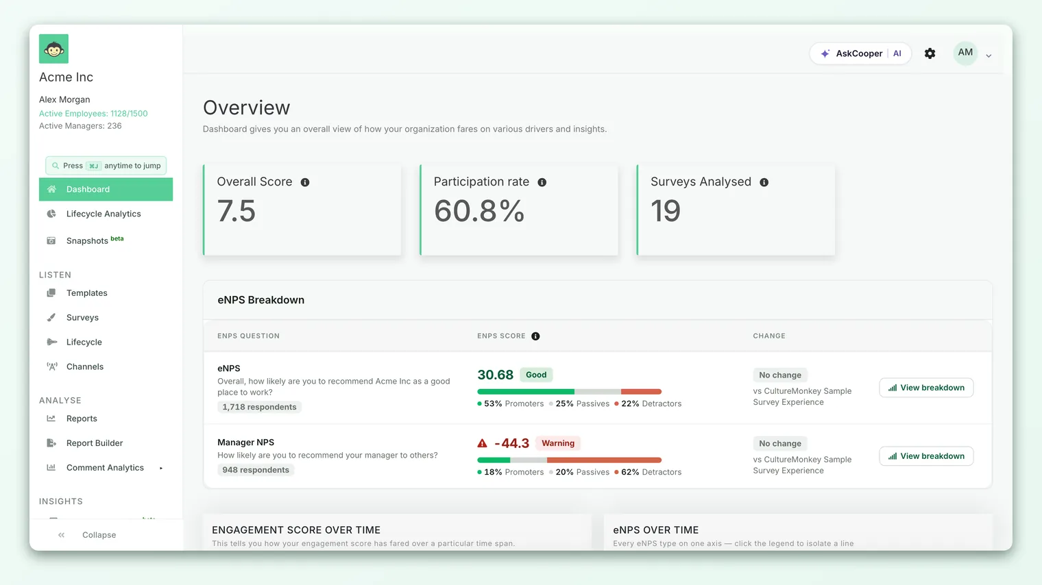
A single number rarely tells the full story on its own. Read it in context:
- 1Check the trend. Look at how the score has moved across recent cycles. A number that's climbing steadily is a better sign than a higher number that's drifting down.
- 2Compare to participation. A high score on low participation is fragile. Confidence in the number grows with the response rate next to it.
- 3Drill into drivers. Open the driver breakdown to see which topics are lifting the score and which are dragging it. This is where the headline becomes actionable. See Drivers and factors explained.
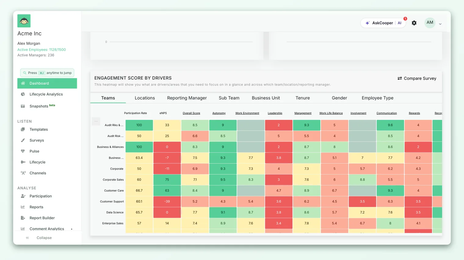
- 4Slice by segment. Filter by team, location, or manager to find where engagement is strong and where it needs attention. A healthy company average can hide a struggling team.
What is a "good" engagement score?
Like eNPS, the honest answer is it depends on your industry, region, size, and the moment you measure. But CultureMonkey does give you a consistent, built-in way to read a score, through the color bands it uses across the product. On the default 0 to 10 scale, those bands are:
| Score band (0-10) | Equivalent on 0-5 | Equivalent on 0-100% | Reading |
|---|---|---|---|
| 1.0 to 4.9 | 1.0 to 2.9 | 1 to 49% | Low - a clear signal to dig into the "why" |
| 5.0 to 7.9 | 3.0 to 3.9 | 50 to 79% | Middle - stable, but with real room to improve |
| 8.0 to 10 | 4.0 to 5.0 | 80 to 100% | High (favorable) - a strongly engaged workforce |
These are the same cutoffs the product uses to color scores red, amber, and green, so they're a reliable reference rather than an arbitrary rule of thumb. Anything landing in the green band (8.0+ on the 0 to 10 scale) is considered favorable.
Two principles matter more than the band you fall into:
- The trend beats the number. A 7.2 that has climbed for a year is a healthier sign than a static 8.0. Consistent improvement is the real win.
- Segments beat the average. Always look beneath the headline. A comfortable org-wide score can mask a team, location, or manager that needs urgent attention.
If the engagement score becomes a target managers are pressured to hit, you risk losing the honest signal that made it useful. Treat it as a diagnosis, not a scoreboard. Your actions on the drivers underneath are what move it.
Overall engagement score vs eNPS
CultureMonkey shows both, and they answer different questions. They're complementary, not competing.
| Overall engagement score | eNPS | |
|---|---|---|
| Question it answers | How engaged are we across many dimensions? | Would you recommend us as an employer? |
| Based on | Every rating answer, across all drivers | One recommendation question |
| Scale | 0 to 10 (or 0 to 5, or 0 to 100%) | −100 to +100 |
| Best for | A rich, diagnostic view you can drill into | A fast, comparable pulse of advocacy |
When both move together, you have a clear story. When they diverge, that's your prompt to investigate. For the full eNPS calculation, see What is eNPS and how is it calculated?.
Frequently asked questions
Why doesn't the overall score equal the average of my driver scores?
Because the overall score is weighted by the number of answers, not by the number of drivers. A driver with more responses contributes more to the headline. The two only match when every driver has an identical answer count. This is intentional, so a lightly-answered topic can't sway the whole number.
What scale is the score on?
Whatever your account is configured to use: 0 to 10 by default, or 0 to 5, or 0 to 100%. All three represent the same underlying sentiment, stored internally on a 1 to 5 scale and converted for display. The overall score, driver scores, and question scores always use the same scale as each other.
Does eNPS or open-text feedback affect the engagement score?
No. The engagement score is calculated purely from rating answers. eNPS and comments have their own reports and don't feed into it.
Do pilot or automated surveys change our headline number?
No. The account-level overall score excludes autopilot and lifecycle sends, so a small or narrowly-targeted automated survey won't skew your organization-wide figure.
What's considered a "good" score?
On the 0 to 10 scale, 8.0 and above falls in CultureMonkey's favorable (green) band, 5.0 to 7.9 is the middle band, and below 5.0 is low. But the trend over time and the health of individual segments tell you more than the band alone.
Why is a score hidden for one of my teams?
Anonymity protection. If a filtered group is too small for individual answers to stay anonymous, its score is hidden until enough people respond. This is expected behavior. See Read the dashboard.
Where to go next
- See the full Dashboard layout: Read the dashboard
- Understand what feeds the score: Drivers and factors explained
- Compare it with advocacy: What is eNPS and how is it calculated?
Your feedback helps us improve the Help Center.