

Access quick survey reports from the side pane
A guide to the "Reports I can access" side pane on the manager dashboard - where it is, which reports appear, how to read each row, and how to open a full report in one click.
On this page
Your manager dashboard is built for a quick read of how your team is doing. Most of the space goes to scores, trends, and actions, but tucked into the right-hand column is a small, high-value shortcut: a quick-access list of the survey reports you can open. Instead of hunting through the Reports area for the right survey, you get the ones that matter to you, right where you already are.
This guide covers exactly where that side pane lives, which reports show up in it (and which don't), how to read each row at a glance, and how to jump into a full report in a single click.
On the CultureMonkey manager dashboard, the right-hand column shows a card titled "Reports I can access." It lists up to eight recent survey reports you're allowed to view, each with its participation rate, and clicking any one opens that survey's full report. It only ever shows reports you have permission to see.
Where the side pane lives
The quick-access list is part of the manager dashboard, the view you land on when you sign in as a manager (it's at app.culturemonkey.io/manager-dashboard). The dashboard is laid out in two columns: a wide left column for your headline scores, trends, and action summary, and a narrower right-hand column for supporting cards.
Look in that right-hand column. Near the top you'll see a small heading, "Reports I can access," followed by a list of survey names. That list is the quick survey reports side pane.
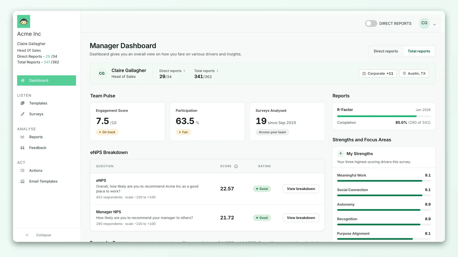
Because it lives on the dashboard itself, you don't have to navigate anywhere to use it. It's meant to be a launchpad: glance at the list, pick the survey you care about, and go straight into its report.
The side pane fills in just after the main dashboard appears. It's fetched separately so the rest of your dashboard can paint instantly while the report list works out participation figures in the background. If you see a brief "Loading reports…" spinner, that's expected. Give it a second.
What appears in the list
This is the important part: the side pane is personalized to you. It does not show every survey your organization has ever run. It shows the survey reports you specifically are allowed to open, based on your team and your access.
A survey has to clear a few bars to appear here:
- It has to be report-ready. The survey must be finished (or far enough along) that its results are available as a report. Drafts and in-flight surveys without results don't appear.
- You have to have access to it. CultureMonkey checks your permissions and your team mapping. If a survey didn't include anyone you manage, or you're not authorized to view its results, it won't show up. You'll only ever see reports you're genuinely allowed to open.
- It has to have real participation from your team. A survey where effectively no one on your team responded is filtered out, so the list stays useful rather than cluttered with empty reports.
The list is capped at eight reports and ordered so the most recent surveys come first. If you have access to more than eight, you're seeing the latest and most relevant ones. For the complete set, head to the full Reports area.
The side pane orders reports by when the survey ran, newest first. It isn't a history of reports you personally opened last, and it doesn't reorder based on your clicks. Think of it as "your latest accessible reports," not "your recently viewed."
How to read each row
Every row in the list is a compact summary of one survey report. From left to right and top to bottom, a row shows:
| Element | What it tells you |
|---|---|
| Survey name | The title of the survey. Long titles are shortened so the row stays tidy. |
| Date | The month and year the survey ended, in parentheses (for example, (mar 26)), so you can tell reports apart at a glance. |
| Arrow | A right-pointing arrow, signaling that the row is clickable and will open the report. |
| Participation bar | A small filled bar showing your team's response rate for that survey, visually. |
| Participation rate | The response rate as a percentage, with the raw counts beside it, for example 72% (18/25). |
That participation figure is scoped to your team, not the whole organization. So the "18/25" means 18 of the 25 people you manage who were invited to that survey responded. That's a quick sanity check before you open a report: a report built on a high response rate is a more reliable read than one built on a handful of answers.
Opening a report
Opening a full report from the side pane takes one click.
- 1Find the survey you want in the "Reports I can access" list.
- 2Click anywhere on its row. The whole row is a link, so you don't have to aim for the arrow.
- 3Land on the full report for that survey, where you can explore scores, drivers, the eNPS breakdown, demographic filters, and comments in detail.
The full report is the same one you'd reach from the Reports area, so everything you can normally do there is available: filtering by team or attribute, reading open-text feedback, and drilling into individual drivers. The side pane is simply a faster door into it.
For a full walkthrough of what you'll find once you're inside, see Open a survey report.
When several reports are listed, the participation rate is a good triage signal. Start with the surveys where your team turned out in numbers - those results carry the most weight - and treat very-low-response reports with appropriate caution.
When the side pane is empty or missing
Sometimes you won't see the card at all, or it'll be empty. That's usually by design, not a bug. Here are the common reasons:
- You have no accessible reports yet. If none of the surveys your team was part of are report-ready, or you don't yet have access to any results, the card simply doesn't appear. It shows nothing rather than an empty shell.
- Your team is below the anonymity threshold. CultureMonkey protects respondents by hiding results for groups that are too small. If your team hasn't crossed the minimum number of responses needed to keep answers anonymous, the participation figures (and the report list along with them) stay hidden until enough people respond. This is expected behavior. See Why can't I see results yet?.
- Reports exist but had no team participation. A survey where no one on your team responded is filtered out of the quick list, even if the survey itself is report-ready.
An empty side pane means you have no quick-access reports meeting the bar right now. It doesn't mean the organization has no results. If you expected a specific report to appear and it isn't there, it's most often an access or anonymity-threshold reason rather than missing data.
How it fits with the rest of the dashboard
The side pane is one of several cards in the manager dashboard's right-hand column, alongside your strengths and focus areas and your action summary. Together they turn the dashboard into a single starting point: read your headline scores on the left, see what's strong and what needs work on the right, and jump straight into the underlying survey report when you want the detail.
If you're new to the dashboard as a whole, start with The manager dashboard, explained for the full tour, then come back here when you want to move quickly from a high-level read into a specific survey's results.
Frequently asked questions
Why don't I see a survey I know exists?
Most likely one of three reasons: the survey isn't report-ready yet, you don't have access to its results (it didn't include people you manage, or your permissions don't cover it), or your team's participation in it was too low to list. The side pane deliberately only shows reports you're allowed to open with meaningful team response.
How many reports can the side pane show?
Up to eight, ordered with the most recent surveys first. If you have access to more than that, use the full Reports area to see everything.
Is this the same as my recently viewed reports?
No. CultureMonkey orders the list by how recent the surveys are, not by what you last opened. It won't reshuffle based on your clicks.
What does the percentage next to each report mean?
It's your team's participation (response) rate for that survey - the share of your invited team members who responded - shown as a percentage with the raw counts beside it, like 72% (18/25). It reflects your team specifically, not the whole company.
The card shows a spinner and then nothing. Is that broken?
Usually not. The list loads a moment after the rest of the dashboard, and if you have no accessible, above-threshold reports it will finish by showing nothing at all. If you expected a report and it's missing, check the access and anonymity reasons above.
Can I open a report straight from here?
Yes. Click any row and CultureMonkey takes you directly to that survey's full report, the same one you'd reach from the Reports area. See Open a survey report.
Where to go next
- Explore a full report: Open a survey report
- Tour the whole dashboard: The manager dashboard, explained
- List looks empty? Why can't I see results yet?
Your feedback helps us improve the Help Center.