

Use CultureMonkey Snapshots for point-in-time data
A guide to the Snapshots page in CultureMonkey - a beta view that captures your organization's headcount, demographics, licensing, and sentiment as they stand right now, plus how to open it and put it to use.
On this page
Snapshots is a single page that gives you a fast, bird's-eye read of your organization as it stands right now: how many people you employ, how they break down by generation and gender, how many licenses you're using, and how your workforce feels based on the comments they've left. Where the Dashboard is built around survey scores and trends, Snapshots is built around your people and your setup - the shape of the organization behind the numbers.
This guide explains what Snapshots shows, how to open it, how to read each part of the page, and the situations where a point-in-time view like this earns its keep.
CultureMonkey Snapshots is a beta page under Reports & Analytics that summarizes your organization's key facts as of the moment you load it: total and active headcount, license usage, generation and gender mix, employee sentiment, silent employees, and data-quality gaps. It's a live view - it reflects the current state each time you open it, so treat it as a "state of the organization today" report.
What Snapshots is
Think of Snapshots as a one-page profile of your organization. Instead of asking "how did people answer this survey?", it answers questions like "who works here, how are they distributed, how much of what we're paying for are we using, and how are people feeling in aggregate?"
It pulls together facts that normally live in several different places - your employee list, your integrations, your survey history, your feedback - and lays them out as a set of tiles and charts you can take in at a glance. That makes it useful both as a quick health check and as something you can screenshot or reference when you need to describe the current state of your program to someone else.
Two things are worth understanding up front:
- It's point-in-time. Every figure reflects the moment you open the page. Load it today and you see today's headcount and today's sentiment; load it next month and the numbers will have moved. It is not a trend chart, and it does not (currently) let you compare one saved snapshot against another.
- It's a beta feature. Snapshots is still being refined, so the exact set of tiles, their labels, and their availability may change. If you don't see it in your navigation, it may not be switched on for your account yet - see the FAQ below.
Who can see Snapshots
Snapshots sits behind two gates, and both have to be open for the page to appear:
- A permission. The ability to view Snapshots is reserved for the highest level of admin access (a full Account Admin / super admin). Managers and more limited sub-admin roles do not see it.
- An account setting. Snapshots also has to be enabled for your account. Because it's beta, it may be off by default and turned on by CultureMonkey for accounts that want to try it.
If you have the right role but the page is missing, the account-level setting is the most likely reason. Your Customer Success contact can enable it.
Snapshots is an admin-level view. If you're a manager and you can't find it, that's expected - the page isn't part of the manager experience.
How to open Snapshots
There's nothing to build or schedule. Opening the page is viewing the snapshot.
- 1Sign in as an Account Admin. You need full admin access for the Snapshots menu item to appear.
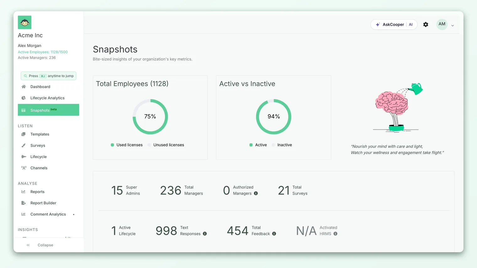
- 2Find "Snapshots" in the left sidebar. It sits in the Analyse area of the navigation, marked with a small camera icon and a green beta tag.
- 3Click it to open the page. The tiles and charts calculate from your current data and render together as one view.
- 4Refresh whenever you want the latest. Because it's live, simply reloading the page recomputes every figure against the present moment.
If you use the quick command palette (the search-and-jump overlay), you can also type "Snapshots" to jump straight there.
What each part of the page shows
The page is organized top to bottom, moving from raw headcount through demographics to sentiment and data quality. Here's how to read each block.
Headcount and licensing
Two donut charts anchor the top of the page:
- Total Employees compares your used licenses (active employees) against your unused licenses - the difference between the number of employees you're contracted for and the number currently active. This is your quickest read on how much of what you're paying for is actually in use.
- Active vs Inactive splits your whole employee list into active and inactive people, with the active share shown as a percentage.
Together these answer "how big are we, and how much license headroom do we have?" in a couple of seconds.
If the unused-licenses slice is large, you have room to add people without a change to your plan. If used licenses are pushing right up against your contracted count, that's a signal to plan ahead before you onboard a new cohort.
Organization statistics
A band of counters summarizes the moving parts of your program: Super Admins, Total Managers, Authorized Managers (managers who can access survey reports), Total Surveys run, Active Lifecycle journeys, Text Responses, Total Feedback, and your Activated HRMS integration (or "N/A" if none is connected). It also lists your active notification channels (email, WhatsApp, Teams, Slack, SMS).
This block is a fast inventory of how your account is set up and how much activity it has generated, without hunting through several settings screens.
Silent and skipped employees
Two figures here flag people your program isn't reaching:
- Skipped - employees who have not been added to any survey.
- Silent - employees who were included in surveys but have never answered one.
Both are early warning signs. Skipped employees may be missing from your audiences by accident; silent employees may face a channel or access problem, or may simply be disengaged. Either way, these counts tell you where participation is leaking.
Data-quality gaps
Snapshots also surfaces gaps that quietly limit your analytics:
- The percentage of employees with no phone number (which means they can't be reached over WhatsApp or SMS).
- The number of employees with no manager assigned (which weakens manager-level and team-level reporting).
A "View employee data" link takes you to the employee list so you can fix these. Closing these gaps is one of the highest-leverage things you can do to improve both participation and the depth of your reports.
Demographic mix
Two bar charts show the composition of your workforce:
- Your Dominant Generation breaks active employees into Baby Boomers, Gen X, Millennials, and Gen Z, and calls out the majority generation.
- Diversity in your organisation breaks employees down by gender (female, male, other, and not specified).
Both are useful for framing who you're surveying, and each chart includes a nudge toward a relevant survey template (for example, a generation-focused or inclusivity survey) when a group dominates.
Employee happiness meter
Finally, a gauge shows overall employee sentiment derived from the tone of the text comments people have left, alongside a simple happy / neutral / sad emoji breakdown. A "View top concerns" link jumps to the feedback where the unhappy signal is strongest, so you can move from "how do people feel?" to "what should we do about it?" in one click.
The happiness meter reads the emotion in written comments, not the recommendation score. For advocacy, look at eNPS; for how people are engaging across drivers, use the Dashboard and survey reports.
Snapshots vs the Dashboard
They look similar at a glance but answer different questions.
| Snapshots | Dashboard | |
|---|---|---|
| Centered on | Your people and your setup | Your survey scores |
| Time frame | Point-in-time (right now) | Trends across cycles |
| Typical question | "Who works here, and how are we set up?" | "How engaged are people, and is it improving?" |
| Headline figures | Headcount, licenses, demographics, sentiment | Engagement score, eNPS, participation |
| Best for | A state-of-the-organization check | Tracking and diagnosing engagement over time |
Use them together: Snapshots tells you the shape of the organization you're measuring; the Dashboard tells you how that organization is responding.
When to use Snapshots
A point-in-time view is most valuable at moments when the state of things matters more than the trend:
- Before a launch. Check headcount, license headroom, and how many employees are missing phone numbers or managers before you send a big survey, so participation isn't quietly capped by data gaps.
- During a leadership update. Screenshot the page to describe the current size, mix, and sentiment of the workforce in one slide.
- After a reorg or a hiring wave. Confirm the new headcount, generation mix, and license usage line up with what you expect.
- As a periodic hygiene check. Once a month, glance at silent and skipped employees and the data-quality gaps, and clear whatever's grown.
Because it's a live page, the "point in time" is always now. If you want to preserve a particular moment, capture it yourself (a screenshot or an export) at the time.
Limitations to keep in mind
- It's beta. Tiles, labels, and availability can change, and the feature may behave differently across accounts.
- It's a live view, not a saved record. There's no built-in history of past snapshots to compare against, so it won't show you how a figure has moved.
- Accuracy depends on your data. Missing managers, blank demographics, or an out-of-date employee list will show up as gaps or "not specified" here. That's a feature (it surfaces the gaps) but it means the picture is only as clean as your inputs.
- Sentiment needs comments. The happiness meter is derived from text feedback, so it's most meaningful once you've collected a reasonable volume of written responses.
Frequently asked questions
Where do I find Snapshots?
In the left sidebar, in the Analyse area, marked with a camera icon and a green "beta" tag. You need full Account Admin access, and the feature has to be enabled for your account.
I'm an admin but I don't see Snapshots. Why?
Most likely the account-level setting isn't turned on yet. Because Snapshots is beta, it's enabled per account. Your CultureMonkey Customer Success contact can switch it on. If you're a manager rather than a full admin, the page isn't part of your view by design.
Does opening Snapshots save a copy I can look back at later?
No. Snapshots is a live page that CultureMonkey recalculates every time you load it, so it always reflects the present moment. If you want to keep a record of a particular day, capture it yourself at the time.
Is the happiness meter the same as eNPS?
No. The happiness meter reads the sentiment of employees' written comments, while eNPS is calculated from the 0-10 recommendation question. They're related but measure different things.
Why does part of the page say "not specified" or show gaps?
Because Snapshots reflects your actual data. Employees without a recorded gender, manager, or phone number show up as gaps. Filling those in on the employee list will make the page (and your reports) more complete.
Will Snapshots change?
Quite possibly - it's a beta feature, so the set of tiles and their behavior may be refined over time. Treat this article as a guide to the current version.
Where to go next
- Track engagement over time: Read the dashboard
- Understand advocacy: What is eNPS and how is it calculated?
- Results look empty or hidden? Why can't I see results yet?
Your feedback helps us improve the Help Center.