

Review engagement and eNPS trends in CultureMonkey
How to read the two over-time trend charts on your CultureMonkey Dashboard - engagement score over time and eNPS over time - including how the time windows and buckets work, what drives movement, and how to tell a real trend from ordinary noise.
On this page
A single score tells you where you stand today. A trend tells you where you are heading, and that is usually the more useful thing to know. Your CultureMonkey Dashboard carries two trend charts side by side near the top: engagement score over time and eNPS over time. Together they let you watch sentiment move across weeks, months, and survey cycles instead of guessing from one number.
This guide explains exactly what those two charts plot, how the time windows and buckets are built, what makes the line move, and - most importantly - how to tell a genuine trend from ordinary week-to-week noise.
The CultureMonkey Dashboard shows engagement score and eNPS as lines over time. Each point is an average of the responses that landed in that period. Use the Last 12M / Last 3M / Last 30D toggle to change the window, look for direction that holds across several points before you call it a trend, and read the two charts together - engagement is the depth, eNPS is the headline.
Where to find the two charts
Open your Dashboard. Below the three summary cards (overall score, participation rate, and eNPS), you will see a split card with two graphs sitting next to each other:
- On the left, Engagement score over time - captioned "This tells you how your engagement score has fared over a particular time span."
- On the right, eNPS over time - captioned "This tells you the likelihood of an employee willing to recommend your organization."
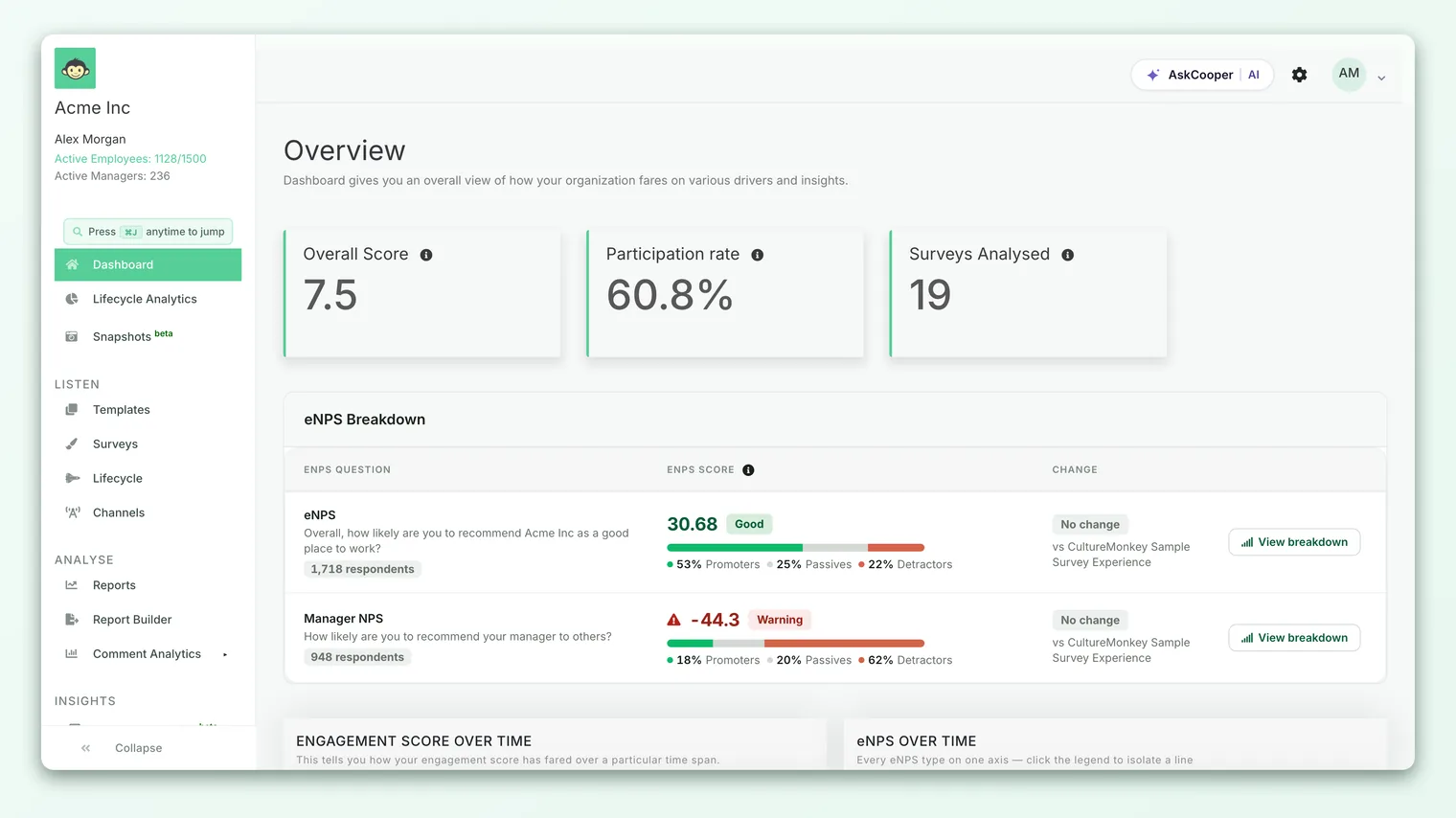
Each chart has its own small set of radio buttons above it (Last 12M, Last 3M, Last 30D) so you can change the time window for one chart without touching the other. For a full card-by-card walkthrough of everything else on this page, see Read the dashboard.
What each chart actually plots
The two charts answer two different questions, so it helps to be precise about what each line is made of.
Engagement score over time plots the average of every rating answer submitted in each time bucket. CultureMonkey groups your engagement questions under drivers, and every rating response carries a numeric value. The chart takes the mean of those values for the period and plots it as one point. Depending on your account setting, that value is shown on a 0-10 scale or rescaled to a percentage, but the shape of the line is the same either way. For the fuller story of what this number represents, see Understand the overall engagement score.
eNPS over time plots your Employee Net Promoter Score for each bucket. For every period, CultureMonkey counts the promoters (people who answered 9-10), the detractors (0-6), and the total who answered the eNPS question, then computes:
> eNPS = (% promoters − % detractors)
So the two lines are not on the same scale. Engagement runs roughly 0-10 (or 0-100 as a percentage); eNPS runs from −100 to +100. That is exactly why they live in separate charts rather than sharing one axis. To go behind the eNPS line and see the promoter, passive, and detractor split that produced it, see View the eNPS breakdown.
Engagement is the diagnosis and eNPS is the headline. When both lines climb together, you have a clean, believable story. When they diverge - say eNPS drops while engagement holds - that mismatch is itself the signal worth investigating.
How periods and buckets are plotted
This is the part people most often misread, so it is worth being exact. Two things are happening at once: a window (how far back the chart looks) and a bucket size (how finely that window is chopped into points).
The three radio buttons set the window:
| Button | Window it shows | How the line is bucketed |
|---|---|---|
| Last 12M | The past year | One point per month |
| Last 3M | The past 90 days | One point per month |
| Last 30D | The past 30 days | One point per day |
So "Last 12M" gives you up to twelve monthly points that show the long arc, while "Last 30D" zooms right in to daily resolution for the most recent activity. "Last 3M" sits in between: a short window still bucketed by month.
Every point is a period average, not a running total and not a snapshot of a single day's mood. If forty people responded across a month, that month's engagement point is the average of all forty ratings, and that month's eNPS point is computed from all forty eNPS answers. Periods with no responses simply have no real data, so they are drawn as zero rather than being skipped. That behavior matters when you interpret the chart (more on that just below).
The Dashboard trends roll up your live engagement and pulse activity across the account. Anything you have deliberately kept off the Dashboard, such as test runs or one-off surveys, is excluded from these lines. See Exclude specific surveys from your Dashboard for how that set is managed. Because of this, the trend reflects your ongoing listening program, not every survey that ever ran.
A worked example: reading the line
Suppose you switch the engagement chart to Last 12M and see monthly points that read roughly: 7.1, 7.2, 7.0, 7.3, 7.2, 7.4, 7.5, 7.6, 7.5, 7.7, 7.8, 7.9.
There is month-to-month wobble in there (7.3 dips to 7.2, 7.6 dips to 7.5), but the overall direction is clearly up: you have gained about 0.8 points across the year, and the small dips never break the climb. That is a trend.
Now suppose the eNPS chart over the same window reads: +18, +20, 0, +22, +24. That "0" in the middle looks alarming until you remember how empty periods are drawn. If almost nobody answered the eNPS question that month (say you ran no survey), the chart shows 0 because there was no score to plot, not because advocacy collapsed to neutral. Always sanity-check a sudden drop to zero against whether a survey actually ran in that period.
A point that sits flat on zero usually means that period had no responses to average, not that your score genuinely fell to zero. Before you react to a cliff-edge drop, check participation for that period. A real decline shows up as a lower-but-nonzero score, not a sudden plunge to the baseline.
Real trend versus noise
The whole value of these charts is direction over time, so the key skill is separating a genuine trend from ordinary fluctuation. A few habits help.
Look for direction that persists. One point moving is noise; three or four points leaning the same way is a trend. A single month that dips and recovers is rarely worth a meeting. A line that has drifted down for a quarter is.
Weigh the window against the bucket. The Last 30D view is bucketed by day, so it is the twitchiest - a couple of enthusiastic or frustrated responses on a quiet day can swing a daily point hard. Use it to spot something recent and specific. Use Last 12M to judge the real arc, because monthly buckets absorb daily randomness.
Mind the sample size behind each point. A point built from four hundred responses is far more trustworthy than one built from four. Thin periods bounce around; well-sampled periods are steady. When a point looks like an outlier, ask how many people it represents before you believe it.
Watch the boundaries on eNPS. eNPS is unusually sensitive because it sorts every answer into promoter, passive, or detractor buckets. A person moving from a 6 to a 7 crosses from detractor to passive and can nudge the whole score, even though their underlying feeling barely changed. Small eNPS wobbles near a survey boundary are normal; sustained movement is the signal.
Prefer trend to level. A +15 that has climbed steadily for a year is a healthier sign than a flat +40. Consistent improvement, in either chart, is the outcome you are really after.
Glance one: is the line generally rising, flat, or falling across the widest window? Glance two: is the most recent point in line with that direction, or is it an outlier? If both glances agree, trust it. If they disagree, look at participation before you conclude anything.
What actually drives the movement
Because each point is an average of real responses, the line moves for concrete reasons rather than by magic. The common ones:
- New survey activity. A fresh engagement survey or pulse pours responses into the current period and can visibly shift that point, especially in the narrow Last 30D view.
- Who responded. If a particularly happy or unhappy team happens to respond heavily in one period, that period's average tilts toward them. This is one reason to check trends by segment, not just the company-wide roll-up.
- Something real changing at work. A reorg, a strong quarter, a return-to-office change, or a leadership shift genuinely moves sentiment - and that is precisely what these charts exist to catch early.
- Action you took. Visibly acting on earlier feedback is one of the most reliable ways to lift both lines over the following cycles. When employees see "you spoke, we acted," advocacy tends to follow.
The engagement line and the eNPS line usually move for the same underlying reasons, which is why watching them together is so useful. Divergence is the interesting case: it tells you the headline and the detail have come apart, and that is a prompt to dig into your drivers and open-text comments.
Limits to keep in mind
These charts are powerful, but they are a summary view. Keep a few caveats in mind so you read them fairly.
- They are averages. A healthy company-wide line can hide a struggling team, and a flat line can conceal one group rising while another falls. The trend is a starting point; segment it to find the real story.
- Empty periods read as zero. As covered above, a drop to zero is very often "no data," not a genuine collapse. Always cross-check participation.
- Different scales, different feel. eNPS ranges from −100 to +100 and reacts sharply near its 6/7 and 8/9 boundaries, so its line naturally looks jumpier than the smoother engagement line. Do not read that jumpiness as instability by itself.
- A single point is noisy. The value is in the direction across several points, never in any one bucket read on its own.
None of these are reasons to distrust the charts. They are reasons to read them as a trend, alongside your fuller reports, rather than reacting to a single moving point.
Frequently asked questions
Why does one of my trend points sit at zero?
Almost always because no responses landed in that period, so there was no score to average. Empty buckets are drawn as zero rather than skipped. Check whether a survey actually ran in that window before treating it as a real decline.
Why is the eNPS line jumpier than the engagement line?
Because eNPS sorts every answer into promoter, passive, or detractor and then subtracts percentages, small shifts near the 6/7 and 8/9 boundaries can move the score noticeably. The engagement line is a straight average of ratings, so it moves more smoothly. Both are correct; they just behave differently.
Do the two charts use the same time window?
Not necessarily. Each chart has its own Last 12M / Last 3M / Last 30D toggle, so you can view engagement over a year while zooming eNPS into the last 30 days, or any other combination.
Can I see the trend for just my team or location?
The Dashboard charts show the account-wide roll-up. To slice a trend by team, location, manager, or another attribute, use the breakdown and reporting views - start with View the eNPS breakdown and your survey reports. Managers see a team-scoped version of the dashboard where results meet the anonymity threshold.
The chart says it doesn't have sufficient data. What does that mean?
It means there are not enough responses in the selected window to plot a meaningful line, so CultureMonkey shows an empty state instead of a misleading one. Widen the window (try Last 12M), or wait until more responses come in.
Where to go next
- Understand the number behind the engagement line: Understand the overall engagement score
- Go behind the eNPS line: View the eNPS breakdown
- See how the whole page fits together: Read the dashboard
Your feedback helps us improve the Help Center.