

View the eNPS breakdown in CultureMonkey
How to open the eNPS breakdown in a CultureMonkey report, read the Promoters, Passives and Detractors split behind your headline number, interpret the rating-by-rating chart, and pair it with the follow-up comments.
On this page
Your eNPS is a single number, but that number is always a summary of something richer: how many of your people are enthusiastic advocates, how many are quietly on the fence, and how many are unhappy enough to be a flight risk. The eNPS breakdown is where you open that number up and see the split behind it. CultureMonkey splits that number into promoters, passives and detractors, and lets you open each group.
This guide shows you how to reach the breakdown in a CultureMonkey report, how to read the Promoters, Passives and Detractors counts, how to interpret the rating-by-rating chart, and how to combine all of it with the follow-up comments so the number turns into something you can actually act on.
On any CultureMonkey survey report, the eNPS summary card has a VIEW BREAKDOWN button. It opens the eNPS details view, which shows a bar chart of responses across the 0-10 scale (colored by group) plus the exact counts of Promoters, Detractors and total answers. This tells you how your score is composed. For the math behind the score itself, see What is eNPS and how is it calculated?.
What the breakdown shows you
The headline eNPS is a subtraction: the percentage of Promoters minus the percentage of Detractors. Two very different workforces can land on the same score. A +20 built from lots of Promoters and a fair number of Detractors is a polarized, high-energy population. A +20 built from a wall of Passives with a thin edge of Promoters is a lukewarm one. The score alone can't tell them apart. The breakdown can.
Concretely, the breakdown answers three questions the single number hides:
- How big is each group? The exact count of Promoters (rated 9-10), Passives (7-8) and Detractors (0-6).
- How is sentiment shaped across the scale? A bar for every rating from 0 to 10, so you can see whether your Detractors are clustered at 5-6 (mildly unhappy, winnable) or sitting at 0-2 (deeply disengaged).
- Where is the easiest movement? A large block of Passives right below the Promoter line is your fastest opportunity to lift the score.
If you're new to what these groups mean and how the number is derived, read What is eNPS and how is it calculated? first. This article assumes you know the groups and focuses on reading them in a report.
How to open the breakdown
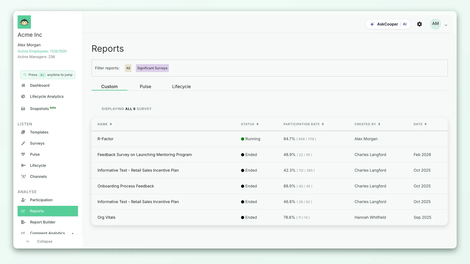
The breakdown lives on the eNPS summary card inside a survey report.
- 1Open a survey report - go to Analyse > Reports and open the survey you want to look at.
- 2Find the eNPS card - on the report's overview, eNPS appears as a summary card alongside your overall engagement score and participation, showing the current score (and a delta versus your previous survey, if one exists).
- 3Click VIEW BREAKDOWN - the small button with a bar-graph icon at the bottom of the eNPS card.
- 4Read the eNPS details view - a panel titled eNPS details opens with the rating chart and the counts. Close it when you're done to return to the report.
If a group is too small to report on, the eNPS value shows as a tilde ("~") and the VIEW BREAKDOWN button is hidden, because there's nothing meaningful (and nothing anonymity-safe) to display yet. More on that under Anonymity and the breakdown below.
Reading the breakdown chart
The heart of the details view is a bar chart. The horizontal axis is the eNPS rating (0 through 10) and the height of each bar is the number of employees who gave that rating. Each bar is colored by the group it belongs to, so you can read the shape of sentiment at a glance:
| Color | Rating | Group |
|---|---|---|
| Red | 0-6 | Detractors |
| Orange | 7-8 | Passives |
| Green | 9-10 | Promoters |
Hovering over a bar shows the exact count for that rating. The value is also printed on each column, so you don't have to guess heights.
Reading the chart is mostly about reading its shape:
- A tall green cluster at 9-10 means genuine advocacy. These are the people who'll refer friends and stay.
- A big orange block at 7-8 is your swing vote. Passives don't add to the score, but they're one good experience away from becoming Promoters and one bad one away from slipping to Detractors.
- Where the red sits matters. Bars concentrated at 5-6 are mildly dissatisfied people who are often recoverable. Bars at 0-2 point to a smaller group of deeply unhappy employees, and that's usually where the sharpest feedback lives.
The 6 (Detractor) and 7 (Passive) bars sit one point apart but land in different groups, and the same is true of 8 (Passive) and 9 (Promoter). If a lot of your responses are bunched right at those boundaries, small shifts in experience can move your headline score noticeably. That's a good thing to know before you set a target.
Reading the counts
Below the chart, the details view lists the numbers behind the score:
- Promoters - the count of employees who rated 9 or 10.
- Detractors - the count who rated 0 through 6.
- Answers - the total number of people who answered the eNPS question.
Passives aren't printed as their own line, but you can always recover them: Passives = Answers − Promoters − Detractors. They're the people who sit in the 7-8 bars on the chart.
These three figures are exactly what CultureMonkey uses to compute your score. The score is the share of Promoters minus the share of Detractors, both taken as a percentage of the total answers:
> eNPS = (Promoters ÷ Answers − Detractors ÷ Answers) × 100
A worked reading
Suppose the details view shows Answers: 200, Promoters: 120, Detractors: 30. You can read the whole picture straight off those numbers:
- Promoters are 120 ÷ 200 = 60%
- Detractors are 30 ÷ 200 = 15%
- Passives are 200 − 120 − 30 = 50 people, or 25%
- eNPS is 60% − 15% = +45
Now the +45 has a story. It's a genuinely strong result driven by a large Promoter base, with a healthy block of 50 Passives that represents your next opportunity. Move a chunk of those Passives up into Promoters and the score climbs without needing to "fix" anyone. That interpretation is only possible because you looked at the breakdown, not just the number. For a fuller walk-through of the calculation and what counts as a good score, see What is eNPS and how is it calculated?.
The details view shows you counts (Promoters, Detractors, Answers) rather than pre-computed percentages. Working the percentages out yourself, as above, is quick and makes the relationship between the groups obvious. The headline eNPS on the card is already rounded to a whole number for you.
Pair it with the follow-up comments
The breakdown tells you the shape of sentiment. It doesn't tell you why people feel that way. That's what the open-text follow-up is for.
If your eNPS question includes the optional comment prompt (something like "What's the main reason for your score?"), those responses are collected as anonymous feedback and are worth reading right next to the breakdown. A practical order of operations:
- 1Read the chart first - get the shape. Are your Detractors mild (5-6) or severe (0-2)? Is there a big Passive block?
- 2Open the feedback - go to Analyse > Feedback for the same survey to read the open-text comments, which stay anonymous.
- 3Match themes to groups - Detractor comments usually name the concrete problems (workload, a manager, pay, tools). Passive comments often reveal what's missing that would tip them into advocacy.
- 4Prioritize - a theme that shows up repeatedly in the comments and corresponds to a large bar on the chart is where your attention pays off most.
The breakdown quantifies the problem; the comments explain it. A score of +10 with a wall of Detractor comments about one specific issue is a far clearer call to action than the number alone would ever be. Always read the two together before drawing conclusions.
The follow-up comment never changes the score. eNPS is calculated purely from the 0-10 rating. The comment is context, and it's the most valuable context you have.
Going deeper by segment
A company-wide breakdown can hide a struggling team inside a healthy average. Once you've read the overall split, the natural next move is to see how it differs across your organization.
To slice eNPS by team, location, manager or any custom attribute, use the demographic view rather than the single breakdown panel. That's where you can compare the Promoter and Detractor mix side by side across groups and find exactly where advocacy is strong and where it needs attention. See View eNPS by demographic for how to filter and compare.
The breakdown and the demographic view work as a pair: the breakdown tells you the shape of the whole, and the demographic view tells you where that shape comes from.
Anonymity and the breakdown
Like every result in CultureMonkey, the eNPS breakdown is protected by an anonymity threshold. If the group behind a report is smaller than the threshold (by default, 5 respondents), the eNPS value is suppressed. On the card, the score shows as a tilde ("~") and the VIEW BREAKDOWN button doesn't appear, because a breakdown of a handful of people could reveal an individual's answer.
This is expected behavior, not a bug. It most often shows up on very small surveys, on newly launched surveys that haven't gathered enough responses yet, or when a filter has narrowed the population too far. If the breakdown looks empty or the score is a tilde, the usual fixes are to wait for more responses, widen the filter, or check that the survey actually included the eNPS question. If you're unsure why results aren't showing, see Why can't I see results yet?.
Frequently asked questions
Where exactly is the VIEW BREAKDOWN button?
On a survey report, the eNPS summary card (next to your overall score and participation) has a small bar-graph button labeled VIEW BREAKDOWN at the bottom. Clicking it opens the eNPS details view with the chart and counts.
Why don't I see a Passives count in the details view?
The details view lists Promoters, Detractors and total Answers. Passives aren't printed as a separate line, but they're the 7-8 bars on the chart, and you can calculate them as Answers minus Promoters minus Detractors.
Why is the eNPS score showing as a tilde ("~")?
That means the group is below the anonymity threshold (5 respondents by default), so CultureMonkey suppresses the score to protect individual responses. The VIEW BREAKDOWN button is hidden in that case. Wait for more responses or widen your filter. See Why can't I see results yet?.
Can I see the breakdown for just one team or location?
Not from the single breakdown panel, which shows the whole reported population. To compare the Promoter, Passive and Detractor mix across teams, locations or managers, use View eNPS by demographic.
Does reading the follow-up comment change the score?
No. CultureMonkey calculates the score only from the 0-10 ratings. The open-text follow-up is anonymous context that helps you understand the "why" behind the breakdown, but it never affects the number.
The chart has a bar at almost every rating - is that normal?
Yes. The chart shows one bar for each rating from 0 to 10, so a spread across the scale is normal and healthy to see. What matters is the shape: where the tall bars are, and whether they sit in the green, orange or red bands.
Where to go next
- Understand the number itself: What is eNPS and how is it calculated?
- Compare across the org: View eNPS by demographic
- Set up or reword the question: Set up your eNPS question
- No score showing? Why can't I see results yet?
Your feedback helps us improve the Help Center.