

View eNPS by demographic and over time in CultureMonkey
How to slice your Employee Net Promoter Score by team, location, manager, or any custom attribute, watch it trend across survey cycles, and read the segmented numbers correctly - including how the anonymity threshold decides what you can see.
On this page
A single company-wide eNPS is a useful headline, but it's an average, and averages hide as much as they reveal. A healthy +38 for the whole organization can sit on top of a sales team at +5 and an engineering team at +60. The number only becomes actionable once you cut it two ways: across groups (which teams, locations, or managers are strong, and which need attention) and across time (is advocacy climbing or slipping cycle over cycle). CultureMonkey lets you cut eNPS both ways, by any employee attribute you have loaded and across survey cycles.
This guide covers both. You'll learn how to group eNPS by any demographic, how to read the segmented figures without over-reading small differences, how to follow the over-time trend, and how the anonymity threshold quietly decides which segments you're allowed to see.
CultureMonkey calculates eNPS the same way for every slice: (% Promoters − % Detractors) over the people in that slice. Group it by team, location, manager, business unit, or a custom attribute to compare segments, and use the over-time trend to watch the number move across cycles. Any segment with fewer respondents than your account's anonymity threshold (default 5) is hidden, so nobody's individual answer can be inferred.
Two ways to slice eNPS
Every eNPS view in CultureMonkey is built from the same raw ingredient: each respondent's 0-10 rating, sorted into Promoters (9-10), Passives (7-8), and Detractors (0-6). What changes is how you group those ratings before the math runs.
- By demographic (segmentation). Split one survey's respondents into groups - by team, location, reporting manager, business unit, or any custom attribute you sync - and calculate a separate eNPS for each group. This answers where advocacy is strong or weak right now.
- Over time (trend). Hold the population roughly constant and calculate eNPS for each period - month, quarter, or year - so you can see the direction of travel. This answers whether things are getting better or worse.
The two combine. You can look at how a single team's eNPS has moved over the last four quarters, which is often the most revealing view of all: it tells you not just that a segment is low, but whether your interventions there are working.
Where to find these views
Both live inside Analyse → Reports. Open the survey you want to analyze, then find the eNPS section of the report.
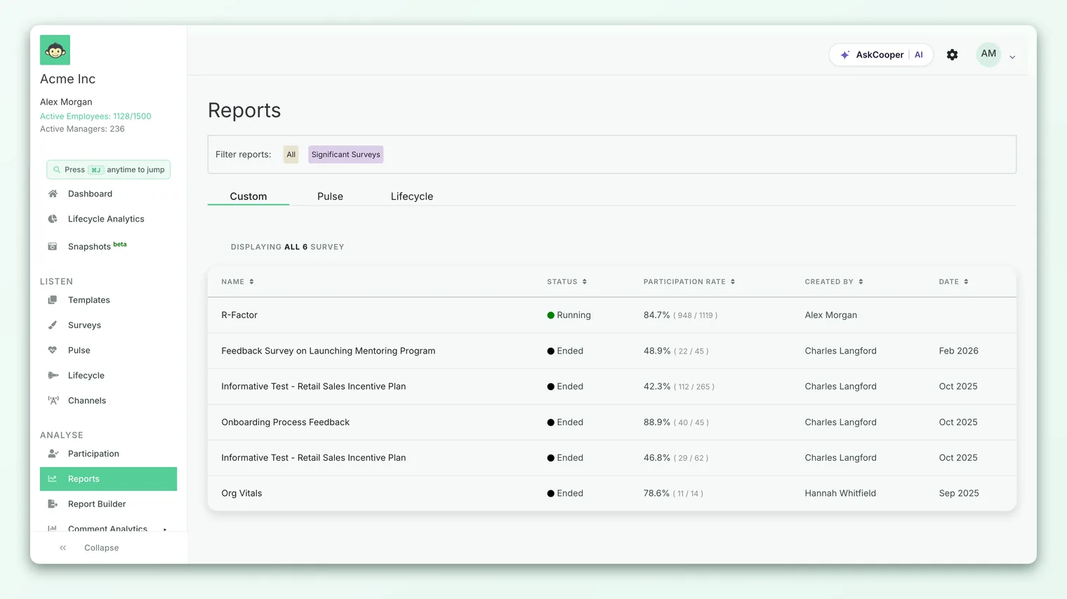
From the eNPS card you have a few moves:
- 1See the breakdown first - open the Promoter/Passive/Detractor split behind the headline before you segment, so you know what you're slicing. See View the eNPS breakdown.
- 2Group by a demographic - choose an attribute (team, location, manager, business unit, or custom) to get one eNPS row per group.
- 3Open the over-time trend - switch to the trend view to plot eNPS by month, quarter, or year across cycles.
- 4Read the reasons - if you included the open-text follow-up, pair the segmented scores with the comments from those same groups.
Grouping eNPS by demographic
Choosing a demographic tells CultureMonkey which attribute to group respondents by. The platform then runs the standard eNPS formula independently inside each group and lists the results so you can compare them side by side.
The attributes you can group by come from the demographics attached to your employees:
| Group by | What it compares | Typical use |
|---|---|---|
| Team | Advocacy team by team | Find which teams are thriving and which are struggling |
| Location / office | Advocacy across sites or regions | Spot geographic patterns after a policy or leadership change |
| Reporting manager | Advocacy under each people-manager | See where manager quality is lifting or dragging sentiment |
| Business unit / department | Advocacy across larger org divisions | Roll up to a leadership-level view |
| Custom attribute | Any dimension you sync (tenure band, job level, shift, employment type) | Slice by whatever matters to your org |
Under the hood, every one of these runs the same calculation. For a given group, CultureMonkey computes:
> eNPS = (Promoters − Detractors) ÷ (Promoters + Passives + Detractors) × 100
That's the exact formula used for your overall score, applied to just the people in that segment. Because Passives sit in the denominator but not the numerator, a group with lots of "fine, not enthusiastic" 7s and 8s will show a lower eNPS than a group of the same size with more decisive 9s, even if nobody in either group is unhappy.
You can only group by an attribute that exists on your employee records. If you want to slice eNPS by tenure band, job level, or shift, make sure that field is populated for your people (via your HRIS sync or employee upload) before the survey runs. Attributes that aren't set simply won't appear as grouping options. See Group scores by demographic for how demographics flow through every report.
A worked example
Suppose your company-wide eNPS on a survey is +30. You group by team and see:
| Team | Respondents | Promoters | Detractors | eNPS |
|---|---|---|---|---|
| Product | 40 | 26 (65%) | 4 (10%) | +55 |
| Customer Success | 32 | 18 (56%) | 6 (19%) | +37 |
| Sales | 28 | 9 (32%) | 12 (43%) | −11 |
| Operations | 3 | - | - | Hidden |
The headline +30 was masking a real problem. Product and Customer Success are healthy, but Sales is in negative territory, with more detractors than promoters. That's where your open-text feedback and driver scores deserve the closest read. Operations is hidden because it has too few respondents to meet the anonymity threshold (more on that below), so you can't and shouldn't try to infer its score.
This is the whole point of segmentation: the average told you almost nothing, but the split told you exactly where to look.
Reading the segmented figures correctly
Comparing eNPS across groups is genuinely useful, but a few habits keep you from drawing the wrong conclusion.
- Weight your attention by size. A +70 from a 6-person team and a +70 from a 200-person division are not equally solid. Small groups swing hard: one person moving from a 9 to a 6 can shift a tiny team's eNPS by double digits. Treat small-group scores as directional, not precise.
- Mind the boundaries. eNPS is unusually sensitive because a 6 (detractor) and a 7 (passive) are one point apart but land in different buckets. A segment can look worse than a neighbor mostly because a handful of people landed on 6 instead of 7. Always glance at the underlying Promoter/Passive/Detractor split, not just the final number.
- Compare like with like. A team surveyed right after a reorg will read differently from one surveyed in a calm quarter. When you compare segments, remember they may be living through different moments.
- Look for spread, then dig. The value of the segmented view is the range between your highest and lowest groups. A tight cluster means your experience is consistent; a wide spread points you straight at the outliers to investigate.
It's tempting to turn a manager-grouped eNPS into a leaderboard, but that's exactly the pressure that makes people game the number. A manager of a small, tenured team and a manager of a large, fast-growing one aren't on a level field. Use the segmentation to start conversations, not to score people.
Watching eNPS over time
The trend view answers the question a single score never can: is this getting better? CultureMonkey buckets responses by submission date and calculates a fresh eNPS for each period, then plots them as a line so you can read the direction at a glance.
You can view the trend at three granularities:
| Interval | Best for |
|---|---|
| Month | Frequent pulse cadences, or watching a recent intervention take hold |
| Quarter | The most common view - smooths out noise while still showing movement |
| Year | Long-run direction and board-level reporting |
A few things to keep in mind when reading the line:
- Trend beats level. A +15 that has climbed steadily for a year is a healthier signal than a static +40. Consistent improvement is the real win, and it's the best evidence that your action plans are landing.
- Expect some jitter. eNPS is a difference of two percentages, so it bounces around a little between periods even when nothing fundamental has changed. Read the slope over several points, not the gap between two.
- Watch who's in each period. If your respondent population changes a lot between cycles (a big hire wave, a divestiture), part of a shift in the line can come from who answered, not from a change in sentiment. Pair a surprising move with participation and headcount context.
- Combine trend with segments. The most powerful diagnostic is a single segment's trend over time. If Sales was −11 last quarter and you ran targeted action plans, the Sales-only trend line tells you whether it's working. For a broader look at how eNPS and engagement move together, see Engagement and eNPS trends over time.
How the anonymity threshold applies
Anonymity isn't an afterthought layered on top of these views - it's built into the query that produces them. When CultureMonkey groups eNPS by demographic or by period, it counts the distinct respondents in each bucket and only surfaces the bucket if that count meets your account's anonymity threshold. Any group below the threshold is dropped from the results entirely.
The threshold is an Account Admin setting, the dashboard anonymity threshold, and defaults to 5 distinct respondents. It can't be set to zero or a negative value; if it ever is left blank, the system falls back to the default of 5, so a single-respondent group can never leak through.
This is why, in the worked example above, the 3-person Operations team showed as hidden rather than as a number. It's working exactly as intended: with only three people, revealing a group eNPS could let someone back into an individual's rating.
A few practical consequences:
- Narrow slices disappear first. The more finely you segment (say, "Sales team, London office, night shift"), the smaller each resulting group, and the more likely it falls below the threshold and drops out. If a breakdown looks sparse, that's usually why.
- The company total still counts hidden groups. A group being hidden from the breakdown doesn't remove those responses from your overall eNPS. Everyone who answered still contributes to the headline number; anonymity only governs what's shown at the segment level.
- It applies to time buckets too. A month with only a couple of responses in a small segment can be suppressed for the same reason, which is one more argument for viewing sparse data at the quarter or year level.
An empty or partial breakdown almost always means a segment is below the anonymity threshold, not that something failed. This is expected, protective behavior. If a whole report looks empty, that's a different situation - see Why can't I see results yet?.
Best practices
- Start with the spread, not the average. Open the segmented view early. The range between your best and worst groups tells you where to spend your energy.
- Pair every low segment with its comments. A low group eNPS is a question, not an answer. The open-text feedback from that same group is where the "why" lives.
- Follow segments through time, not just at a point. The single most useful view is a struggling segment's trend across cycles. It's the only way to know if your fixes are working.
- Keep your slices wide enough to be visible. If you routinely lose segments to the anonymity threshold, group at a coarser level (team instead of sub-team, region instead of office) so you actually get numbers to act on.
- Don't over-read one-point differences. Because of the 6-versus-7 boundary, small gaps between segments can be noise. Look at the underlying split before you conclude one group is meaningfully behind another.
Frequently asked questions
Why is a segment's eNPS not showing?
The most common reason is the anonymity threshold: the group has fewer distinct respondents than your account requires (default 5), so CultureMonkey hides it to protect individuals. Broaden the grouping (for example, group by team rather than sub-team) so more people fall into each bucket.
Does hiding a small group change my overall eNPS?
No. Everyone who responded is included in the company-wide number. The anonymity threshold only controls what's displayed at the segment level; it never removes responses from the overall calculation.
Can I group by two attributes at once?
The standard eNPS card groups by one attribute at a time. For a two-dimensional cut (for example, eNPS by location and job level in one table), CultureMonkey offers a dedicated NPS report export where you can pick two dimensions. Availability depends on your plan.
What time interval should I use for the trend?
Quarter is the most common default: it smooths out the natural jitter in eNPS while still showing real movement. Use month if you survey frequently and want to catch a recent change quickly, and year for long-run, board-level reporting.
Why does a small team's eNPS jump around so much between cycles?
Because eNPS is a difference of percentages over a small base, one person changing their answer can move a small group's score by a lot. Treat small-group and short-interval scores as directional, and read the trend over several points rather than reacting to a single swing.
Can managers see eNPS for just their team?
Yes, managers can view their own team's eNPS and segment it further, as long as each resulting group still meets the anonymity threshold. Some accounts add extra anonymity checks specifically for the manager dashboard.
Where to go next
- See what's behind the number: View the eNPS breakdown
- How demographics flow through every report: Group scores by demographic
- Watch the bigger trend: Engagement and eNPS trends over time
Your feedback helps us improve the Help Center.