

Report data looks wrong or incomplete
The usual reasons a report seems to show the wrong numbers, missing groups, or too few responses - anonymity suppression, an excluded survey, an active filter, data still indexing, the scale it's displayed on, and demographic mapping gaps - and how to check each one.
On this page
- First, confirm what you're actually looking at
- Cause 1: Anonymity is hiding a group
- Cause 2: A survey is excluded from the Dashboard
- Cause 3: A filter is quietly re-scoping everything
- Cause 4: The data is still indexing
- Cause 5: You're reading the number on the wrong scale
- Cause 6: Demographic mapping gaps
- A quick diagnostic checklist
- Best practices to avoid confusing reports
- Frequently asked questions
- Where to go next
You open a report expecting one thing and see another. A team you know responded is missing. The overall score looks lower than last cycle for no obvious reason. A number reads 4.1 when you were sure it was on a 10-point scale. The participation count doesn't match how many people you invited. It's unsettling, because a report you can't trust is a report you can't act on.
The good news: in almost every case, the data is correct and something about how it's being scoped, counted, or displayed is the real story. This guide walks through the handful of causes behind nearly every "this looks wrong" moment - anonymity suppression, a survey excluded from the Dashboard, an active filter, data that's still indexing, the scale the numbers are shown on, and gaps in how employees are mapped to demographics - and gives you a quick way to check each one.
Before assuming a bug in CultureMonkey, ask three questions in order: Am I looking at the right population? (filters, anonymity, excluded surveys), has the data finished processing? (indexing lag right after responses land), and am I reading the number on the scale I think I am? (5, 10, or percentage). Nine times out of ten, one of those explains it.
First, confirm what you're actually looking at
Most "wrong data" reports are really "unexpected scope" reports. Before anything else, get clear on the exact view in front of you.
- Which survey (or the Dashboard)? A single survey report and the rolled-up Dashboard answer different questions. The Dashboard blends many surveys; a report shows one.
- Any filters applied? Check the filter controls at the top of the report. A single active filter re-scopes every number on the page.
- Which segment or grouping? A driver score for one team is not the company-wide driver score.
- How recently did responses arrive? Very recent activity may not have finished processing yet.
Once you know precisely which population and which moment you're looking at, the causes below become easy to match.
Cause 1: Anonymity is hiding a group
This is the single most common reason a report looks "incomplete." A team you know responded shows nothing, an eNPS card is blank, or a whole filtered view comes back empty. That is almost always anonymity suppression, and it's the platform working exactly as designed.
Every anonymous survey carries a minimum-response threshold, floored at 3 for anonymous surveys and often set higher. No score, breakdown, comment, or participation figure is ever shown for a group smaller than that threshold. The rule is applied twice: once to the report as a whole, and again independently to every demographic slice - each team, location, manager, and every combination of them. So a small sub-team hidden inside a perfectly healthy company-wide number is expected: the parent shows, the tiny child doesn't.
The tell-tale sign is that the broad view works and the narrow one doesn't. If your overall report is full of numbers but "Location: Austin, Tenure: under 1 year" is blank, you've almost certainly landed on a group below the threshold, not a data problem.
Widen the view. Remove a filter, or roll a team up to its parent. If the numbers reappear as the group gets bigger, you were below the anonymity threshold. That's the fix, too: get more responses into the group, or look at a broader slice. See Why can't I see results yet? and How anonymity works.
One nuance worth knowing: with the anonymity-by-submission setting on, the count compared against the threshold is actual responders, not invited participants. A ten-person team where only two people replied is treated as a group of two and stays hidden, even though ten were invited. If a well-staffed team shows nothing, check whether few people have actually submitted.
Cause 2: A survey is excluded from the Dashboard
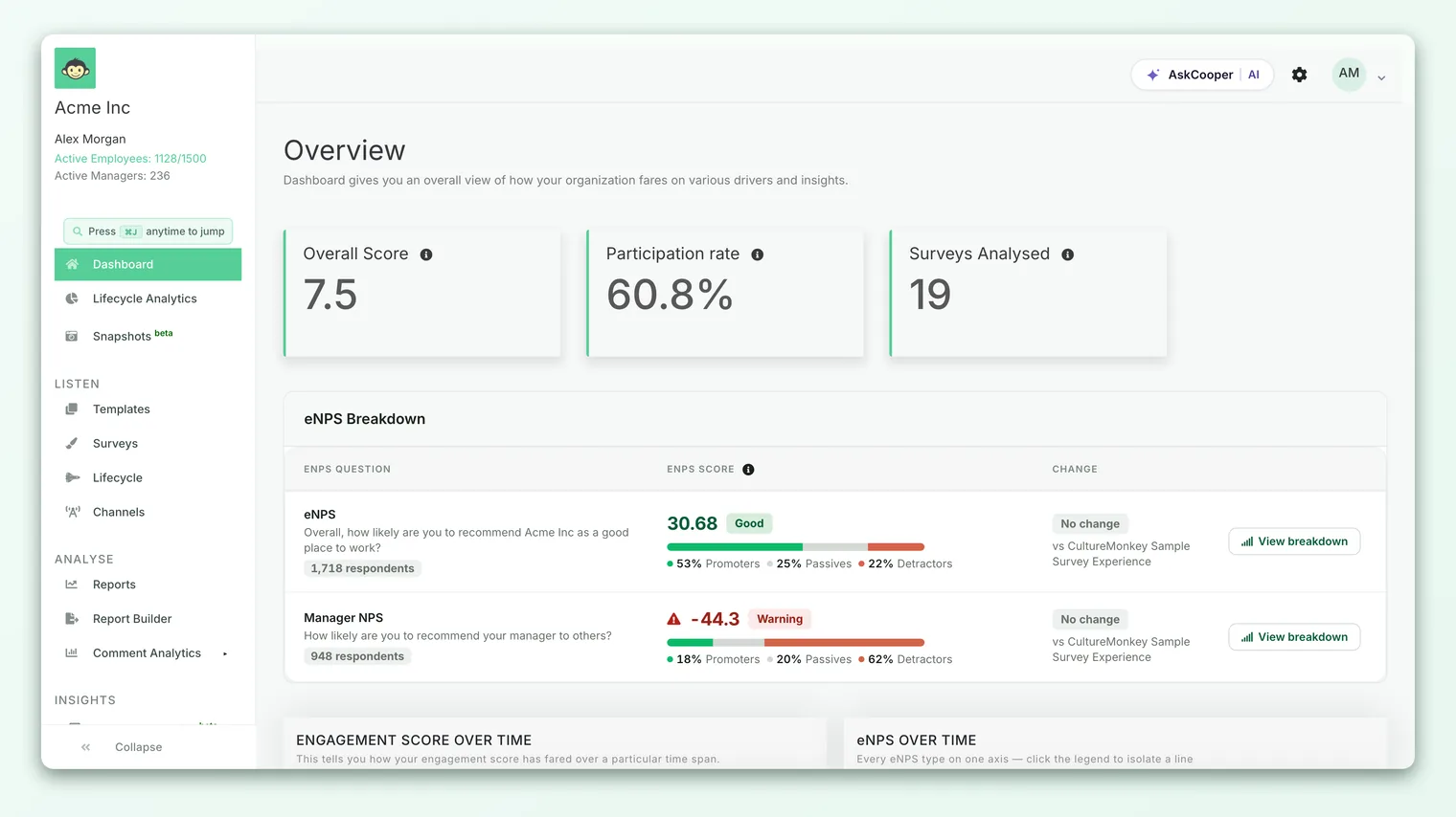
If the Dashboard numbers look off but an individual survey's own report looks fine, a dashboard exclusion is a likely culprit - in either direction.
Dashboard survey exclusions let an admin keep specific surveys out of the rolled-up totals: the overall score, combined eNPS, participation, and driver trends. Excluded surveys are filtered out of the queries that build the Dashboard, so their responses never reach the aggregated figures. Crucially, this changes the Dashboard only. The excluded survey still exists and its own report still shows every response.
This cuts two ways when data looks wrong:
- A survey you expected to see reflected is missing from the rollup. It may have been excluded (a common choice for test runs, demos, and one-off pulses). Its own report is intact; it's just not folded into the headline.
- The Dashboard number moved and nobody knows why. Excluding or re-including a survey recalculates the rollup, sometimes noticeably. If a stakeholder asks why the overall score shifted, an exclusion change is a good first thing to check.
The distinction to hold on to: exclusion affects metrics that combine surveys. It never changes any single survey's own numbers, because those were never an average across surveys to begin with. To review or change the excluded set, see Exclude specific surveys from your Dashboard.
Cause 3: A filter is quietly re-scoping everything
A filter is the easiest way to convince yourself a report is wrong. Apply one, forget it's there, and every score, driver, and comment on the page now reflects a subset of employees rather than the whole organization.
When you filter, CultureMonkey rebuilds the report from scratch using only responses from matching employees. This is a genuine re-scope, not a highlight: the overall score, eNPS, participation rate, and every driver are recalculated against the filtered population. So a filtered engagement score of 6.8 sitting under a company-wide 7.4 isn't a discrepancy - it's two honestly calculated numbers about two different groups.
Two filter behaviors explain most confusion:
- A filtered view can go empty while the unfiltered one is full. Filtering narrows the population toward the anonymity threshold, so a tight filter can select real people yet show nothing because the group is too small to display.
- Stacked filters shrink fast. Across different attributes, filters combine with AND, so each attribute you add makes the group smaller. "Sales team AND Berlin AND under-1-year tenure" can collapse to a handful of people, or none.
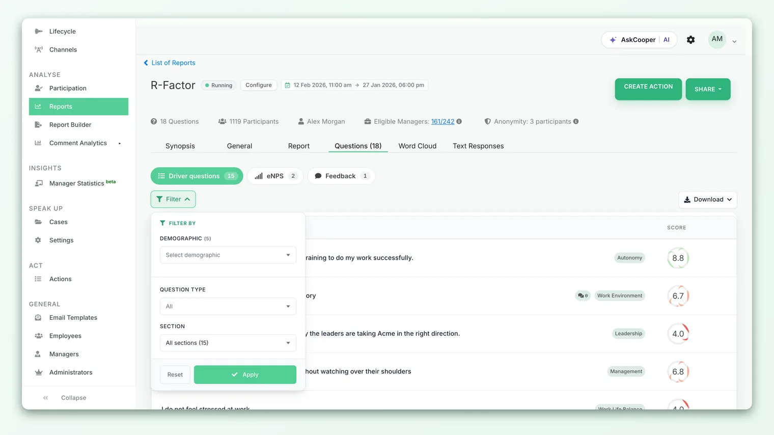
The view changed far more often than the data did. Check the filter controls first. Clear every filter (or set each attribute back to "All") and confirm whether the numbers return to what you expected. See Filter reports by demographic and attributes.
Cause 4: The data is still indexing
Reports in CultureMonkey aren't read straight off the raw response table. Responses are indexed into a fast analytics layer that powers scores, breakdowns, heatmaps, and trends. When responses land - or when a survey's participants are re-synced - a background job re-indexes that data before it shows up in reports.
That means there's a normal, short lag between "a response arrived" (or "an employee's team was corrected") and "the report reflects it." During that window, counts can look slightly low, a just-submitted response may not appear, or a demographic correction you made a minute ago may not yet be grouped the new way. This isn't data loss - it's processing that hasn't caught up.
You'll most often notice indexing lag in three situations:
- Right after launch or a reminder. A wave of responses is still being indexed, so the participation count and scores climb over minutes, not instantly.
- Just after re-importing or re-mapping employees. Changing someone's team, manager, or a custom attribute triggers a re-index of that survey's participants before the new grouping appears in reports.
- Immediately after closing a survey. The final responses need a moment to settle into the report.
If numbers look a little low right after activity, give it a few minutes and reload the report. If a large group has had plenty of responses for a while and still looks wrong, indexing lag is no longer a likely explanation - move on to the other causes, and if it persists, note the survey name and view for support.
Cause 5: You're reading the number on the wrong scale
A score that "looks wrong" is sometimes exactly right, just shown on a scale you weren't expecting. CultureMonkey can display engagement scores in three ways, set at the account level:
| Display setting | Scores shown as | A "good" score looks like |
|---|---|---|
| Out of 5 | 0 to 5 | 4.1 |
| Out of 10 (default) | 0 to 10 | 8.2 |
| Percentage | 0 to 100 | 82% |
The underlying sentiment is the same; only the presentation differs. An account set to display out of 5 will show 4.1 where an out-of-10 account shows 8.2 - identical results, different scale. If a number looks unexpectedly small (or large) compared to what a colleague sees or what you remember, confirm which scale your account is on before concluding anything is off.
Two related things to keep straight:
- eNPS is not on this scale. eNPS is always a score from −100 to +100, calculated as % promoters minus % detractors. It is not shown out of 5, 10, or 100, so don't compare it to a driver score directly. See What is eNPS and how is it calculated?.
- Percentage display is not participation. A driver shown as "82%" on a percentage account is a sentiment score, not "82% of people responded." Participation rate is a separate figure. Reading one as the other is a classic source of confusion.
Cause 6: Demographic mapping gaps
If a group looks smaller than it should, or people land in an "Unassigned" bucket, the issue is usually in the employee data, not the report. Reports group people by the demographics on their employee records: team, location, manager, tenure, and any custom attributes you imported. When those fields are missing or inconsistent, the grouping reflects the gap.
Common mapping gaps that make a report look incomplete:
- Employees with no team or location. People whose team or location field is blank don't join any of those groups. They still count toward company-wide totals, but they fall into an Unassigned bucket (you'll see options like "All (Includes Unassigned)") rather than a named team, which can make a specific team look short.
- Inconsistent values. "Sales" and "sales team" or "NYC" and "New York" are treated as different groups. Responses split across near-duplicate values, so each group looks smaller than the real headcount.
- A custom attribute mapped to too few people. An attribute only appears as a filter or grouping option when at least three employees share a value. A custom field filled in for one or two people simply won't show up as a slice.
- Manager or reporting-line gaps. If a manager relationship wasn't imported, that manager's rollup won't include the affected reportees.
- 1Spot the gap - if a team or segment looks short, or an "Unassigned" group is unexpectedly large, that's your signal to check the employee data behind it.
- 2Check the employee records - open the affected employees and confirm their team, location, manager, and relevant custom attributes are filled in and spelled consistently.
- 3Fix at the source - correct the values (or re-import from your HRIS with clean data). Field mapping during import is where most of these gaps originate.
- 4Let it re-index - after you correct and save, the survey's participants re-index before the new grouping appears in reports, so allow a short moment before re-checking.
Because grouping is only ever as good as the employee data feeding it, keeping team, location, and manager fields clean at import time prevents most of these surprises. See Filter reports by demographic and attributes for how attributes drive both filtering and grouping.
A quick diagnostic checklist
When a report looks wrong, run through these in order. The first "yes" is usually your answer.
| Symptom | Most likely cause | Quick check |
|---|---|---|
| A known team or slice shows nothing | Anonymity suppression | Widen the view; does it reappear? |
| Dashboard number off, but the survey report is fine | Survey excluded from Dashboard | Check Manage Survey Visibility |
| Every number changed vs. yesterday | An active filter | Clear all filters and compare |
| Counts slightly low right after activity | Data still indexing | Wait a few minutes, refresh |
| A score looks too small or too large | Scale display (5 / 10 / %) | Confirm your account's scale |
| A group looks short or "Unassigned" is big | Demographic mapping gap | Check employee team/location fields |
| eNPS doesn't match a driver score | Different metric and scale | eNPS is −100 to +100, not out of 10 |
If you've worked through all of these and a genuinely large, fully responded, correctly mapped group still shows numbers that don't add up, that's the point to contact support with the survey name and the exact view you're looking at.
Best practices to avoid confusing reports
- Always note your scope. Before reading a number, know which survey (or the Dashboard), which filters, and which segment you're on. Most "wrong data" is really "different scope."
- Clear filters between questions. Get in the habit of resetting filters when you switch what you're investigating, so a leftover filter doesn't skew the next answer.
- Exclude test and demo surveys early. Keep trial runs out of the Dashboard from the start, so they never quietly move your headline numbers. See Exclude specific surveys from your Dashboard.
- Keep employee data clean. Consistent team, location, and manager values at import time prevent split groups and oversized "Unassigned" buckets.
- Give fresh data a moment. Right after launch, reminders, or a re-import, let indexing catch up before drawing conclusions from the counts.
- Read the trend, not just the number. A single figure that looks off is far less meaningful than a consistent movement across cycles.
Frequently asked questions
A team I know responded shows no data. Is the report broken?
Almost never. This is anonymity suppression: the group is below the minimum-response threshold (3 by default, often higher), so CultureMonkey hides its results to protect individuals. Widen the view or roll the team up to its parent and the data usually reappears. See Why can't I see results yet?.
My overall score dropped and nothing seemed to change. What happened?
Check three things: whether a filter is applied (re-scoping the whole report), whether a survey was recently excluded from or re-included in the Dashboard (which recalculates the rollup), and whether new responses simply shifted a real average. All three can move a headline number without anything being "wrong."
The participation count doesn't match how many people I invited. Why?
Usually one of two reasons. Either responses are still indexing right after activity and the count is catching up, or you're looking at a filtered or grouped view that counts only a subset. Confirm you're on the unfiltered report and give recent activity a few minutes.
A score reads 4.2 but I expected something around 8. Is that a bug?
No - your account is likely set to display scores out of 5 rather than out of 10. The sentiment is the same; only the scale differs. Confirm which scale your account uses. Note that eNPS is separate again, always on a −100 to +100 scale.
Some employees show up as "Unassigned." How do I fix that?
Those employees are missing the demographic field you're grouping by (team, location, and so on) on their records. Fill in and standardize the field on the employee record or your next import, then let the survey re-index. Consistent values also prevent near-duplicate groups like "NYC" and "New York" splitting your data.
I just corrected an employee's team, but the report hasn't updated. Do I need to do anything?
No action needed - just a short wait. Changing an employee's team, manager, or attributes triggers a background re-index of that survey's participants before the new grouping appears in CultureMonkey reports. Refresh the report after a few minutes.
Where to go next
- A blank or greyed-out report: Why can't I see results yet?
- Dashboard numbers that seem off: Exclude specific surveys from your Dashboard
- Scoping a report to the right people: Filter reports by demographic and attributes
- The mechanics behind hidden groups: How anonymity works
Your feedback helps us improve the Help Center.