

View the report summary
How to read the summary of a survey report in CultureMonkey - participation and response counts, the headline engagement and eNPS scores, feedback and sentiment stats, and where to go for the full detail.
On this page
Every survey report in CultureMonkey opens with a summary: a fast, scannable overview of how the survey performed before you dive into the detail. It answers the first questions anyone asks when a survey closes. How many people responded? Where does engagement stand? What is the eNPS? Is the feedback mostly positive or negative?
This guide walks through the summary of a report end to end: the key stats and participation counts, the headline scores, the feedback and sentiment call-outs, and how to move from the summary into the deeper views when you want the full story.
The Summary tab of a CultureMonkey report shows the "vital signs" of a survey: emails sent, responses received and missed, the participation rate, bounce rate, average response time, and a feedback snapshot with overall sentiment. The Report tab adds the headline scorecards - Overall Score (or Engagement Score), Participation Rate, and eNPS. Read the summary first, then drill in.
Where the summary lives
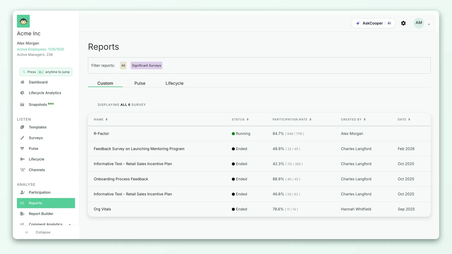
Open any report from Analyse - Reports and click the survey you want. A row of tabs runs across the top of the report:
- Summary (labeled General when the AI Synopsis is switched on) - the participation and feedback overview this article focuses on.
- Report - the headline scorecards, participation-over-time chart, and the driver heatmap.
- Questions, Word Cloud, Text Responses (or Feedback), Benchmark, and, where enabled, eNPS Benchmark and Insights.
Just above the tabs, a compact meta bar always tells you the essentials at a glance: the survey status (Running, Completed, and so on), the number of questions, the number of participants, the run dates, and who created it. That strip is your quickest orientation before you read anything else.
Key stats: who got it and who answered
On the left of the Summary tab sits the Key Stats card. It is the plain-numbers account of what happened when the survey went out:
- Emails sent - how many invitations were delivered for this survey. For a QR-only survey there is no invitation, so this line is replaced with a note that it is a QR-Only Survey (No Launch or Reminder Notifications).
- Clicks on survey link - how many people opened the survey (shown only when there is at least one click).
- Employees responded - the count of people who submitted their answers.
- Employees didn't respond - the count who were invited but haven't submitted yet.
Read together, these four lines tell you the shape of your response funnel: invited, opened, submitted, and still outstanding. If a large group clicked but few submitted, that points to a survey that felt too long or unclear. If few clicked at all, the issue is reach or timing rather than the survey itself.
If the survey is still running and you have the right access, a Boost Participation Rate link appears next to the participation number. It opens a per-manager view of who has and hasn't responded, so you can nudge the teams that are lagging. See Track participation for the full workflow.
The participation rate
The Participation Rate is the headline of the summary: the percentage of invited employees who submitted a response. It sits in its own card with a thin progress bar underneath, and a helper line reading Emails sent Vs Employees responded (or Participants vs Submissions for a QR-only survey) so you always know exactly what the percentage is measuring.
Participation is the number to check first, because it governs how much you can trust everything else. A 90% participation rate means the scores below it represent almost everyone. A 20% rate means they represent a self-selected slice, and you should read the other numbers with more caution.
There is no single "good" participation rate, but a useful rule of thumb is that a mature engagement program often lands in the 70-90% range, while a first survey or a brand-new pulse cadence may start lower and climb as trust builds. What matters most is the direction of travel over successive surveys.
Bounce rate and average response time
Two smaller cards sit beneath participation and describe the quality of the response experience:
| Card | What it measures | How to read it |
|---|---|---|
| Bounce Rate | The ratio of employees who viewed the survey but didn't answer it | A high bounce rate means people opened the survey and left. Look at length, timing, and the opening question. |
| Average Response Time | The average time employees took to complete the survey | Very long times can signal a survey that felt heavy; very short ones can hint at rushed, low-quality answers. |
If there isn't enough data yet (for example, no one has clicked the link, so a bounce rate can't be computed), the card shows We don't have sufficient data rather than a misleading zero. That is expected on a survey that has only just launched.
Several summary cards are computed live from responses. Early in a survey's life you'll see "insufficient data" placeholders that resolve into real numbers as people respond. This isn't an error - it's the report waiting for enough signal to be meaningful.
The feedback snapshot
If the survey collected open-text feedback, the Summary tab adds a Feedback Distribution section. It shows a pie chart splitting every comment into Positive, Neutral, and Negative buckets, alongside a Total Feedback Count. Beneath it, an Average Feedback Sentiment gauge plots the mean sentiment of all comments on a scale that runs from -1 (most negative) to +1 (most positive).
This is your fastest read on the mood behind the scores. Two surveys can share the same engagement number while one is full of constructive, hopeful comments and the other full of frustration. The sentiment gauge surfaces that difference immediately, and the distribution tells you whether a handful of strong opinions or a broad pattern is driving it.
The feedback snapshot respects access rules. It is shown to admins and in shareable report links, but it is hidden for manager logins when your account has chosen to keep free-text feedback away from managers. If you expected the feedback cards and don't see them, that account-level setting is the likely reason.
The headline scores
The summary of the survey's outcomes - the scores leaders care about most - lives at the top of the Report tab, as a row of scorecards. There are three of them:
| Scorecard | What it answers | Notes |
|---|---|---|
| Overall Score (or Engagement Score) | How engaged are people across every driver? | Shown as a 0-10 index by default, or as a percentage if your account displays scores that way. Carries a delta "since last survey". |
| Participation Rate | What share of invited employees responded? | Carries a delta "from previous survey" so you can see whether reach is improving. |
| eNPS | On balance, would people recommend you as an employer? | A score from -100 to +100, with a View Breakdown link into the Promoters, Passives, and Detractors split. |
Each score card that supports comparison shows a small up or down arrow with a percentage and the words increase or decrease, so you can see the movement since the last survey at a glance. A rising arrow next to a healthy absolute number is the story you want; a high number that is trending down is a prompt to look closer.
For the full meaning of the engagement index and how it is built from your driver questions, see Understand the overall engagement score. For how the eNPS number itself is calculated, see What is eNPS and how is it calculated?.
A score card displays a dash or a tilde when there isn't enough data to compute it, or when a group is too small to meet the survey's anonymity threshold. eNPS in particular shows ~ until enough people have answered the recommendation question. This protects individual responses and is expected, not a fault.
Strengths and areas to focus on
The summary gives you the headline; the driver scores tell you which parts of the employee experience are pulling it up or dragging it down. On the Report tab, below the scorecards, the driver heatmap breaks the overall score into its individual engagement drivers and, where you have segments, into teams, locations, and other attributes.
Reading it as a strengths-and-weaknesses map is straightforward: the highest-scoring drivers are what your organization is doing well, and the lowest-scoring drivers are where attention will move the needle most. Colour coding makes the outliers jump out, so you can spot a struggling team inside an otherwise healthy company-wide average. For managers, CultureMonkey surfaces a similar view on the manager dashboard as My strengths and Focus areas.
The practical loop is: read the summary to see whether something needs attention, then use the driver heatmap to see what and where, then open What the report sections mean to work through each part of the report in order.
A worked read of a summary
Suppose you open the summary for a just-closed quarterly survey and see:
- Emails sent: 480, Employees responded: 372, Participation Rate: 78%
- Bounce Rate: 12%, Average Response Time: 4 minutes
- Total Feedback: 210 comments, sentiment +0.3
- On the Report tab: Overall Score 7.9 (up 3% since last survey), eNPS +32 (View Breakdown)
Here is how to read it in one pass. Participation at 78% is solid, so the scores are trustworthy. A 12% bounce rate is modest, and a four-minute response time is comfortable, so the survey experience itself was fine. An overall score of 7.9 that is trending up is a healthy, improving picture, and an eNPS of +32 confirms broad advocacy. The +0.3 sentiment says the 210 comments lean positive overall. Nothing here screams alarm, so your next move is to open the driver heatmap to find the one or two drivers with the most room to improve and turn them into action.
That is the whole point of the summary: five or six numbers that, read together, tell you in under a minute whether a survey is a "celebrate and fine-tune" story or a "dig in now" story.
Best practices for reading a summary
- Check participation before you trust any score. A great engagement number on 15% participation is not a great engagement number.
- Read the trend arrows, not just the values. Direction of travel is usually more informative than the absolute number on a single survey.
- Pair the score with the sentiment. The engagement number tells you how much; the sentiment gauge and comments tell you how it feels.
- Use "insufficient data" as a cue, not a bug. Give a freshly launched survey time before you read too much into partial numbers.
- Move from summary to detail deliberately. The summary tells you where to look; the driver heatmap, questions, and text responses tell you why.
Frequently asked questions
Why is my Summary tab called "General"?
When your account has the AI Synopsis feature switched on, CultureMonkey adds a Synopsis tab and relabels the participation overview tab General. The content is the same - it is still your key stats, participation, and feedback snapshot.
Why don't I see the feedback distribution?
CultureMonkey only shows the feedback cards when the survey collected open-text responses. They are also hidden for manager logins when your account has chosen to keep free-text feedback away from managers, so a manager may see the scores without the comment sentiment.
Why does my eNPS show a "~" instead of a number?
Because not enough people have answered the recommendation question yet, or the group is below the anonymity threshold. The tilde is a placeholder that resolves into a real score once there are enough responses to report safely.
What's the difference between the Summary tab and the Report tab?
The Summary tab is about the survey run: who was invited, who responded, and the feedback snapshot. The Report tab is about the results: the headline scorecards, participation over time, and the driver heatmap. Most people read Summary first, then Report.
Can managers and guests see the same summary?
Guests viewing a shareable link see a read-only version of the same tabs. Managers see the summary too, though some elements (like free-text feedback sentiment) can be hidden by account-level settings. The numbers themselves are always subject to the survey's anonymity threshold.
Where to go next
- Walk through every part of the report: What the report sections mean
- Understand the headline number: Understand the overall engagement score
- Improve who responds: Track participation
Your feedback helps us improve the Help Center.