

Understand report sections
A guided map of a CultureMonkey survey report - what every tab is for (Summary, Report, Questions, Word Cloud, Text Responses, Benchmark, eNPS Benchmark), what lives in each, and how to move between them.
On this page
- How to get to a report
- The tabs at a glance
- Summary: your at-a-glance health check
- Report: the scores and drivers deep dive
- Questions: how each question scored
- Word Cloud: themes at a glance
- Text Responses: what people actually wrote
- Benchmark: how you compare with your industry
- eNPS Benchmark: advocacy in context
- Synopsis and Insights
- Moving between sections
- Frequently asked questions
- Where to go next
A CultureMonkey survey report isn't a single page. It's a set of tabs, each answering a different question about how your survey went. One tab tells you how many people responded, another how each question scored, another what people wrote in their own words, and another how you compare with peers.
Related release: Report Insights (March 4, 2026). See every dated change on Product Updates.
If you know what each tab is for, you can go straight to the answer you need instead of scrolling. This guide is a map of the whole report: what every section shows, why it exists, and how to move between them.
Open any CultureMonkey survey report and you'll see a row of tabs near the top: Summary, Report, Questions, Word Cloud, Text Responses, Benchmark, and eNPS Benchmark. Summary is your at-a-glance participation view, Report is the score-and-driver deep dive, Questions breaks down each question, and the text tabs surface what people actually wrote. Benchmark tabs compare you with your industry.
How to get to a report
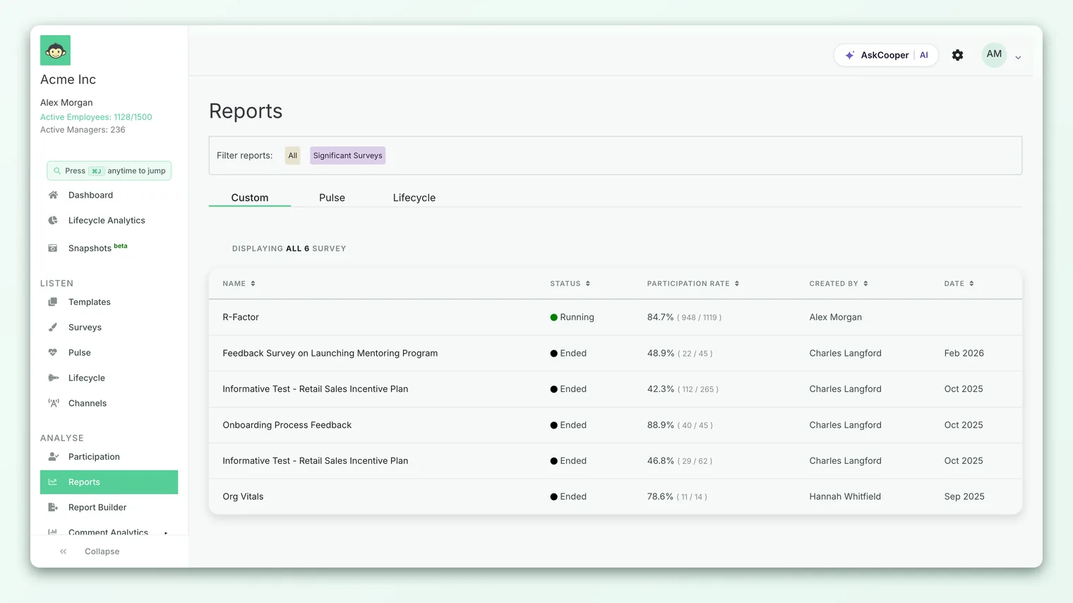
Every survey that has collected responses has its own report. To open one, go to Analyse > Reports in the left navigation, then click the survey you want. That lands you on the report, with the tab row waiting at the top. For the full walkthrough (including shared and guest links), see Open a survey report.
Two things are worth knowing before we walk the tabs:
- The tab row is consistent, but not identical for everyone. Which tabs appear depends on your role, your plan, and a few account settings. A manager viewing their own team may see fewer tabs than an account admin. If a tab described here is missing for you, that's usually expected, not a bug.
- Filters carry across tabs. When you apply a date range or a demographic filter (team, location, manager), it follows you as you move between sections, so the numbers stay consistent from one tab to the next.
The tabs at a glance
Here's the full set, in the order they usually appear, with the one-line job of each. The sections below unpack them.
| Tab | What it answers | Best for |
|---|---|---|
| Summary | Did people show up, and how do they feel overall? | A quick health check |
| Report | What's the overall score, and which drivers are strong or weak? | The main diagnosis |
| Questions | How did each individual question score? | Question-level detail |
| Word Cloud | What themes come up most in open text? | Spotting recurring topics |
| Text Responses | What did people actually write? | Reading verbatim feedback |
| Benchmark | How do our driver scores compare with our industry? | External context |
| eNPS Benchmark | How does our eNPS compare with our industry? | Advocacy context |
You may also see a Synopsis tab (an AI-written narrative summary) or an Insights tab on some accounts. Those are covered briefly at the end.
Summary: your at-a-glance health check
Summary is the landing tab on many reports, and it answers the first question anyone asks: did people actually respond, and what's the mood?
It leads with participation. You'll see your participation rate (the share of invited people who answered) with a progress bar, so you can tell at a glance whether you have enough responses to trust the rest of the report. Alongside it sit two supporting metrics:
- Bounce rate - the ratio of people who opened the survey but didn't answer it. A high bounce rate is a hint that something (length, timing, a confusing first question) is putting people off.
- Average response time - how long, on average, people took to complete the survey.
If the survey collected open feedback, Summary also shows a feedback distribution (a pie split of positive, negative, and neutral comments) and an average sentiment gauge. This is a fast read on tone before you dive into the actual comments on the text tabs.
Summary is designed as a first glance, not the full story. Use it to confirm you have enough responses and to sense the overall mood, then jump to Report or Questions for the detail behind those numbers.
Report: the scores and drivers deep dive
The Report tab (sometimes labelled the main report view) is where most analysis happens. It's built around your headline scores and the drivers beneath them.
At the top you'll find summary cards for the metrics that matter most:
- Overall Score - your overall engagement score for this survey, with a delta showing the change since your last survey.
- Participation Rate - repeated here so you always have context for the scores.
- eNPS - your Employee Net Promoter Score, if the survey included the eNPS question. To see the promoter, passive, and detractor split behind it, open View the eNPS breakdown.
Below the cards, the tab charts trends and driver strength:
- Participation over time shows how responses accumulated, so you can see whether reminders moved the needle.
- Driver scores over time (on recurring or autopilot surveys) tracks how each engagement driver has shifted across cycles.
- The driver heatmap (labelled Engagement score by drivers) is the centerpiece. It lays out every driver (Leadership, Recognition, Growth, and so on) with a color-coded score, so your strongest and weakest areas jump out. Click into a driver to drill down by segment.
If Summary tells you whether to worry, Report tells you where to look.
Questions: how each question scored
The Questions tab (its label includes the question count, like Questions (18)) breaks the survey down to the individual question. Every question is listed with its own score, so you can see exactly which items pulled a driver up or dragged it down.
A few things make this tab powerful:
- Section tabs across the top let you filter to one section of the survey at a time (for example, just the Leadership questions), or view All sections together.
- You can expand a question to see its answer distribution - how many people chose each option - which often explains a middling average.
- Where demographic data allows, you can compare a question's score across teams or segments.
- A Download button exports the question scores for offline analysis.
This is the tab to reach for when a driver looks off and you want to know which specific question is responsible. For a deeper walkthrough of reading and interpreting these numbers, see Read question scores.
Word Cloud: themes at a glance
The Word Cloud tab turns your open-text feedback (survey comments, free-text answers, and question comments) into a visual of the most frequent keywords. Larger words appear more often.
It's a fast way to spot recurring themes before you read a single comment. If workload, manager, or hybrid looms large, you know where the conversation is concentrated. The tab also shows a total keyword count, and non-English feedback can be translated so the cloud reflects your whole workforce. Treat it as a signpost that tells you what to read next, not as evidence on its own.
Text Responses: what people actually wrote
The Text Responses tab (on some accounts still labelled Feedback) is where the verbatim comments live. This is the qualitative heart of the report: the actual words behind every score.
Each comment is tagged with a sentiment (positive, negative, or neutral) so you can scan the tone quickly, and you can filter and sort to focus on, say, only the negative comments or only the responses tied to a particular driver. Comments remain anonymous - you're reading what people said, not who said it.
This tab is where scores turn into understanding. A low Recognition score is a fact; the three comments explaining why recognition feels thin are what let you act. For how to filter, star, and work through these responses effectively, see Read free-text responses.
Word Cloud and Text Responses both draw on open feedback, but they serve different moments. Word Cloud shows you the shape of the conversation; Text Responses lets you read it. Use the cloud to decide what to look for, then the responses to actually read it.
Benchmark: how you compare with your industry
Scores are more meaningful with context. The Benchmark tab compares your driver scores against a benchmark drawn from organizations in your industry and of your employee size. Each driver shows your score next to the benchmark, so you can see where you lead your peers and where you trail them.
Depending on your plan and account settings, this tab may also surface Suggested Actions (recommended next steps for your weakest drivers) and Suggested Courses. Benchmark is optional at the account level, so if it isn't there, it may be turned off or unavailable on your plan.
eNPS Benchmark: advocacy in context
The eNPS Benchmark tab does for eNPS what the Benchmark tab does for drivers: it places your Employee Net Promoter Score next to an industry benchmark for your size and sector. It's the quickest way to answer "is our advocacy score actually good?" without guessing. Like the driver benchmark, this tab is gated by an account setting, so it won't appear on every report.
Synopsis and Insights
Two more tabs show up on some accounts:
- Synopsis - an AI-generated narrative summary of the survey. When it's present, it often appears first, with the Summary tab renamed General. It's a plain-language recap of what the data says.
If you don't see either, nothing is wrong; they're conditional features.
Moving between sections
Switching sections is simply a matter of clicking a different tab in the row. A few habits make it smoother:
- 1Set your filters once. Apply your date range and any demographic filter on the first tab. It carries across the others, so every section shows the same slice of data.
- 2Work top to bottom. A natural path is Summary (do I trust this data?) to Report (where are the problems?) to Questions (which question exactly?) to Text Responses (why?). That order takes you from signal to root cause.
- 3Use benchmarks for context, not verdicts. Check Benchmark and eNPS Benchmark to see whether a score is genuinely low or just low for you. Peers are context, not a target.
- 4Export when you need to share. Most tabs offer a download or export so you can pull scores and comments into a deck or spreadsheet.
Frequently asked questions
Why do I see fewer tabs than a colleague?
Tab visibility depends on your role, your plan, and account settings. Managers, sub-admins, and account admins can see different sets, and features like Benchmark, eNPS Benchmark, Synopsis, and Insights are each gated separately. A missing tab is usually a setting, not an error.
What's the difference between the Summary tab and the Report tab?
Summary is the quick health check: participation, bounce rate, response time, and overall sentiment. Report is the diagnosis: overall score, eNPS, trends, and the driver heatmap. Summary tells you whether to worry; Report tells you where.
The Feedback tab is now called Text Responses. Are they the same thing?
Yes. On CultureMonkey accounts with the newer feedback experience, the Feedback tab is labelled Text Responses. Both show the same anonymous, sentiment-tagged verbatim comments.
Do my filters reset when I switch tabs?
No. A date range or demographic filter you apply carries across tabs, so the numbers stay consistent as you move around the report.
Why is a tab empty or hidden behind a message?
Usually because there isn't enough data yet, or the segment you filtered to is below the anonymity threshold. CultureMonkey keeps results hidden until enough people respond, so no individual can be identified.
Where to go next
- Getting into a report: Open a survey report
- The numbers behind each question: Read question scores
- Reading the verbatim comments: Read free-text responses
- The promoter/detractor split: View the eNPS breakdown
Your feedback helps us improve the Help Center.