

Track your team's drivers over time
How a manager watches their team's engagement drivers move across survey cycles in CultureMonkey - what the manager dashboard actually plots over time, how to read driver strengths and focus areas cycle over cycle, and where the per-driver trend lines live.
On this page
A single survey tells you how your team feels about Recognition or Growth right now. What it can't tell you, on its own, is whether that feeling is climbing, holding, or quietly slipping. For that you need to watch the same driver across several cycles. As a manager, everything you see is already scoped to your people - your direct and indirect reports - so tracking your team's drivers over time is really a question of reading the right cards on your dashboard in the right order.
This guide explains how to follow your team's driver movement across cycles: what your manager dashboard plots over time, how to read the strengths and focus areas that surface your driver scores, how to compare cycle over cycle, and where to go for a true per-driver trend line. It's the manager-scoped companion to Track driver performance over time, which covers the account-wide, all-drivers chart.
Your CultureMonkey manager dashboard (app.culturemonkey.io/manager-dashboard) scopes every card to your reporting line. The Scores over time card plots your team's overall engagement score and eNPS month on month, so you see the headline trajectory. Your per-driver picture shows up in Strengths & focus areas and How I compare, which rank and benchmark your drivers for the current period. To read a single driver's line across cycles, use the account-wide driver scores over time chart. Everything is held to an anonymity threshold, so thin teams and periods stay hidden until enough people respond.
Where your team's trends live
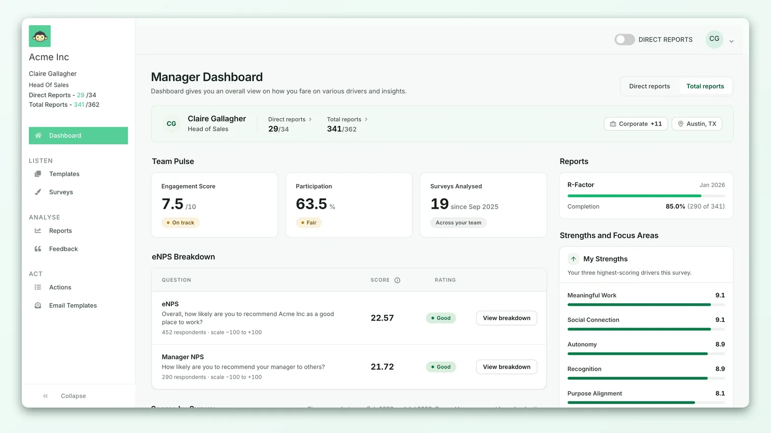
When you sign in as a manager, CultureMonkey opens your manager dashboard. Its hero strip names you, your team, and your reach: your Direct reports and indirect reports counts, your Employees total, and your team and location. Everything below that strip is automatically scoped to that reporting line. You never have to filter to "my team" - the dashboard is your team.
For how that scoping is built (who counts as a direct versus indirect report, and the toggle that narrows the view to your immediate team), see Set up manager-employee relationships. The short version: your dashboard covers your whole reporting subtree by default, so a driver score there reflects everyone beneath you, not just your direct reports.
The dashboard is organized into a few cards. Three of them carry your driver story over time:
- Scores over time - your team's overall engagement and eNPS trajectory, month on month.
- Strengths & focus areas - your highest and lowest drivers for the current period.
- How I compare - your per-driver scores set against internal and industry benchmarks.
The rest of this guide walks each one and shows how to read them together as a trend, not just a snapshot.
The Scores over time card
The card titled Scores over time, under the eyebrow The trajectory, is your headline trend. Its description reads "How your team's engagement score and eNPS have moved month on month," and that's exactly what it plots: two trajectories for your reporting line, bucketed by month.
You can view it two ways using the small toggle in the top-right of the card:
- Bar chart (the default) splits into two panels side by side: Engagement score over time on the left and eNPS over time on the right.
- Line chart overlays both on one graph, with your engagement score on the left axis and eNPS on the right.
Each point is a month's worth of your team's responses rolled up into a single number, so the shape of the line is the arc of your team's sentiment over the program, not a single survey's result.
The Scores over time card plots your team's overall engagement score and eNPS. It does not draw a separate line for each driver. It's the headline "is my team trending up or down?" view. For a driver-by-driver trend line, see Track driver performance over time.
Read this card first because it frames everything else. A rising overall line tells you the whole is improving; a falling one tells you to go find which driver dragged it down. That "which driver" question is what the next two cards answer.
Reading your drivers cycle over cycle
Because the Scores over time card is deliberately about the overall numbers, your per-driver trend comes from reading your driver score cards across cycles. Two cards surface those scores, and both refresh each time a new survey closes.
Strengths and focus areas
The Strengths & focus areas panel ranks your team's drivers for the current period, calling out where your team scores highest (strengths) and lowest (focus areas). It's the fastest read on which themes are carrying your team and which need attention right now. Full detail on how that panel is built lives in Your team's strengths and focus areas.
To turn that snapshot into a trend, note where a driver sits after each cycle. A driver that was a strength last quarter and has slid into your focus areas this quarter is the single most useful signal this panel gives you - the movement between lists is the trend, even though each view is a snapshot.
How I compare
The How I compare card sets your per-driver scores against two benchmarks:
- Internal benchmark - "Your scores vs. the top-scoring manager and the company-wide average, per driver." This tells you where your team stands relative to the rest of the organization, driver by driver.
- Industry benchmark - "Your scores benchmarked against the industry standard, per driver."
Watching these cycle over cycle adds context a raw score can't. A driver that holds steady at 7.0 while the company average climbs is quietly falling behind, even though its own number didn't move. Benchmarks turn a flat line into a relative one.
None of these cards draws a multi-cycle line for a single driver. Their power comes from reading each new cycle against the last: did this driver rise or fall, did it cross from strength to focus area, did it gain or lose ground on the benchmark? Consistency across two or three cycles is a trend; one cycle's move is just a data point.
Watching a single driver's line
When a driver keeps showing up in your focus areas and you want to see its actual shape over time - the rise, the dip, the recovery - you want the driver scores over time chart. That chart draws one line per driver, with each point the average of that driver's ratings for a period.
That per-driver, multi-line chart is the account-wide view, not a card on your manager dashboard. It buckets by month on the Dashboard and by week inside a single survey report, opens with the first three drivers shown, and lets you toggle up to three lines at once through its legend. It's the right tool the moment your question becomes "show me Recognition's line for the last year," and it's covered end to end in Track driver performance over time.
It's easy to expect the manager dashboard's Scores over time card to break out by driver - it doesn't. That card is your team's overall engagement and eNPS. The per-driver lines live in the separate driver-scores-over-time chart. Keep the two straight and you'll always know which question each one answers.
From a trend to a root cause
A trend tells you which driver is moving and when. It never tells you why. When a driver in your focus areas has slipped for a second cycle running, that's your cue to go behind the number:
- 1Start with the driver that's moving - not the lowest driver, but the one changing fastest. A healthy driver falling steadily matters more than a low one sitting flat.
- 2Read the comments behind it - your team's open-text feedback is where the "why" lives. The score says something changed; the words say what.
- 3Check participation first - before you read a dip as a real decline, confirm enough of your team actually answered that cycle. A thin period bounces around for reasons that have nothing to do with sentiment.
- 4Turn it into an action - create an action plan for the driver, assign an owner, and set a date. A tracked trend only earns its keep when it leads to a change.
- 5Re-read it next cycle - watch whether your action moved the line. Improvement shows up as a driver climbing back out of your focus areas.
The Turning insight into action card on your dashboard closes this loop for you, showing your action plans by status and even your pending actions by driver, so you can line up the drivers that are slipping against the actions meant to fix them.
Trends and anonymity
Like every result in CultureMonkey, your manager dashboard is protected by an anonymity threshold. If your team - or a narrow slice of it in a given period - is too small to report safely, the relevant card is held back rather than drawn from a handful of answers. This keeps any one person's response from being inferred through a small team's score.
In practice that means a few things for tracking trends:
- A missing driver isn't a zero. If a driver you expected doesn't appear in your strengths or focus areas, the usual reason is that too few of your team answered its questions to clear the threshold, not that the score collapsed.
- A quiet cycle may show no point. A period with too little participation has nothing to average, so it simply doesn't plot rather than showing a false low.
- Thresholds apply to your whole dashboard. Because your view is already scoped to your reporting line, a small team can push a card below the line entirely until participation climbs.
If a card or driver looks empty when you expected data, participation is almost always the reason. For the full explanation of why results are held back until a group is large enough, see Why can't I see results yet?.
How the manager view differs from the org view
It's worth being clear about how your team-scoped trends relate to the account-wide ones an admin sees, because the names overlap.
| Your manager dashboard | Account-wide (admin) view | |
|---|---|---|
| Scope | Your reporting line only | The whole organization |
| Over-time card | Overall engagement score + eNPS, monthly | Same headline trends, plus per-driver lines |
| Per-driver view | Strengths & focus areas, benchmarks (per cycle) | Driver scores over time (one line per driver) |
| You reach it at | app.culturemonkey.io/manager-dashboard | The main Dashboard and survey reports |
The two are consistent by design: your team's numbers roll up into the account-wide totals an admin sees. When your driver moves and the org's doesn't, that gap is itself a signal that the issue is specific to your team rather than company-wide.
Frequently asked questions
Does my dashboard's Scores over time card show a line per driver?
No. That card plots your team's overall engagement score and eNPS month on month. It's the headline trajectory, not a driver breakdown. For a line per driver, use the driver scores over time chart.
How do I see whether one specific driver is trending up or down for my team?
Read your Strengths & focus areas and How I compare cards across cycles - note where the driver ranks and how it sits against the benchmark each time. For the actual plotted line of that driver over several periods, open the driver scores over time chart.
Why is my dashboard bucketed by month?
The CultureMonkey manager Scores over time card rolls up your ongoing listening program and buckets it by month, so each point reflects a month of your team's responses and the line shows the longer arc rather than week-to-week noise.
A driver disappeared from my dashboard. Did the score drop to zero?
Almost certainly not. A missing driver usually means too few of your team answered its questions that cycle to clear the anonymity threshold, so CultureMonkey suppresses it rather than showing it from thin data. Check participation before reading it as a decline.
Can I see trends for just my direct reports, not my whole reporting line?
Your dashboard covers your entire reporting subtree by default. Whether you can narrow the view to only your direct reports depends on the direct-reports toggle described in Set up manager-employee relationships, which is available to managers with enough direct reports.
Where to go next
- See the per-driver trend line: Track driver performance over time
- Read your ranked drivers this cycle: Your team's strengths and focus areas
- Understand how your team is scoped: Set up manager-employee relationships
Your feedback helps us improve the Help Center.