

View average sentiment by driver
How CultureMonkey averages the sentiment of every comment tagged to each driver, how to read which themes are emotionally positive or negative, and how to pair this emotional read with your numeric driver scores.
On this page
Your numeric driver scores tell you how people rate each theme of work. They don't tell you how people feel when they write about it. A driver can sit at a respectable 7.2 and still be surrounded by frustrated, worried comments - or score a soft 5.8 while people write about it with real warmth and hope. Average sentiment by driver is the analytic that closes that gap.
This is the Driver Stats view. It takes every open-text comment your people have written, reads the emotional tone of each one, groups those comments by the driver they were tagged to, and gives you a single average sentiment score per driver. The result is a map of which themes in your organization are emotionally positive and which are emotionally negative - the feeling behind the numbers, driver by driver.
Every piece of feedback in CultureMonkey carries a sentiment score from about −1 (very negative) to +1 (very positive), and every piece of feedback is tagged to one or more drivers. The Driver Stats view averages the sentiment of all comments tagged to each driver and plots one bubble per driver, positioned as Positive, Neutral, or Negative. It answers "which themes do my people feel good or bad about when they talk?" - a different question from "which themes score highest?" Read the two together.
What this analytic measures
CultureMonkey has two very different signals about a driver, and this article is about the second one.
- The numeric driver score comes from rating questions. When employees answer a scaled question, that answer is averaged into the driver the question belongs to. This is the number you see in reports and heatmaps. For the full explanation, see Understand drivers and factors.
- The average sentiment comes from comments. When employees write open-text feedback, CultureMonkey scores the emotional tone of what they wrote and tags the comment to the relevant driver. Average that emotional tone across all comments for a driver and you get its average sentiment.
So a driver ends up with two readings that don't have to agree. Recognition might score 7.0 on the rating scale (people are broadly satisfied) while its comments lean negative (the people who chose to write about recognition were mostly unhappy). That disagreement is not a bug. It is one of the most useful things this view surfaces, and we come back to it below.
This view is the aggregate: one averaged number per driver, across all feedback. If you instead want to read the sentiment mix inside a live list of comments - the red, amber, and green tags on individual feedback cards - that is a different screen. See Driver-level sentiment in the feedback view. Use this article for the org-wide roll-up; use that one for reading a stream of comments.
Where sentiment scores come from
Every comment CultureMonkey receives is run through sentiment analysis, which assigns it a sentiment score on a continuous scale from roughly −1 to +1. Think of it as a needle: strongly negative language pulls toward −1, strongly positive language pulls toward +1, and flat or mixed language sits near 0.
That single per-comment number is the atom this whole view is built from. If you want the full picture of how a comment gets its score, what the scale means, and why some comments read as neutral, see How sentiment scores work.
CultureMonkey uses fixed thresholds to translate a raw score into a polarity label:
| Sentiment score | Polarity | What it means |
|---|---|---|
| 0.2 and above | Positive | The comment reads as clearly positive |
| Between −0.1 and 0.2 (or unscored) | Neutral | Flat, mixed, or too short to read a clear tone |
| −0.1 and below | Negative | The comment reads as clearly negative |
Notice the neutral band is deliberately a little wider on the positive side (it runs from −0.1 up to 0.2). CultureMonkey gives a comment a small buffer before calling it "positive," so a mildly upbeat remark isn't over-counted as genuine praise. These same thresholds decide where each driver lands in the view.
How the driver average is computed
The average sentiment for a driver is exactly what it sounds like, computed in three steps:
- 1Collect the comments - CultureMonkey gathers every piece of feedback tagged to the driver, across all the feedback you're allowed to see.
- 2Average their sentiment scores - it takes the mean of the sentiment scores of those comments. That mean, rounded to two decimals, is the driver's average sentiment (still on the −1 to +1 scale).
- 3Label the polarity - it applies the thresholds above to that average, so the driver is classified as Positive, Neutral, or Negative and placed accordingly in the chart.
A worked example makes it concrete. Suppose the Work Life Balance driver has five comments tagged to it, with sentiment scores of +0.6, +0.4, −0.2, +0.5, and +0.1. The average is (0.6 + 0.4 − 0.2 + 0.5 + 0.1) ÷ 5 = +0.28. Because 0.28 is at or above the 0.2 threshold, Work Life Balance is labeled Positive. One sour comment didn't sink it, because four others outweighed it - which is the whole point of an average.
A single comment can be tagged to more than one driver (someone might write about both their manager and their growth in one sentence). When that happens, the comment's sentiment counts toward the average of each driver it's tagged to. That is intended: the remark really was about both themes.
Reading the Driver Stats view
You'll find this analytic under Feedback in the Analyse area, on the Driver Stats view. Its header says it plainly: it shows the emotional effect of CultureMonkey drivers in your organization, based on the feedback provided by your people.
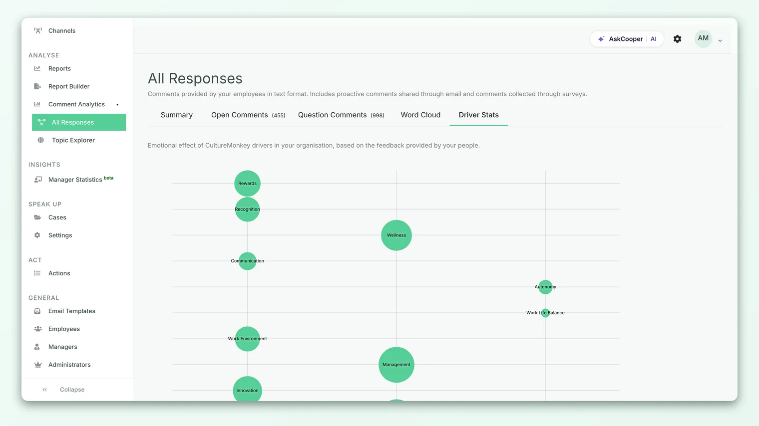
The view is a bubble chart with a simple logic:
- Three columns across the bottom label the polarity: Positive, Neutral, Negative. Which column a driver lands in tells you, at a glance, the emotional lean of the conversation about that theme.
- Vertical position reflects the actual average score on the −1 to +1 scale, so within a column you can see which drivers are more strongly positive or negative than others.
- Each bubble is one driver, labeled with the driver's name, and hovering it shows the exact average value.
- Bubble size scales with the score, so the strongest readings are the most visually prominent.
Read it as a landscape. A cluster of bubbles over on the Negative side is a short list of the themes your people feel worst about when they open up. A healthy spread toward Positive is a sign that the conversation, not just the ratings, is in a good place.
Your eye should go to the two ends first. The most negative driver is where emotional strain is concentrated and is usually the best candidate for a conversation or an action plan. The most positive driver is a strength worth naming and protecting. The neutral middle is real but less urgent - it's where people are either content or simply not writing with strong feeling.
Pairing sentiment with the numeric driver score
This view is at its most powerful next to your rating-based driver scores, because the interesting cases are where the two disagree. Line them up mentally into four quadrants:
| Numeric driver score | Average comment sentiment | What it usually means |
|---|---|---|
| High | Positive | A genuine strength - people rate it well and talk about it warmly. Protect it. |
| High | Negative | A warning under a good number - the rating looks fine, but the people who write are unhappy. Read the comments now. |
| Low | Positive | Rated soft, but people write with hope or goodwill. Often the easiest driver to move - the appetite is there. |
| Low | Negative | Rated low and felt badly. This is your priority; the number and the emotion agree. |
The two off-diagonal cases (high score / negative sentiment, and low score / positive sentiment) are the ones you'd miss if you only looked at the ratings. A driver that scores well but reads negatively is a quiet risk: satisfaction on the scale can mask a vocal, frustrated minority whose comments are the leading edge of a bigger problem. A driver that scores poorly but reads positively is often a hidden opportunity - people want it to work, so effort there is likely to be welcomed.
An average sentiment near neutral can mean "everyone feels lukewarm" or it can mean "half love it, half hate it, and they cancel out." Those are completely different situations. When a driver sits near the middle, don't stop at the bubble - open the comments for that driver in the feedback view and look at the actual spread of positive and negative before you conclude anything.
What you see depends on who you are
Like everything in CultureMonkey, this view respects access and anonymity, so two managers looking at the "same" view can see different things.
- Your scope is your people. The average for each driver is computed only over the feedback you're authorized to see. A team manager's Recognition sentiment reflects their team's comments; an admin's reflects the wider organization. The shape of the chart is relative to your window, not the whole company.
- Only drivers with comments appear. A driver shows up only if it has at least one comment tagged to it in your scope. If a theme has drawn no written feedback, it simply won't have a bubble - there's nothing to average.
- Small groups may show nothing. If you don't clear the anonymity threshold, the view won't render individual results at all, for the same reason every other analytic protects small populations: no one should be able to infer a single person's feedback. If a driver or the whole chart looks empty, too few comments is the usual reason, not a fault. See Why can't I see results yet?.
Best practices
- Never read sentiment alone. The bubble tells you the tone of a driver, not the reason. Always pair it with the numeric driver score and then read the actual comments behind the theme. Tone points; comments explain.
- Watch the disagreements. When a driver's rating and its sentiment pull in opposite directions, that gap is more informative than either signal by itself. Make a habit of scanning for it.
- Weigh the volume. A driver averaged from three comments is far noisier than one averaged from three hundred. An extreme bubble built on a handful of comments can swing with the next response, so treat thin drivers with care.
- Track it over cycles. A single snapshot is a mood; a trend is a signal. If a driver drifts from positive toward negative across surveys, that movement is worth acting on before it shows up in your ratings or your attrition.
- Close the loop where it's negative. The clearest use of this view is to pick the most negative driver, read its comments, build an action plan, and tell people what you heard. Visible follow-through is what turns a negative bubble green over time.
Frequently asked questions
How is this different from the sentiment tags on individual feedback cards?
Those tags classify each comment one at a time, inside a live list you scroll through - that's the feedback view. This analytic averages all of a driver's comments into a single score and plots one bubble per driver. Same underlying sentiment data, different altitude: one is the stream, this is the map.
Why does a driver read negative when its numeric score is fine?
Because the two measure different things. The score comes from rating questions across everyone who answered; the sentiment comes only from people who chose to write. Writers are often the strongly-feeling minority, so a driver can be rated "fine" and still read negative in comments. That gap is a prompt to read the comments, not a contradiction.
Do neutral or unscored comments count in the average?
A comment that landed in the neutral band still has a numeric sentiment score, so it is included in the average and pulls the driver toward the middle. Comments with no score at all (too short to read a tone) are treated as neutral for labeling and don't contribute a value to the average.
Why is one of my drivers missing from the chart?
Because it has no comments tagged to it in your scope. In this view, CultureMonkey only plots drivers that people have actually written about. A driver measured purely by ratings, with no open-text feedback, won't appear here - look at its numeric score instead.
Can I see this for just my team?
Yes. CultureMonkey automatically scopes the view to the feedback you're authorized to see, so a team manager sees their team's driver sentiment, provided the group is large enough to meet the anonymity threshold.
Is the sentiment scale the same −1 to +1 as elsewhere in CultureMonkey?
Yes. The per-comment sentiment score and the thresholds (Positive at 0.2 and up, Negative at −0.1 and below) are the same ones used across the product. See How sentiment scores work for the full detail.
Where to go next
- Read the comment stream, not the average: Driver-level sentiment in the feedback view
- Understand the −1 to +1 scale: How sentiment scores work
- See how driver scores are built: Understand drivers and factors
Your feedback helps us improve the Help Center.