

View the participation report
A full tour of the CultureMonkey participation report - the four headline numbers, response rates by team and manager, the time-wise submission trend, how each reminder moved the needle, comparing against a target, and every export it offers.
On this page
- Where the report lives
- The four headline numbers
- Response rates by segment
- The time-wise submission trend
- Did the reminders help?
- Where people drop off
- Comparing against a target
- Is your data ready?
- Exporting the report
- How anonymity affects what you see
- A practical reading routine
- Frequently asked questions
- Where to go next
The participation report is the deep end of participation in CultureMonkey. Where the dashboard card gives you one glanceable number and the live view lets you watch a survey fill up, the participation report is the full diagnostic: response rates broken down by every segment you record, a time-wise curve of when submissions actually arrived, how each reminder moved the needle, how you're tracking against a target, and a set of exports for sharing all of it.
Related release: Participation Digest (June 24, 2026). See every dated change on Product Updates.
This guide walks the whole report top to bottom. You'll learn where it lives, what each of its sections shows, how the numbers are calculated, and which export to reach for when. If you only need a running rate, or the aggregate dashboard figure, those are lighter jobs covered elsewhere: see Track participation in real time and Track participation rate on the dashboard. This article is about the complete report.
The participation report opens from Analyse > Participation (pick a survey from the dropdown) or from any survey's report. It leads with four numbers (rate, total participants, submitted, pending), then lets you break the rate down by manager, team, location and more, see a day-by-day submission trend, check whether each reminder lifted responses, and compare the current rate against a target you set. CultureMonkey lets you export everything on screen to PNG or XLSX.
Where the report lives
There are two doors into the same report.
The standalone one is Analyse > Participation. It opens with a Choose survey dropdown at the top; running and recently ended surveys are listed, grouped by type. Pick one and the full report loads underneath. This is the fastest way in when you want to compare participation across a few surveys without hopping between reports.
The per-survey door is inside a survey's own report. Open the survey from Listen > Surveys or Analyse > Reports, and the participation report is a tab alongside the summary and the score detail. Same report, already scoped to that survey.
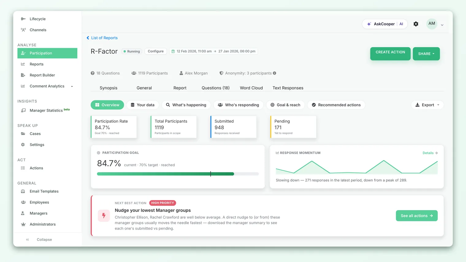
The full participation report is a newer, richer view than the classic live participation page, and it rolls out per account. If Analyse > Participation shows the simpler live view rather than the sectioned report described here, the report may not be switched on for your account yet.
The four headline numbers
The report opens with the same four cards you see on the live participation view, so the story stays consistent everywhere participation appears:
| Card | What it shows | How it's derived |
|---|---|---|
| Participation Rate | Overall completion percentage | Submitted ÷ Total participants × 100 |
| Total Participants | Everyone invited (in scope) | Count of participant records for the survey |
| Submitted | Responses received so far | People who completed and submitted |
| Pending | Yet to respond | Total participants − Submitted |
The four reconcile: Submitted + Pending = Total Participants, and Rate = Submitted ÷ Total × 100. The rate is rounded to two decimals internally and shown as a clean percentage. As everywhere in CultureMonkey, participation is counted per person, not per answer: one submission counts once, no matter how many questions the survey had, and opening or clicking the invitation without finishing does not count.
A 92% rate on a 25-person team is 23 responses; a 58% rate on a 1,500-person census is 870. The second is a far larger, more reliable sample. The report shows both, so use both before you draw a conclusion about any group.
Response rates by segment
The average rate hides more than it reveals. A comfortable company-wide 70% routinely contains a team sitting at 20%, and that team is exactly where a nudge pays off. The Who's responding section is built for finding those groups.
By default the report groups the breakdown by manager. You can switch the grouping to team, location, region, country, gender, employee type, sub team, tenure, business unit, business group, or designation, plus any custom attribute your account records that has enough mapped employees to report on. Each row shows that group's participant count, submissions, and rate, so you can sort from weakest to strongest and see where responses are stalling.
Above the table, a highlights strip does the sorting for you. It splits groups into two bands by rate:
- Top groups - anything at or above a 75% rate. These are your strong responders.
- Needs attention - anything below a 50% rate. These are the groups a follow-up push will help most.
Groups in the healthy middle (50-74%) appear in neither strip, so the highlights stay focused on the extremes that actually warrant a decision. A short auto-generated insight summarizes how many groups need attention and where responses are dropping.
Grouping splits everyone into rows; filtering narrows who's counted at all. You can apply filters (say, one location) so every number on the report - the four cards, the breakdown, the highlights - recomputes for just that population. This is how you answer "how is the Bangalore office responding, broken down by team?" in one view.
The time-wise submission trend
Knowing your final rate is useful; knowing when responses arrived tells you what actually drove them. The Response trend chart under What's happening plots participation over the life of the survey: bars show responses received per day, split by the channel they came in on (Email, SMS, Slack, MS Teams, WhatsApp, or QR for anonymous-link responses), and a line tracks the cumulative response rate climbing toward your headline number.
The curve almost always has the same shape: a sharp spike in the first day or two after launch, a long flatter tail, and smaller bumps on the days reminders went out. That shape is the point. A flat first day suggests a delivery problem, not a participation one. A tail that never bumps after a reminder tells you the reminder didn't land. You can switch the granularity between Day, Week, and Month for longer-running surveys, and flip between the graph and a table of the same figures.
The report also surfaces a few timing signals drawn from when people submitted:
- First-hour responses - how many came in within an hour of launch, a read on how eagerly your audience opened the invitation.
- Peak window - the two-hour block of the day (in your account timezone) when the most responses arrived, useful for timing your next send.
- Dropped mid-survey - people who started answering but never submitted, a signal the survey may be too long or something is putting them off.
- Never opened - invited people with no record of ever opening the survey, the group a channel change or a reminder is most likely to reach.
Did the reminders help?
Sitting alongside the trend is a per-stage breakdown that answers a question every admin asks after a nudge: did it work? CultureMonkey divides the survey's life into stages, one per send event - Launch, then Reminder 1, Reminder 2, and so on for each reminder that actually went out.
For each stage it shows the date it was sent, the channel it went on, how many submissions arrived during that stage's window (before the next send), and the cumulative rate reached by the end of it. Reading down the column, you can see plainly whether each reminder produced a fresh bump in responses or barely moved the number. That's the difference between "our reminders are working, keep the cadence" and "reminders are exhausted, try a different channel or message." To set up or adjust those reminders, see Follow up with non-responders.
Where people drop off
The funnel is a four-step view of how invited people turned into submitted responses:
| Step | What it counts |
|---|---|
| Invited | Everyone added to the survey |
| Opened | People with a record of opening the invitation |
| Started | People who answered at least one question |
| Submitted | People who completed and submitted |
The gaps between the steps are the diagnosis. A big drop from Invited to Opened points at deliverability or channel - your invitation isn't reaching or grabbing people. A drop from Started to Submitted points at the survey itself - length, a confusing question, or a bad moment to ask. Knowing which gap is widest tells you whether to fix your sending or fix your survey.
Comparing against a target
Under Goal & reach, the report lets you set a participation target and see how the current rate measures against it. The target defaults to 70% and you can change it to whatever your program aims for. A progress bar fills to the current rate, a marker sits at your target, and a caption tells you how many more responses you'd need to reach it.
The target is a planning aid, not a fixed benchmark baked into the product. There's no universal "right" number: engagement and lifecycle surveys often land in the 60-80% range for a healthy launch, while lighter pulse surveys run lower because they go out more often. Set the target to something realistic for the survey type and audience, then use the "responses needed" figure to judge whether one more reminder gets you there or whether the gap is too large to close in the time left.
If the goal bar says you need 40 more responses and the highlights strip names three teams sitting below 50%, those two facts combine into a plan: those teams roughly hold the responses you're missing. That's usually a faster route to the target than a blanket reminder to everyone.
Is your data ready?
A participation report is only as good as the data behind the people in it. The Your data section checks two things about the invited population:
- Contactability - how many participants have an email address on file, and how many have a phone number. Email also unlocks Slack (Slack resolves by email at send time), and phone unlocks SMS and WhatsApp, so this doubles as a "which channels can we even use?" check.
- Completeness - how many participants have a manager, team, location, business unit, designation, and gender filled in. This matters because those are the very fields you slice participation by. A team with no manager mapped can't appear in a manager breakdown.
If a segment looks thin or a breakdown row is missing people, this section often explains why: the underlying employee records are incomplete. Fixing that upstream (in General > Employees) makes every future report sharper.
Exporting the report
The Export menu (top right of the report) gives you several ways to take the data out, matched to different jobs:
- Download PNG - the whole report as an image, for pasting into a slide or a leadership update.
- Download full report - a multi-sheet XLSX that breaks participation across several demographics at once. You pick up to four group-by fields (team, location, manager, and so on, plus custom attributes), and each becomes its own sheet. This is the one for a thorough readout.
- Breakdown export - the current on-screen breakdown, but uncapped: every group in your chosen cut, not just the top rows shown.
- Response-trend export - the day-by-day timeline as a table, one row per day with per-channel columns, so you can chart the build-up yourself.
- Pending list - the named individuals who haven't submitted yet, for chasing responses.
The pending list, by its nature, names individuals who haven't answered. That's fine for following up, but treat the file with care: don't circulate it widely, and remember it's an operational list, not survey results. It never reveals what anyone answered, only whether they've responded. In the current version, demographic filters on screen are not applied to the pending-list export, so it returns the full pending population regardless of any filter you've set.
How anonymity affects what you see
Every result in CultureMonkey is protected by anonymity thresholds, and participation breakdowns are no exception. Each survey has a minimum response threshold, and for anonymous surveys this can't drop below a floor of 3 responses. If a segment you're slicing by hasn't reached that threshold, its row is suppressed so no single person's participation - and later no single person's answers - can be inferred.
In practice, the top-level rate is almost always safe: the whole-survey pool clears the threshold easily, even early. It's the narrow slices that hide - a five-person team, or a tight filter combination. That's expected behavior, not a bug. Non-anonymous surveys use a lower floor, so smaller groups can show. If a breakdown looks empty when you know people are in it, the threshold is nearly always the reason; the full walkthrough lives in Why can't I see results yet?.
The hidden row isn't an obstacle; it's the reason people answer honestly. A small team responds candidly precisely because its data can't be singled out. Waiting for the threshold is the price of candid feedback, and it's worth paying.
A practical reading routine
Here's an efficient way to work through the report, whether mid-survey or after it closes:
- 1Start with the four numbers. Read the rate next to the counts to gauge the overall health and sample size.
- 2Scan the highlights. See which groups are top responders and which need attention before you dig into the full table.
- 3Check the trend. Look at the response curve and the reminder stages to understand what drove responses and whether the last nudge landed.
- 4Read the funnel. Find the widest gap to know whether to fix your sending or your survey.
- 5Set a target and close the gap. Use the goal bar and the "needs attention" groups to plan your next, targeted push. See Follow up with non-responders.
- 6Export what you need to share. PNG for a slide, full-report XLSX for a detailed readout, pending list for chasing.
Frequently asked questions
How is the participation report different from the live participation view?
The live view (and the dashboard card) answer "what's the rate right now?" The full participation report adds the why and what next: response rates by every segment, a time-wise submission trend, per-reminder impact, a drop-off funnel, target comparison, and richer exports. See Track participation in real time for the live view and Track participation rate on the dashboard for the card.
Can I break participation down by a custom attribute?
Yes, as long as the attribute has enough mapped employees to report on safely. Custom attributes appear as group-by options in the breakdown and in the full-report export picker, alongside the standard demographics like team, location, and manager.
Does the report update live while the survey is running?
Yes. It reflects responses received up to when you load the page, so refreshing gives you the current picture. There's no meaningful delay between someone submitting and their response counting.
What does the target percentage do to my results?
Nothing. The target is a personal planning aid for the goal bar - it changes how the "responses needed" figure is calculated and where the marker sits, but it never changes the actual rate or any underlying data. Set it to whatever's realistic for that survey.
Why is a team missing from the breakdown?
Almost always the anonymity threshold: that group hasn't reached the minimum responses (a floor of 3 for anonymous surveys), so its row stays hidden. Occasionally it's a data gap - the team's employees have no manager or team mapped, so they can't be bucketed. The Your data section will flag the latter. See Why can't I see results yet?.
Can managers see the participation report for their teams?
Access to the full report is controlled by your CultureMonkey account's settings and role permissions, and any view a manager gets is scoped to the people and teams they're mapped to, subject to the same anonymity threshold. If you don't see the report at all, it may not be enabled for your role yet.
Where to go next
- Watch a survey fill up live: Track participation in real time
- Read the aggregate on your home screen: Track participation rate on the dashboard
- Chase the people who haven't answered: Follow up with non-responders
Your feedback helps us improve the Help Center.