

Compare your team to benchmarks in CultureMonkey
How a manager uses the "How I compare" section of the manager dashboard to place their team against the company-wide average, the top-scoring manager, and the industry standard - where each comparison lives, how to read above and below, and the caveats.
On this page
Your team's driver scores are useful, but a number on its own rarely tells you what to do next. Is a 7.4 on Recognition a strength or a soft spot? The honest answer is it depends on what you compare it to. That is what benchmarks are for. They turn a lone score into a position: ahead of the pack, in the middle, or behind. CultureMonkey gives every team both comparisons: against your own organization, and against the external benchmark for your industry and size.
As a manager, you do not have to go hunting for that context. The manager dashboard brings it to you in one place, a section called How I compare. This guide is the manager-hub tour of that section: what each comparison means, where it sits, how to read being above or below the line, and the caveats that keep you from over-reading a small gap. For the deeper mechanics of each benchmark type, this article links out to the dedicated guides.
The How I compare section of your CultureMonkey manager dashboard holds two tabbed comparisons. The Internal benchmark tab plots each driver as a bar showing your team's score against the company-wide average and the top-scoring manager. The Industry benchmark vs my score tab plots your team's scores against an external industry standard. Both answer "how is my team doing?" from a different angle: internal is "compared to everyone here," industry is "compared to other companies like us." Read the gaps, not the raw numbers, and trust a repeated pattern over a single reading.
Two benchmarks, one section
CultureMonkey gives managers two kinds of benchmark, and the manager dashboard puts both under the same How I compare heading so you can flip between them without leaving the page. It helps to keep the two straight from the start.
| Internal benchmark | Industry benchmark | |
|---|---|---|
| Compares your team to | Your own organization (the company-wide average, and the top-scoring manager) | An external standard for your industry |
| Answers | Am I ahead of or behind my peers here? | Are we ahead of or behind other companies like us? |
| Where it lives for managers | The "How I compare" section, Internal benchmark tab | The "How I compare" section, Industry benchmark vs my score tab |
| Best for | A fair, like-for-like internal reference | An outside-in view that internal comparison cannot give |
These two are complements, not rivals. Your team can sit comfortably above the company average yet still trail the wider industry, or the reverse. That is exactly why both are worth a look: each catches something the other misses. A team at the company average on a driver where the whole company is struggling looks fine internally and weak externally, and only the industry tab will tell you that.
Where the comparisons live on your dashboard
Open your manager dashboard. Scrolling past your headline metrics and your strengths and weaknesses, you reach the How I compare block. At the top of it is a small set of tabs.
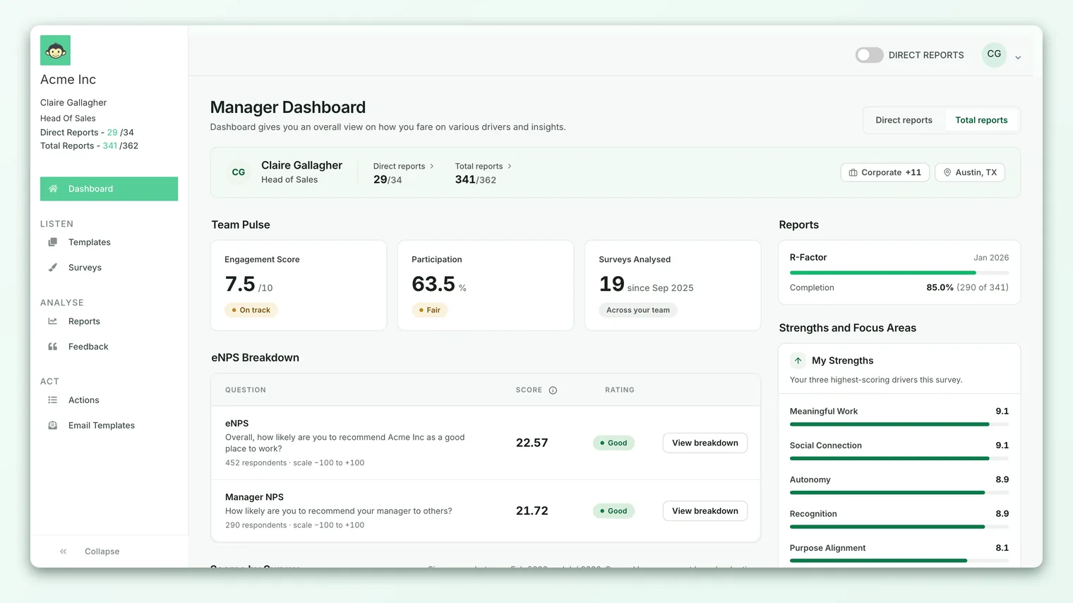
- Internal benchmark is the first tab and is usually selected by default. Its description reads: "Your scores vs. the top-scoring manager and the company-wide average, per driver."
- Industry benchmark vs my score is the second tab. Its description reads: "Your scores benchmarked against the industry standard, per driver."
Each tab draws one horizontal bar per engagement driver, so you can scan your whole scorecard at a glance and see the shape of the gaps across drivers at once rather than reading them one row at a time. If your account has only one of the two switched on, that tab simply fills the section on its own and there are no tabs to click.
"How I compare" is built for people who manage a team, because a comparison only makes sense when you have a team to score. If you are viewing another manager's dashboard, or you do not manage anyone, this is not the view you will see. For the wider layout it sits in, see A tour of the dashboard.
Reading the internal benchmark tab
The internal benchmark answers a plain, human question: "How is my team doing compared to everyone else here?" On each driver bar you are looking at three things at once:
| Marker | What it is |
|---|---|
| Your score | The average answer from the employees you manage, for that driver. This is scoped to your team, exactly like the rest of your dashboard. |
| Company-wide average | The same driver calculated across everyone in the organization, with the manager scoping switched off. |
| Top-scoring manager | The highest driver average among managers, so you see the leading edge and not only the middle of the pack. |
The important detail is that your score and the company-wide average come from the same calculation over the same survey data. The only difference is who is included: your people for your score, the whole organization for the average. Because both are built the same way, they are directly comparable, and the gap between them is meaningful rather than an apples-to-oranges artifact.
To read it well:
- Rank by the gap, not the score. The most useful drivers are the ones that sit furthest below the company-wide average, not simply your lowest numbers. A low score that matches the company average is an organization-wide theme, not yours to fix alone. A driver where you trail the average is specifically yours to work on.
- Use the top manager as a ceiling, not a stick. The top-scoring marker shows what "great" looks like for that driver inside your own company. It is there to give you a realistic aim, not to rank you against a named colleague.
For the full mechanics, including exactly how the company-wide average is aggregated and why it quietly contains your own team, see Compare against internal benchmarks.
An optional account setting swaps the per-driver top-manager comparison for a manager or organization engagement score. If your internal tab looks different from a colleague's at another company, this is often why.
Reading the industry benchmark tab
Switch to the Industry benchmark vs my score tab and the frame of reference changes from inside your company to outside it. Now each driver bar shows your team's score against an industry standard score for that driver.
CultureMonkey picks the right benchmark from the industry set on your account, which an admin chooses in the account settings. Every driver is compared to the external reference for that same industry, so a manager in a manufacturing company is measured against a manufacturing norm rather than a global average. The benchmark figures are converted to whatever scale your account uses (a 0-10 driver score, a 0-5 heatmap value, or a percentage), so both sides of the bar are always on the same scale and you never have to mentally rescale.
Read it the same way you read the internal tab, but with a different question in mind:
- Above the industry line on a driver means your team is doing better on it than typical companies in your sector. Worth noticing, and worth protecting.
- Below the industry line means you trail your peers there. These are usually the drivers to prioritize, because "low for our industry" is a stronger signal than "low in absolute terms."
- On the line means you are roughly typical for your sector. Neither a flag nor a win on its own.
Two things are specific to the industry tab and worth knowing:
- It only benchmarks standard drivers. The external dataset is keyed on CultureMonkey's standard engagement drivers, so custom drivers and custom questions have no industry reference and will not appear. A bar missing from this tab is usually a custom or unbenchmarked driver, not an error.
- It depends on the account industry being set. If your admin has not set an industry, or there is no benchmark data for it, the industry tab may not populate. That is an account-level setting, not something a manager changes.
For the deeper version of this comparison, including the eNPS benchmark and how the benchmark data is grouped, see Compare against industry benchmarks.
Putting the two together
The real value of "How I compare" is reading both tabs against each other. Take one driver and ask both questions:
| Internal read | Industry read | What it usually means |
|---|---|---|
| Above the company average | Above the industry | A genuine strength. Notice what you are doing and see if it transfers. |
| Above the company average | Below the industry | You lead internally, but the whole company trails the sector. A company-wide theme, not just yours. |
| Below the company average | Above the industry | Your team trails peers here, yet the company is strong overall for the sector. Specifically yours to work on. |
| Below the company average | Below the industry | A clear priority. You are behind both your colleagues and your peers on this driver. |
That last row is where your action planning earns its keep, and the top-left row is where you look for practices worth spreading. The two middle rows are the ones a single benchmark would have hidden from you, which is the whole reason both tabs exist.
Turning a gap into a next step
A benchmark tells you where to look. The detail underneath tells you why. When a driver sits below either line, work down this short loop:
- 1Start with the biggest downside gaps. Scan for the drivers furthest below the company average or the industry line and begin there, rather than with your lowest raw scores.
- 2Read the comments for that driver. The reason for a gap almost always shows up in what your people wrote. Pair the number with the open-text feedback before you conclude anything.
- 3Check where the gap is concentrated. The same scores viewed as a grid can show whether one sub-team or the whole team is pulling the driver down. See How to read a heatmap.
- 4Create an action and re-measure. Build a concrete action plan for the drivers that trail the most, assign an owner, and watch the bar move next cycle.
If your account has it switched on, a download icon next to the internal benchmark lets you export the comparison to CSV, which is handy for a one-to-one or a team review away from the app. If you do not see the icon, the export is simply not enabled for your account.
Caveats to keep in mind
Benchmarks are a compass, not a scoreboard. A few things keep them honest:
- Anonymity thresholds still apply. If too few people on your team responded, the "How I compare" section will not render a comparison, so no individual's answers can be inferred. An empty section is by design, not a bug. If your dashboard is blank here, this is the most common reason.
- Small teams are noisy. With a handful of respondents, one person's mood can swing your average by a point or more. The smaller your team, the more you should trust the trend over any single gap.
- The reference moves too. The company-wide average and the industry standard both shift over time. If the whole company improves and you hold level, you have slipped relative to the average even though your own score did not fall. Read both movements together.
- "Average" is not "good." Matching the company average just means you are in the same shape as everyone else, which might be a struggling shape. This is exactly where the industry tab earns its place, by adding the outside perspective the internal tab cannot.
- A few drivers may be suppressed. For governance reasons, some drivers can be withheld from the comparison, so your list may be shorter than the full set. That is expected, not missing data.
None of these are reasons to skip the benchmarks. They are reasons to read them as one input among several, alongside your comments, your trend, and each other.
Frequently asked questions
Why does my "How I compare" section not appear at all?
The most common reason is the anonymity threshold: if too few people on your team responded, the whole section is hidden until there are enough responses. An admin can also switch off either benchmark tab account-wide, so a missing tab may be turned off rather than empty.
Does the company-wide average include my own team?
Yes. Your employees are part of the organization, so their answers are counted in the company-wide average. For most teams the effect is small, but the average is a true whole-company figure, not the average of everyone except you.
Who is the "top-scoring manager" I am compared to?
It is the highest driver average among managers for that driver, shown so you can see the leading edge and not just the middle. It is a ceiling to aim at, not a personal ranking. Some accounts replace this marker with an engagement score instead.
Why is a driver missing from the industry tab but present on the internal tab?
The industry benchmark only covers CultureMonkey's standard drivers. Custom drivers and custom questions have no external reference, so they appear on the internal tab (which compares you to your own organization) but not on the industry tab.
The industry tab is empty. What happened?
Usually the account industry is not set, or there is no benchmark data for your industry. That is an account-level setting your admin controls, not something a manager changes. See Compare against industry benchmarks.
Can I see a benchmark for just one sub-team?
Your dashboard is already scoped to the people you manage, and the comparison reflects that scope, provided the group is large enough to meet the anonymity threshold. Narrower slices behave the same way, hiding themselves when they fall below the threshold.
Where to go next
- Go deeper on the internal comparison: Compare against internal benchmarks
- Go deeper on the outside-in view: Compare against industry benchmarks
- See the whole manager dashboard in context: A tour of the dashboard
Your feedback helps us improve the Help Center.